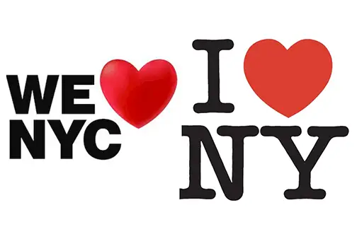
City and state officials on Monday launched a new ad campaign called “We ❤️ NYC” that’s intended to counter pessimism about the city’s future and encourage civic engagement and pride among residents.
But this being New York City, the initial reaction was marked more by disdain and ridicule.
“Let's all come together no matter if it's volunteering to clean up parks, volunteering at a homeless shelter. It's about all contributing together because this is the city we love,” Mayor Eric Adams said during an early morning CNBC interview ahead of a formal announcement.
As many New Yorkers instantly recognized, the “We ❤️ NYC” symbol is a riff on the classic “I ❤️ NY” campaign created in the 1970s by Milton Glaser.
Nostalgia, though, breeds diehards. Glaser’s logo remains the ubiquitous symbol of the city, emblazoned on T-shirts and souvenirs. And it even carries a New York City origin story: The late design legend said he sketched the logo with a crayon in the back of a taxi cab.
So when a New York Times journalist solicited reactions on Twitter to the city’s new ad campaign, the rants poured in.
“Don’t mess with perfection,” tweeted one person who included an image of Glaser’s logo.
Ben Stephens, a freelance copywriter, offered a critique in design terms.
The iconic power of Glaser’s design “comes from its simplicity, its boldness, the foursquare arrangement of its elements,” he wrote.
He then added: “The original looks like the voice of a city. The new one looks like the voice of an investment bank or possibly a healthcare provider.”
Councilmember Justin Brannan of Brooklyn compared the new logo to the Holland Tunnel’s 2018 holiday signage that was widely considered a design fail.
The ad campaign was about a year in the making, according to Kathryn Wylde, the president of the Partnership for New York City, a business lobbying group leading the effort.
Wylde told Gothamist that those behind the newest campaign felt the city needed to distinguish it from the original version, which is trademarked by New York state.
Unlike the rounded typewriter typeface used by Glaser, the font for the new logo is the same one employed in the city’s subway system.
“This was a time for ‘we,’ not ‘me,’” she said. “The message is, 'This takes all of us.'”
Graham Clifford, the designer and art director behind the new logo, told the New York Times the idea was to “give it more of a modern twist.”
In the same story, Matthew Quint, a branding expert at Columbia University, predicted that people would poke fun at the new design on social media.
This is not the first time the “I ❤️ NY” has been recycled. After the 9/11 terrorist attacks, Glaser adapted his design into “I ❤️ NY MORE THAN EVER.”
Some could argue that the campaign is already doing its job. Wylde seemed to be pleased that the logo was already spurring discussion.
“‘I heart NY’ has been a tourism campaign,” she said. “We believe this has to start locally with New Yorkers.”


