before
after
About
(Est. 2013) “Mobvista is a leading technology platform providing mobile advertising and mobile analytics services to the app developers globally. With its global coverage and local service capabilities, Mobvista has provided one-stop advertising services to over 2000 app developers in 60 countries, meeting their various needs from user acquisition to monetization. Mobvista’s advertising platform covers over 200 countries, reaching over 900 million unique mobile devices per day. Meanwhile, Mobvista’s mobile analytics SaaS platform has tracked behavioral data throughout the life cycle of gamers in over 49,000 games. Mobvista ranked the largest in China, the second in Asia and the top ten in the world, in terms of monetization SDK average DAUs in the first half of 2018. On December 12, 2018, Mobvista was officially listed on the Main Board of The Stock Exchange of Hong Kong(Stock Code: 01860). Currently, Mobvista has nearly 600 employees with offices in 12 cities across the world.”
Design by
FutureBrand (Shanghai, China)
Related links
N/A
Relevant quote
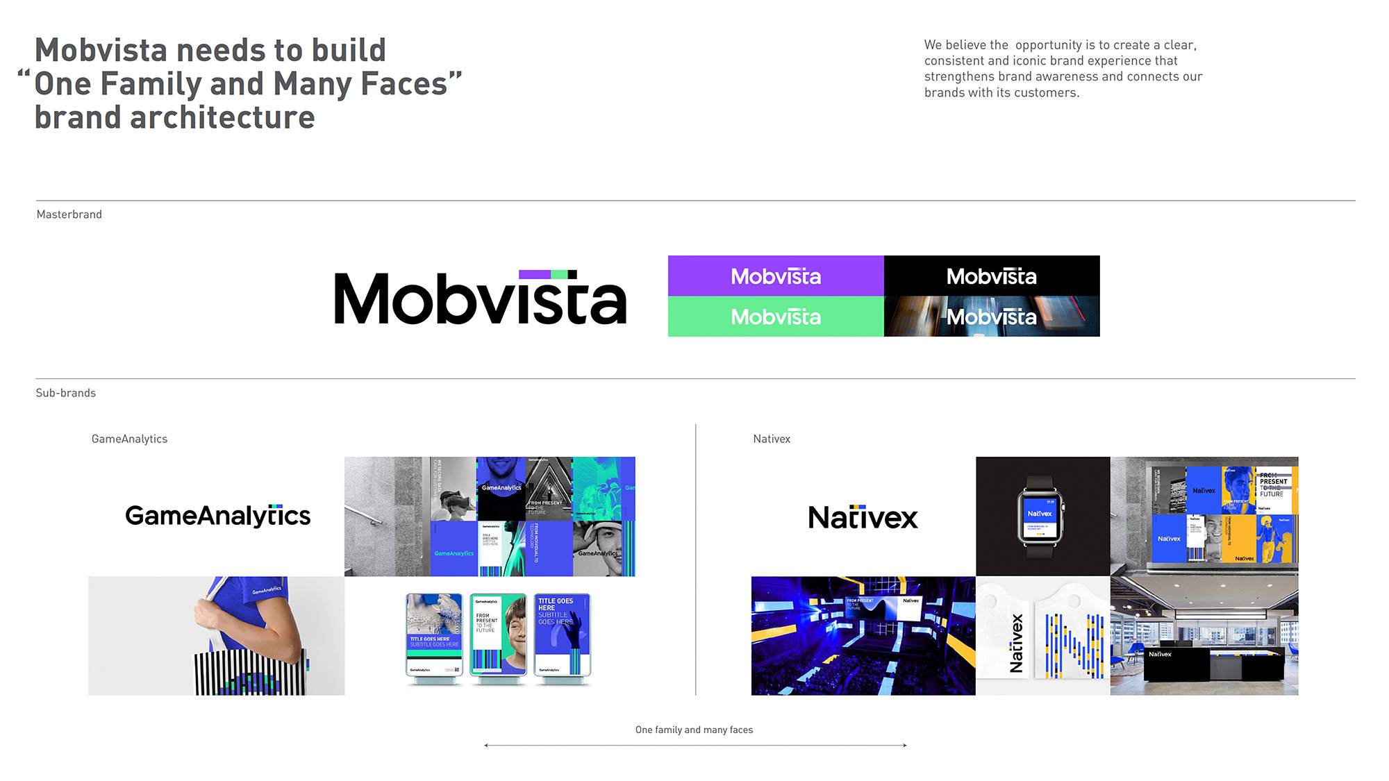
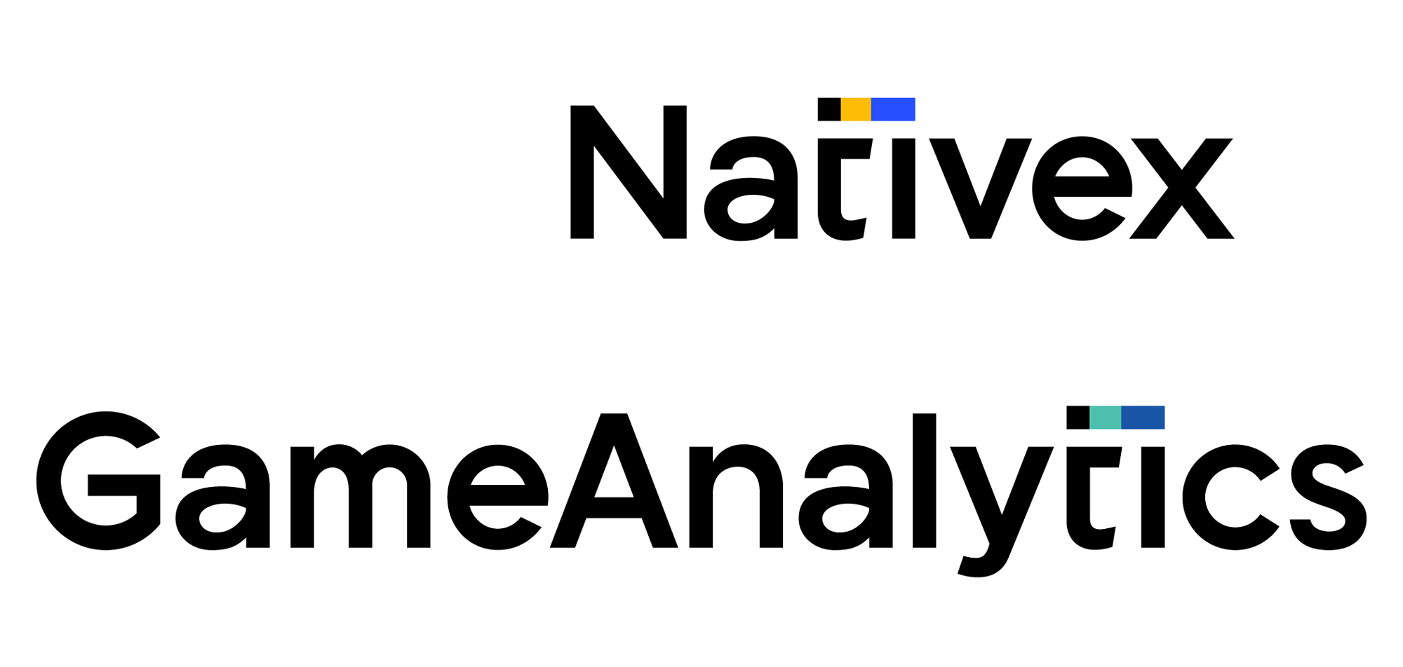
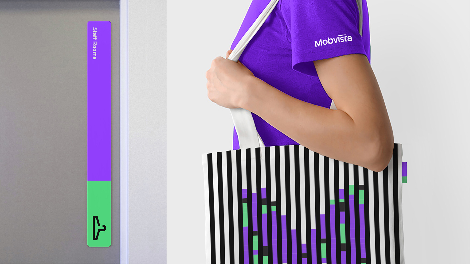
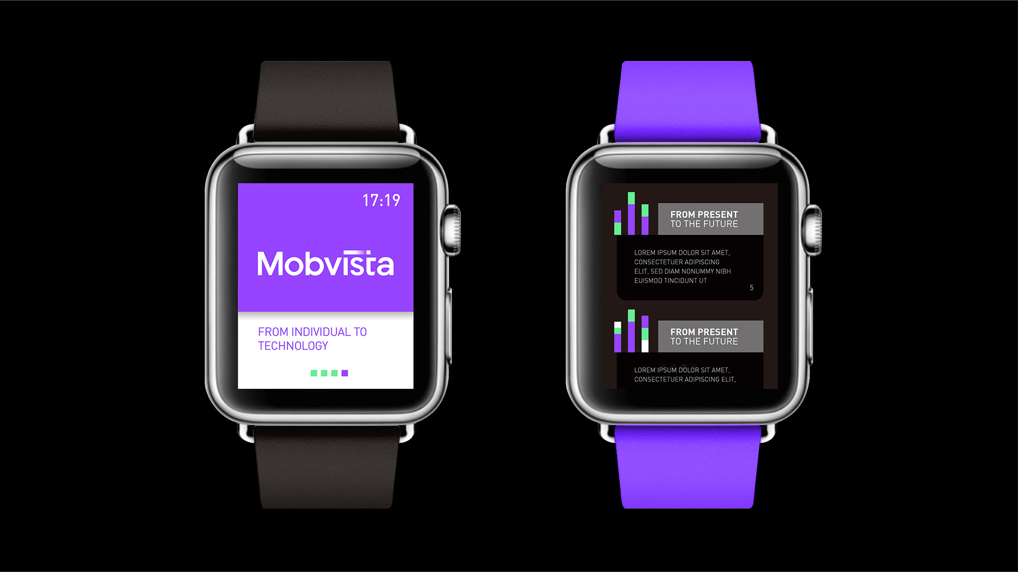
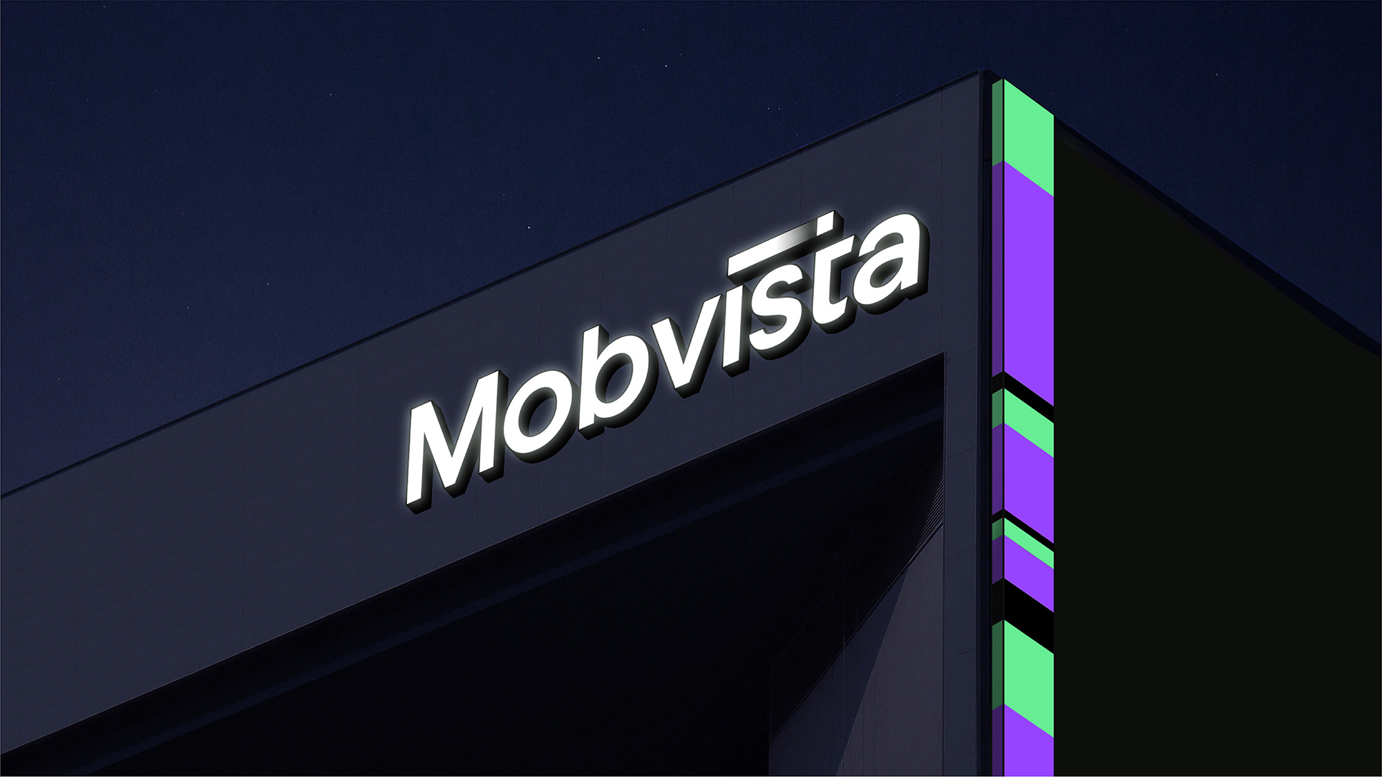
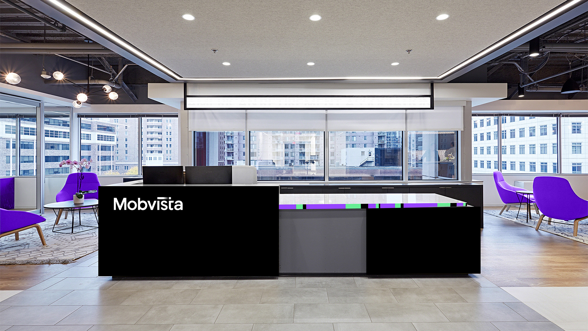
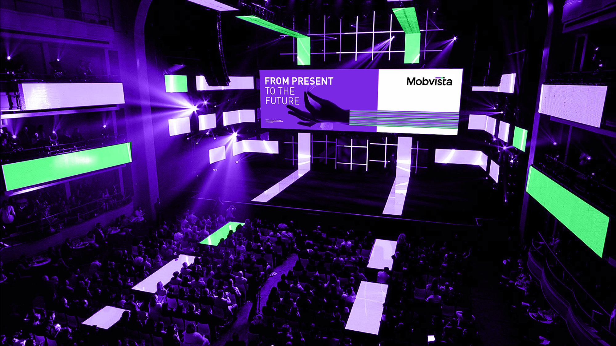
Whether it is the master brand of Mobvista, or the business sub-brands Nativex, GameAnalytics and Mintegral, "i-t" is a part of the soul, so we move the dot above i to the top of t, meaning technology for I (customers), to demonstrate customer-centric technology company business philosophy, forming a unique memory point of Mobvista brand logo design.
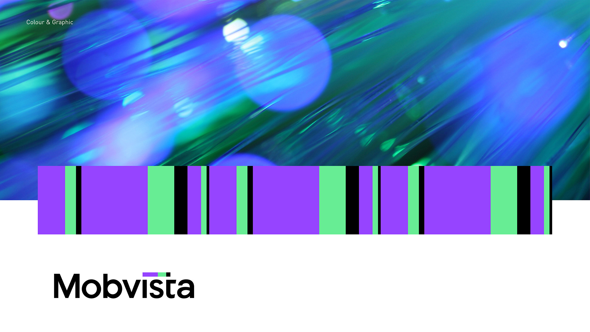
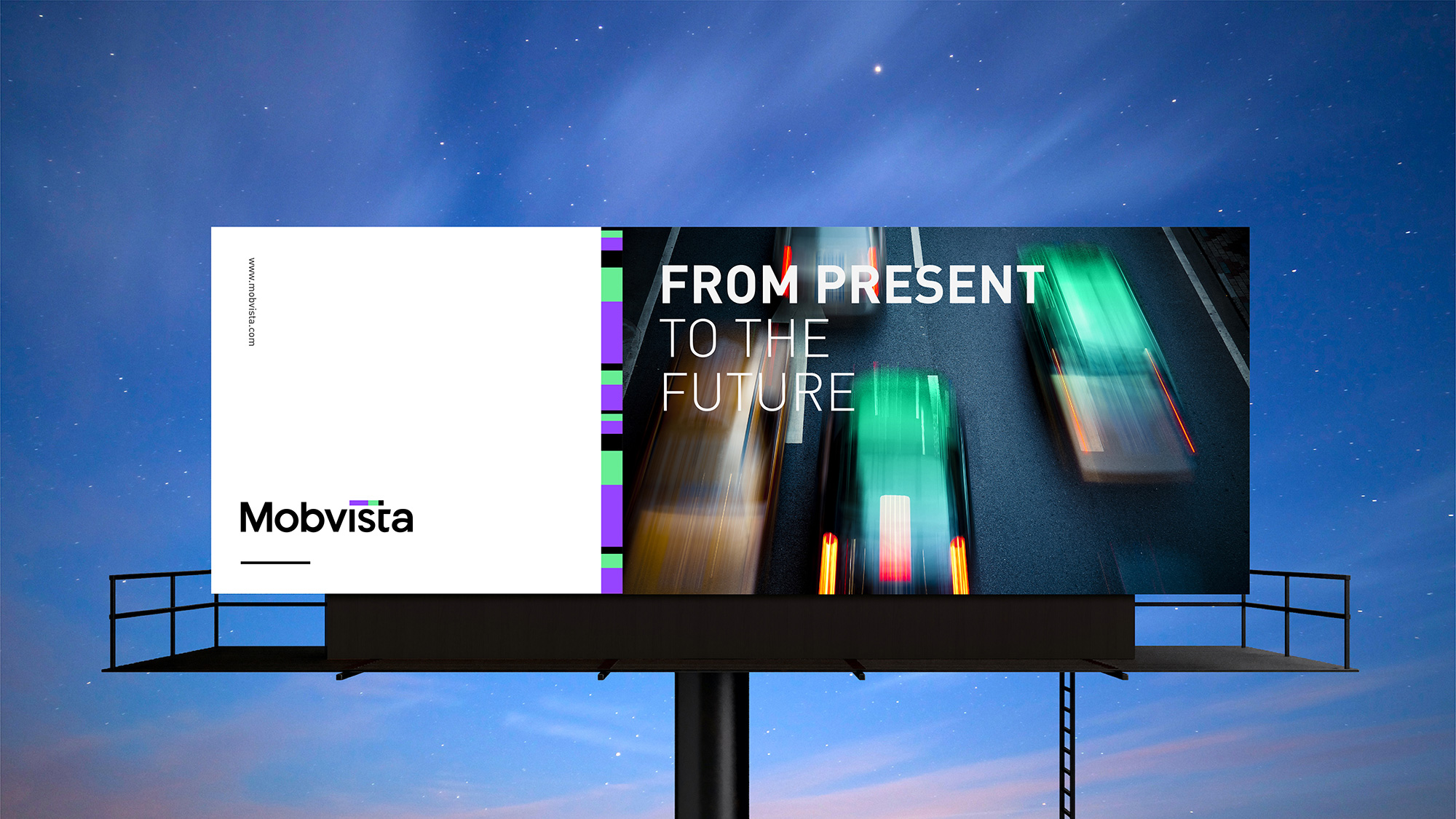
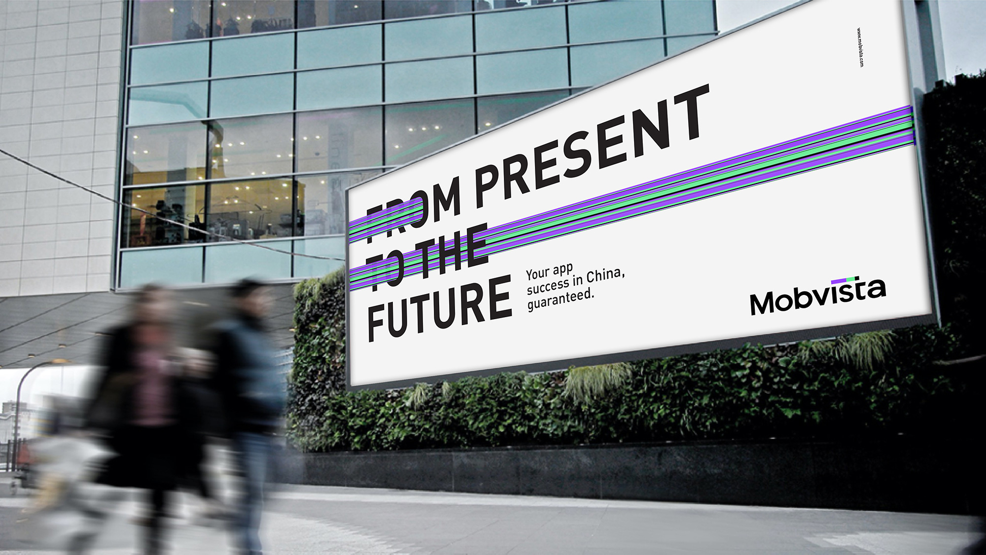
The moving dot between i and t in combine with brand main color purple, green, forming a unique color bar, like a bridge connecting the west and the east, content and services for global users with indifference, with technology to promote business globalization, and to practice for each market each customer service.
The design of “i-t” connection, endowed with a variety of variations, forms another unique memory point for the VI system, further enhancing the unique visual assets of the Mobvista brand. The colour bar also highlights Mobvista's mobile marketing technology attributes and data-driven business competitive advantages.
FutureBrand provided text
Images (opinion after)

Opinion
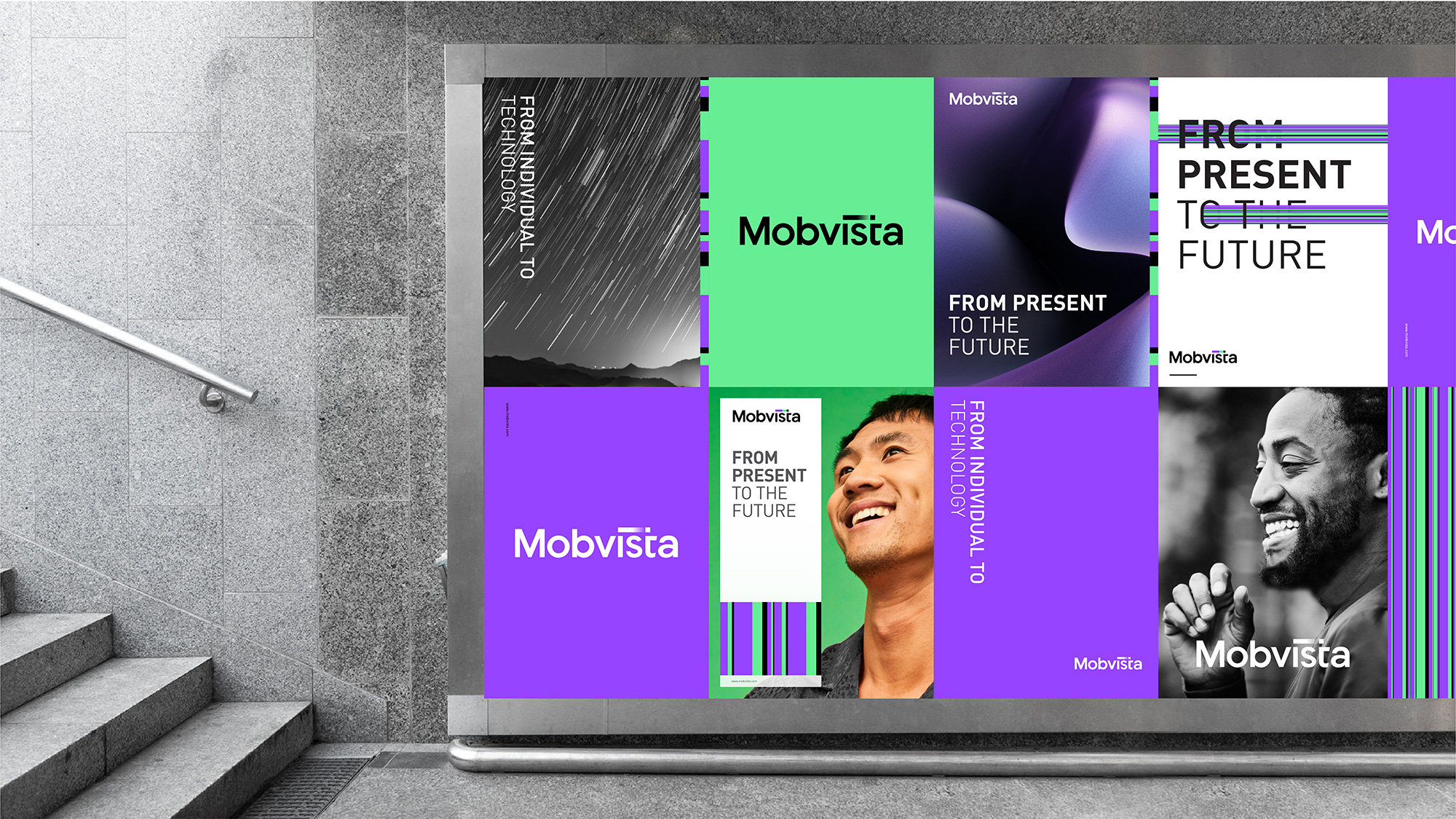
The old logo, aside from being generic, placed a lot of emphasis on the word “Mob” which obviously stands for “Mobile” but, well, also for “Mob” and perhaps that association is not an issue in China but with globalization and whathaveyou maybe it could be. Anyway, the new logo is a huge improvement and while it still operates under a business-y sans serif, the “i” to “t” color bar adds sufficient personality and is a fresh approach to playing with the tittle. The graphic move lends itself to a lot of awesome corporate rationalization — connectivity! Technology! Individuals! — and as eye-rolling as it can be, it’s hard to argue against it because it does work. The logo isn’t my favorite by any means but as a tech-sector, corporate logo, it’s quite okay. Bonus points for working the signature graphic device into the “ti” ligatures of the sub-brands. The applications are a little too… creative. I feel like they tried to build too cool of a system with a lot of things going on — thick bars! Thin bars! Photos! Portraits! Textures! — and while it’s all decently done maybe it’s too much of too many things. Overall, a strong logo update and a viable identity system that maybe with a little less excitement could be much stronger.

Comments