before
after
Reviewed Jul. 6, 2020 by Armin
Industry / Technology
Established in 2006, Waze is one of the most popular navigation apps in the world, with 130 million users in over 180 countries and is, in part, fueled by its community of users who report, in real time, traffic and road conditions (along with the very helpful police-up-ahead reports so that you can slow your speeding, which you shouldn’t be doing). Originally created as a free digital database of the map of Israel in Hebrew built through crowd-sourcing and named FreeMap Israel, the Israel-based company created Waze in 2008 to commercialize its technology and after a few years of expansion and adoption, it was purchased by Google in 2013. Today, Waze fills the gap in many countries where Google and Apple Maps isn’t available or as accurate — if it weren’t for Waze, me and my family would probably still be lost in the mountains of Costa Rica in 2018 at 10:00pm during a massive wind storm — or by sending you through routes you never thought possible that are so obscure they stop short of making you drive through people’s backyards. Long way of saying, Waze rocks. Last week, Waze introduced a new identity designed by New York, NY-based Pentagram partner, Natasha Jen.
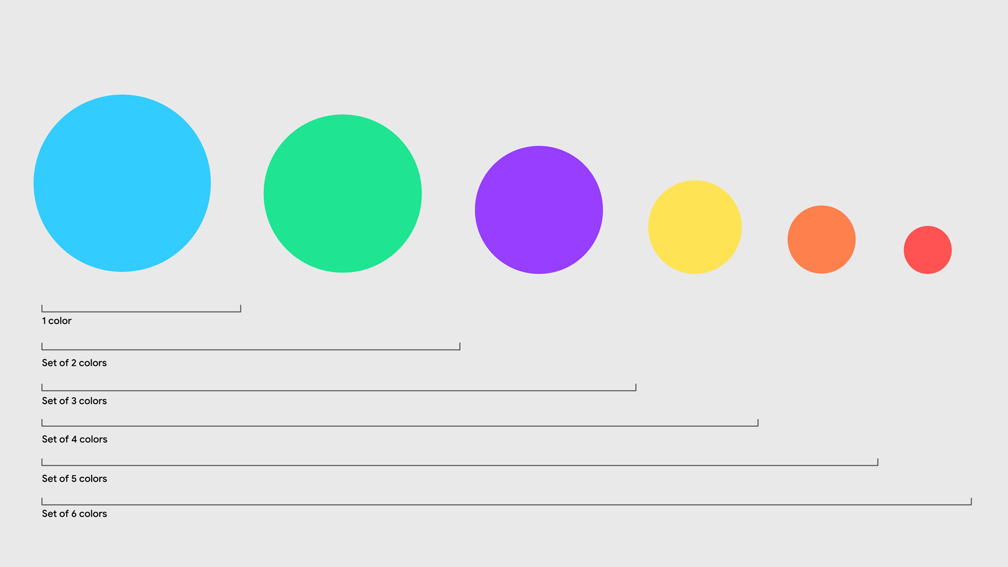
Pentagram has refreshed the Waze brand identity with a universal system that enhances the platform’s collaborative spirit and provides a better experience on the road. The identity updates the iconic Wazer symbol, introduces a set of new “Moods” that help users more authentically express themselves within the app, and streamlines the platform’s signature use of illustration. The system introduces a colorful visual language called “Block by Block” that is inspired by the modular design of the city grid, roads and streets. The refresh also included the development of a new brand voice and messaging that is bold, witty and welcoming.
Pentagram project page
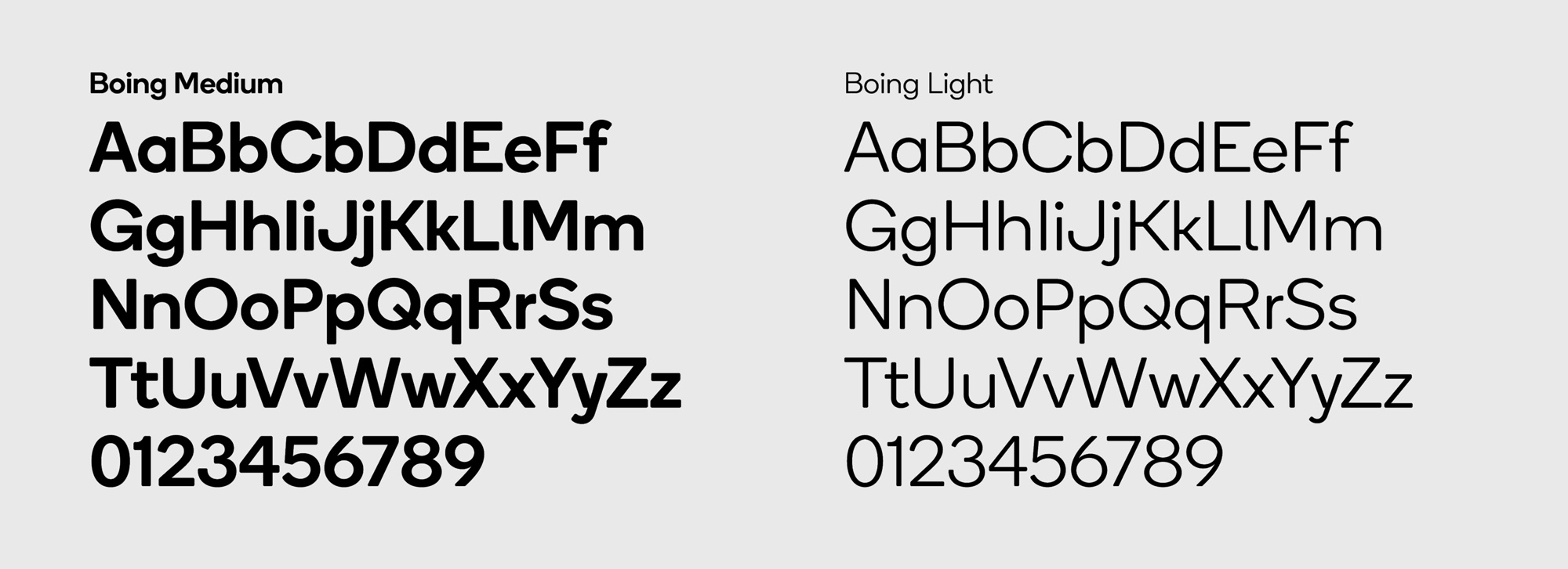
The new identity builds on this heritage to create a visual language that unifies the look of the brand while reinforcing its joyful sense of individual expression. The refreshed logotype is based on Boing, the sans serif typeface which combines personality with utility and has rounded corners for a friendly look. (The font was originally designed by A2 Type, who tweaked it for the logo).
The Wazer itself now features a rounder, more upright form, with the wheels placed on either side to give it a sense of depth. The shape more clearly suggests a speech bubble, emphasizing the app’s focus on communication. Two Wazers are paired for the new Carpool Wazer, heading somewhere together. The simple, playful outline-based style extends to the Moods and other illustrated elements and icons.
Pentagram project page
Despite my deep appreciation for Waze and its existence, I have always found its logo and overall appearance somewhat disappointing, much in the same way as Skype back in the day — great product, amateur logo and identity — which I mention because Waze’s old rounded sans serif reminds me of Skype’s old logo, along with the blue color. Anyway… regarding Waze… the old logo was… I wouldn’t say “bad” as it had a non-challenging, user-friendly charm that is hard to disagree with but it definitely had a kind of naive aesthetic that didn’t fully inspire confidence in that this thing could take you from Point A to Point B. The old icon, which I have to admit I had never thought twice about it being a speech bubble, was mostly fine except for its two wheels on the front which just rubbed me the wrong way and it’s this specific evolution I appreciate the most in the new logo where one wheel is in front and one behind, adding depth and, somehow, more personality to the bubble which now has also been finessed to look more like a speech bubble and less like a ghost. Its more round proportion makes it more adorable as well. The wordmark evolution is very welcome as well, going from an early 2000s Web 2.0 rounded sans serif with drop shadow to a late 2010s serious sans serif, which might be exchanging one trend for another but at least this one looks more trustful and contemporary. tl;dr this is a great, subtle evolution of the logo that keeps the goodness and recognizability of the old one through a more refined approach while maintaining all of its playfulness.
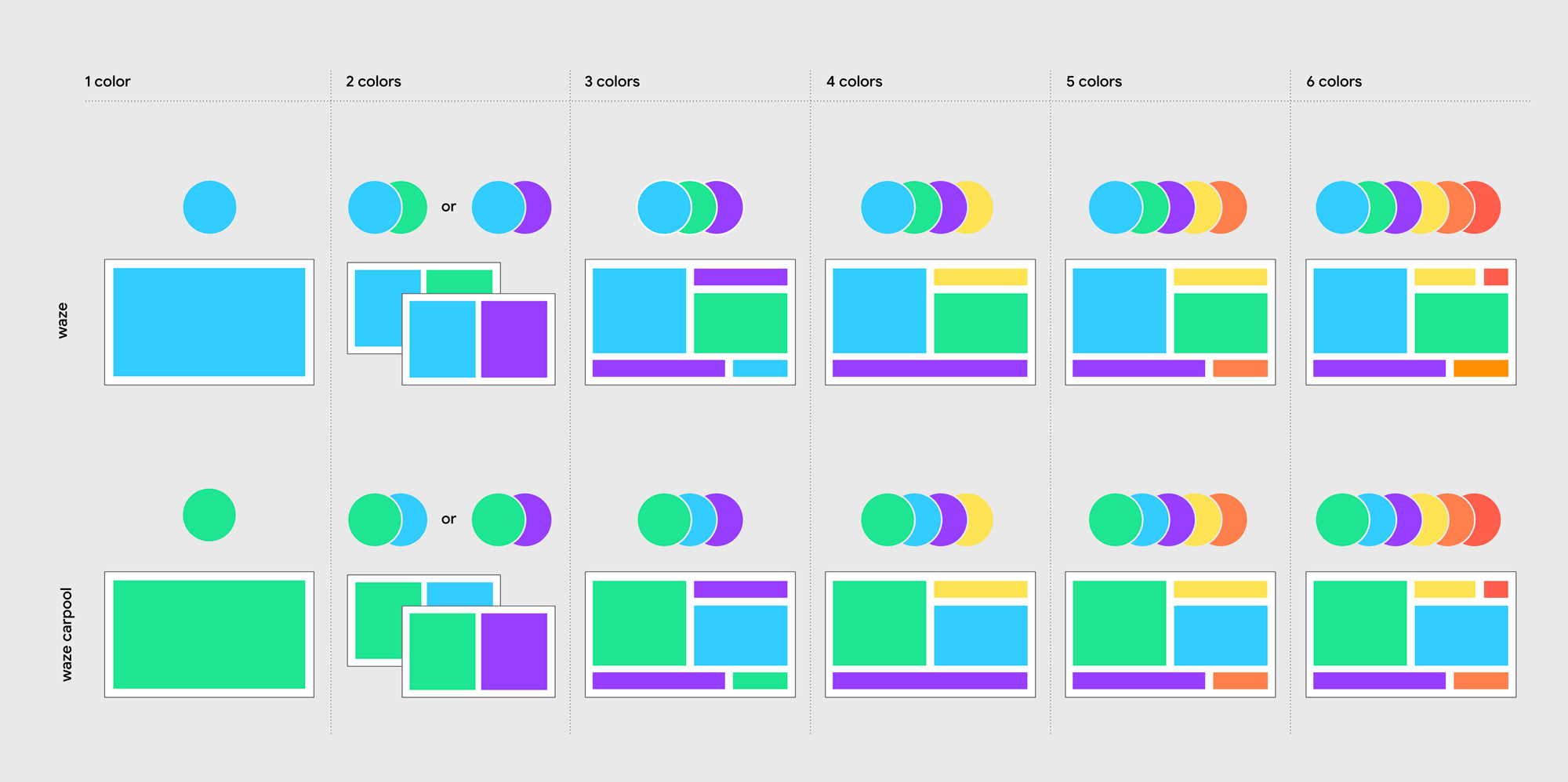
Like the logo, the new icons have gone through a subtle evolution but they are infinitely better. The simple shift of all of them now having black strokes makes them a more cohesive set and they now look much better integrated with the Wazer icon.
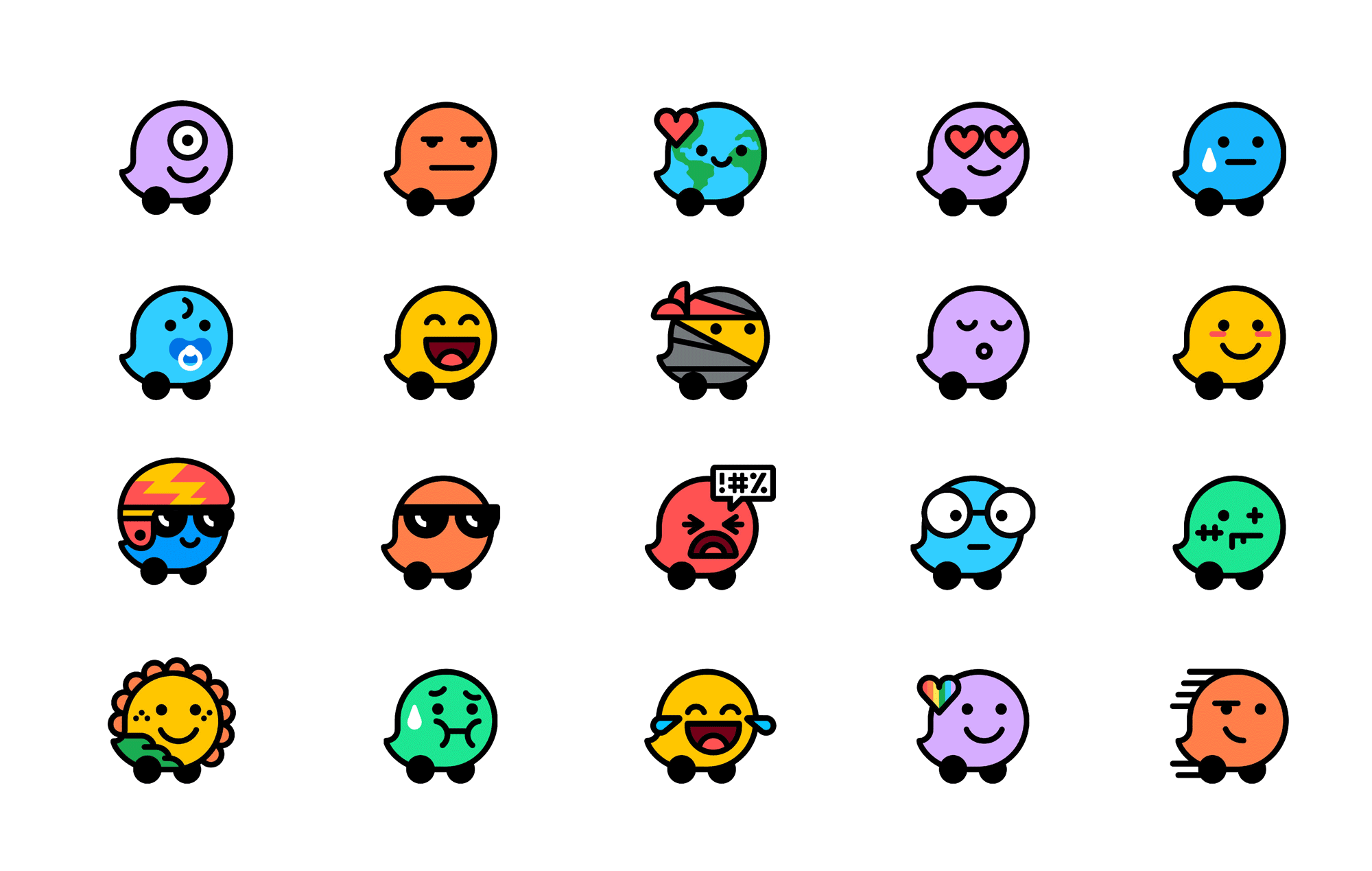
Drivers see each other on the Waze map as Moods, the avatars they use to express whatever they’re feeling—from clear-sailing bliss to gridlocked frustration. Highlighting the humanity of the Waze community was a goal of the refresh, and an expanded set of 30 new Moods helps bring people to the forefront by focusing on the emotional experience of driving. The new Moods offer a broader range of emotions so users can more accurately share their current state of being, enabling them to better connect with and help other drivers. (The additional Moods were designed in collaboration with FIG.)
The new Moods are based on recognizable feelings or emotions expressed by a person or character, rather than on how they look. To capture as many feelings as possible, Waze conducted research with 13,000 drivers to find out how they described their daily commute. This helped guide and define the range of unique emotions for the new Moods, which capture feelings like Happy, Adventurous and Zombified with more clarity and humor than ever. The family of Moods is infinitely expandable, and extends to custom Moods for partnerships with other brands and celebrities.
Pentagram project page
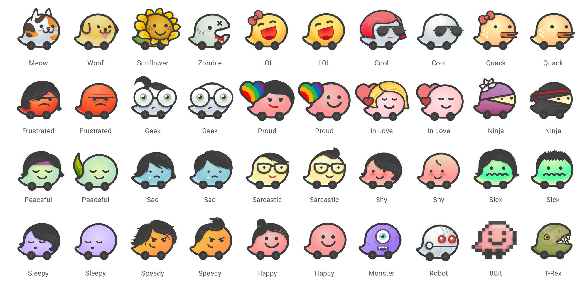
I’m sure many users (and possibly many BN readers) will find the old moods better and I do think there is something engaging about them but I very much prefer the new, simplified moods, in part because they remind me of the Mr. Men book series.
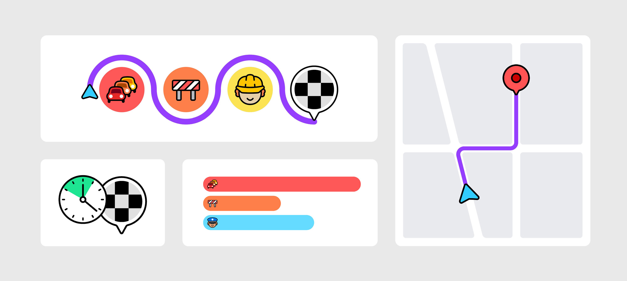
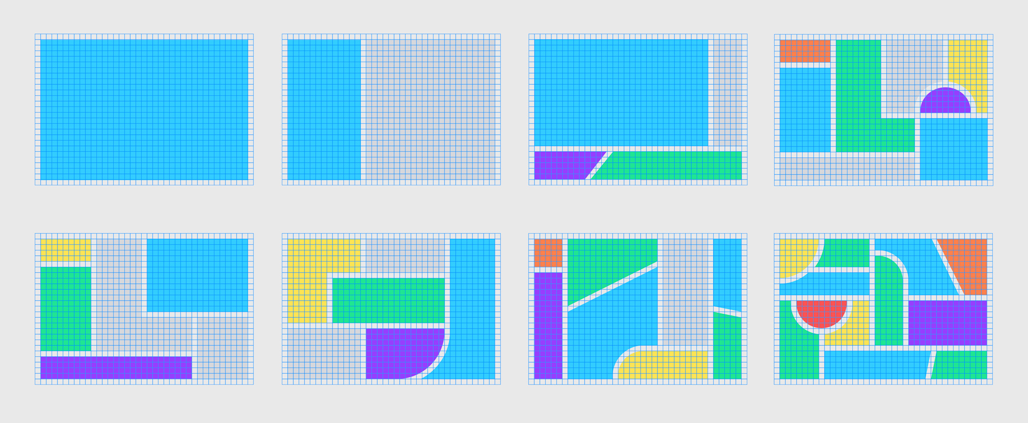
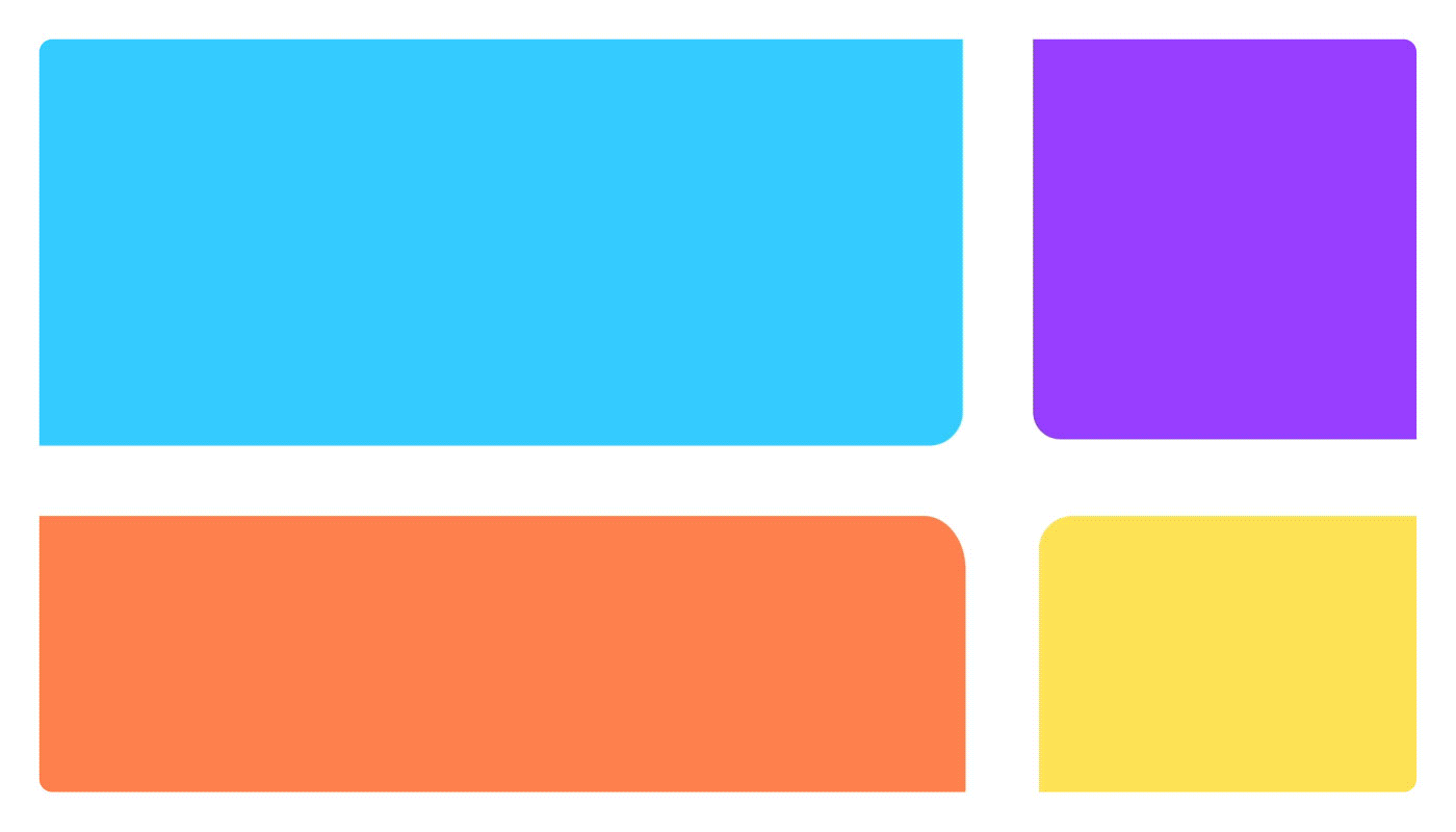
An underlying framework based on a geometric grid provides a strong but flexible foundation for the brand as it moves forward. The system builds on the minimalist Waze interface, which uses flat color and clean lines. Along with the logo and Wazer symbol, the program updates core visual elements including the Moods for users’ driver avatars, speech bubbles and product icons, which have all been carefully redrawn based on the same grid. The system ensures consistency across a range of assets, from infographics to social posts to email templates.
This grid comes to life in the new Block by Block visual language inspired by the modular design of the streetscape. The system organizes information into colorful “block-scapes”—from simple, elegant layouts to hectic, city-like structures—that create an instantly recognizable world of Waze across a multitude of contexts, from the app to social media and the Waze website. The blocks are a simple way of bringing the road and map to life in a cohesive way, with an infinitely flexible array of shapes that reflect the variety of the brand but always read as Waze.
Pentagram project page
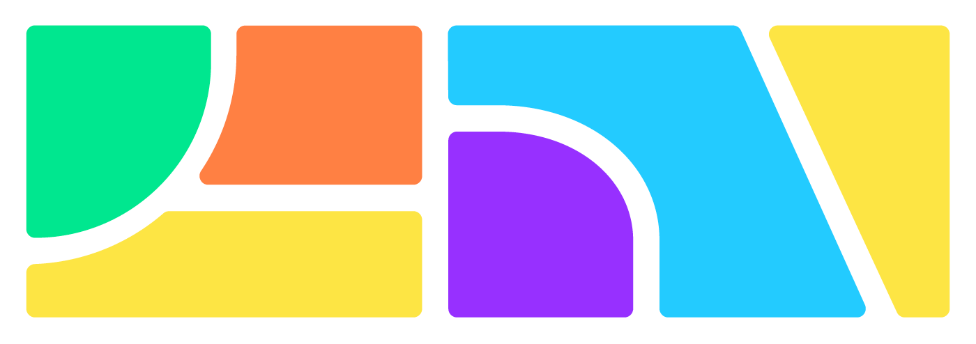
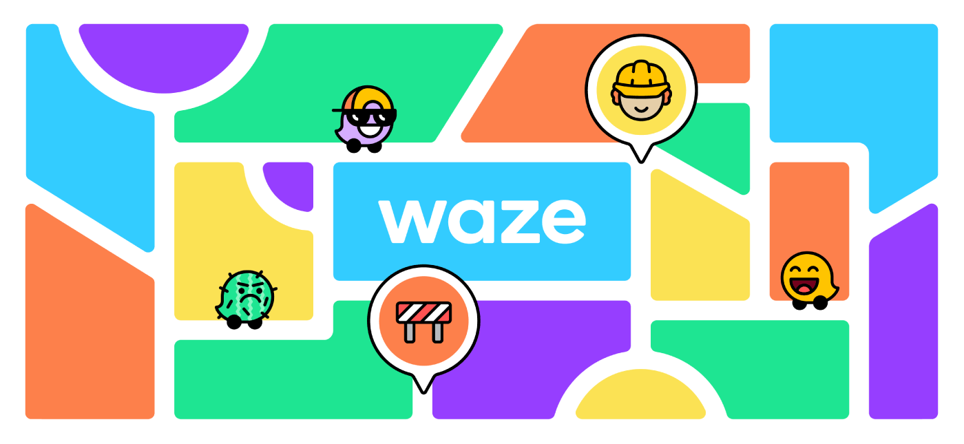
Another fun improvement in the identity is the addition of the colorful city block backgrounds that take the ubiquitous map grids and transform them into something playful and relevant for Waze to use as a key identifying element for its communications.
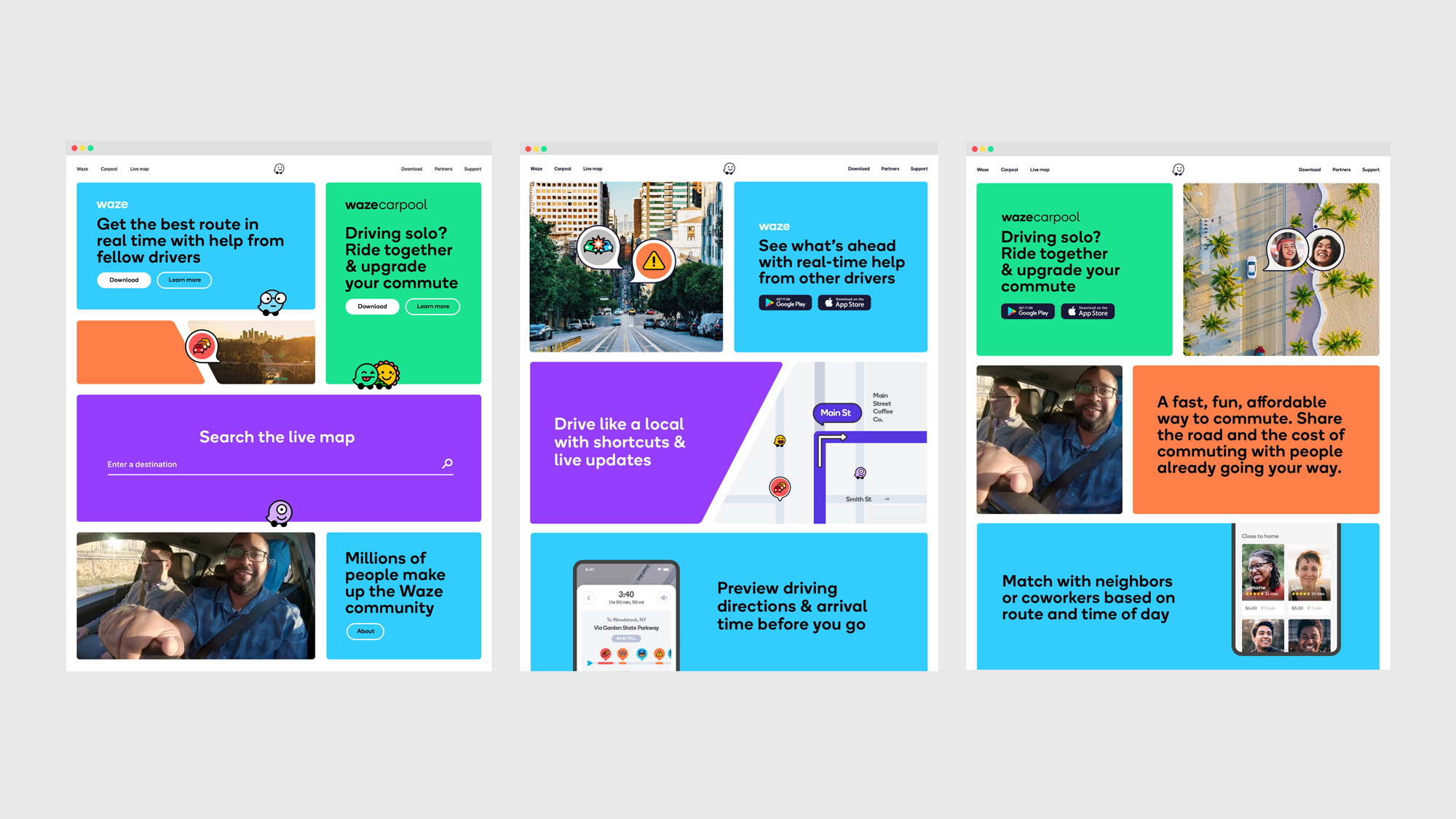
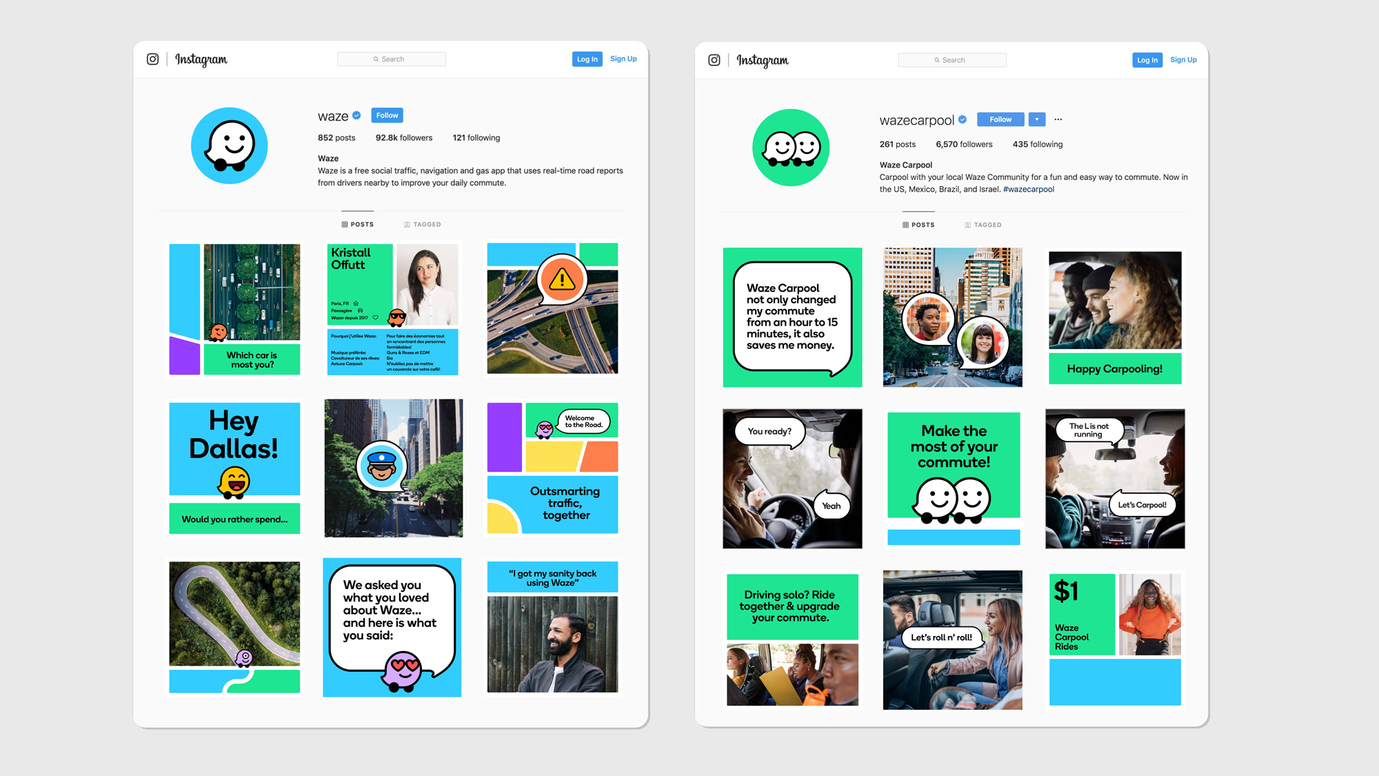
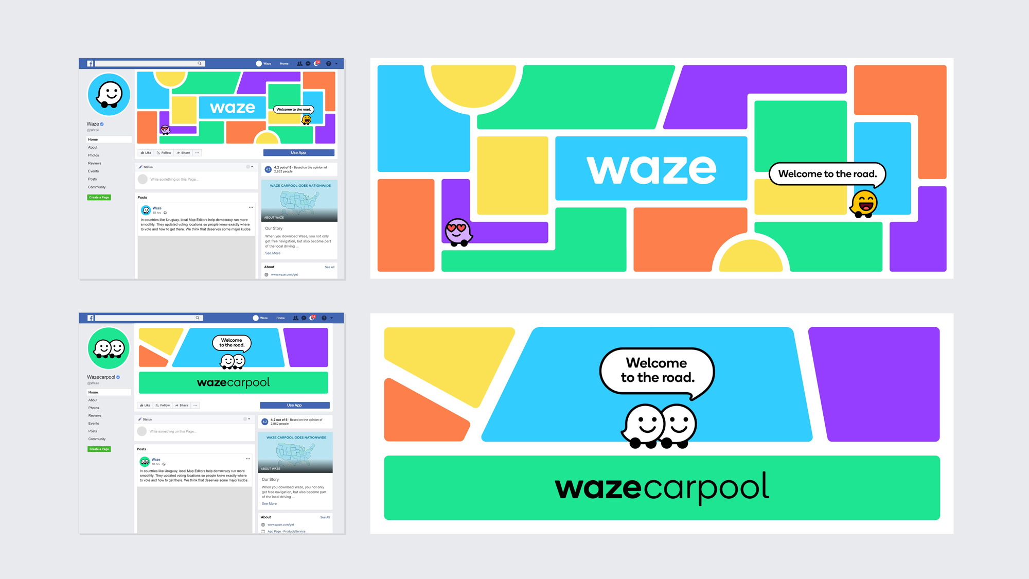
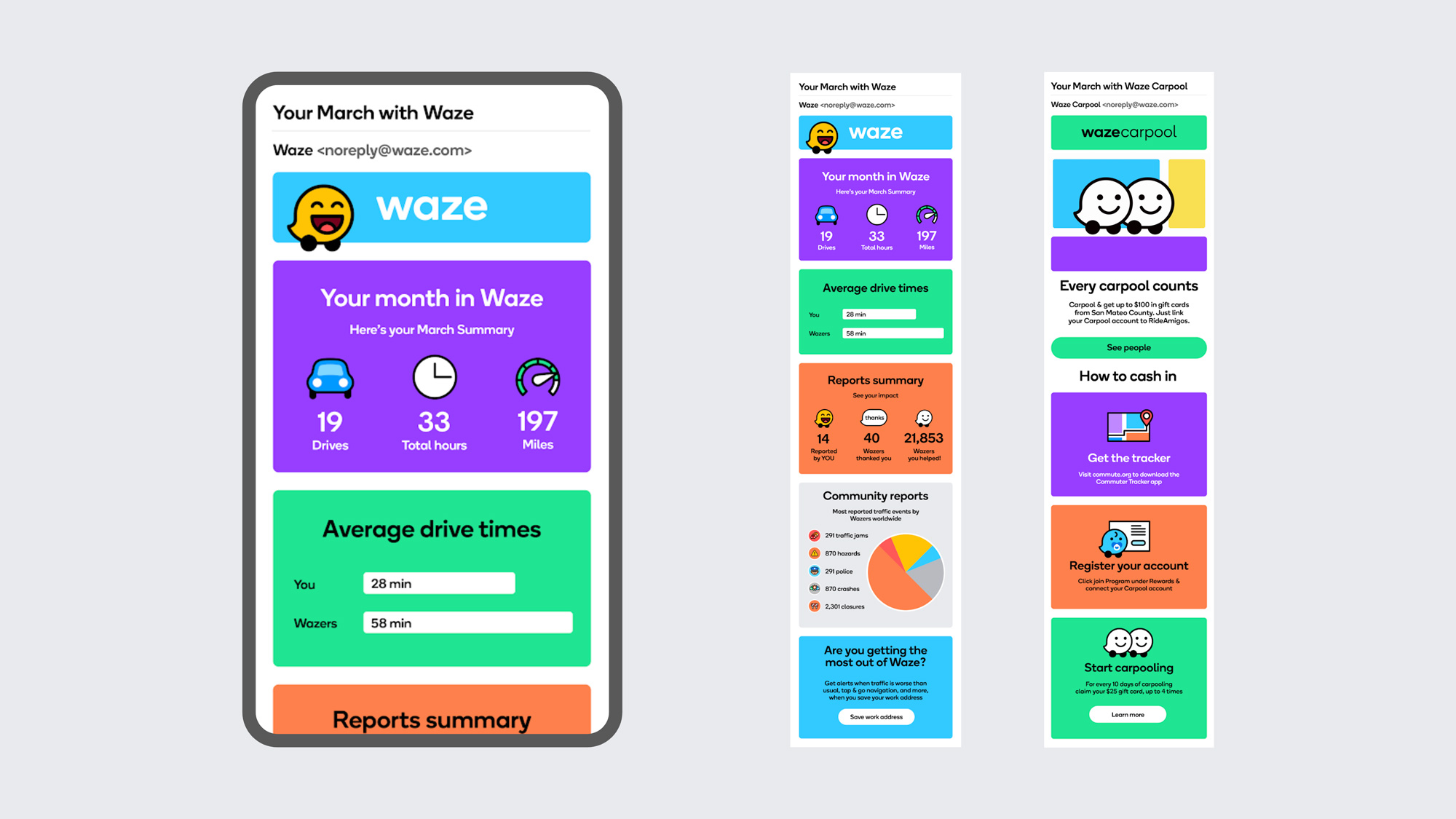
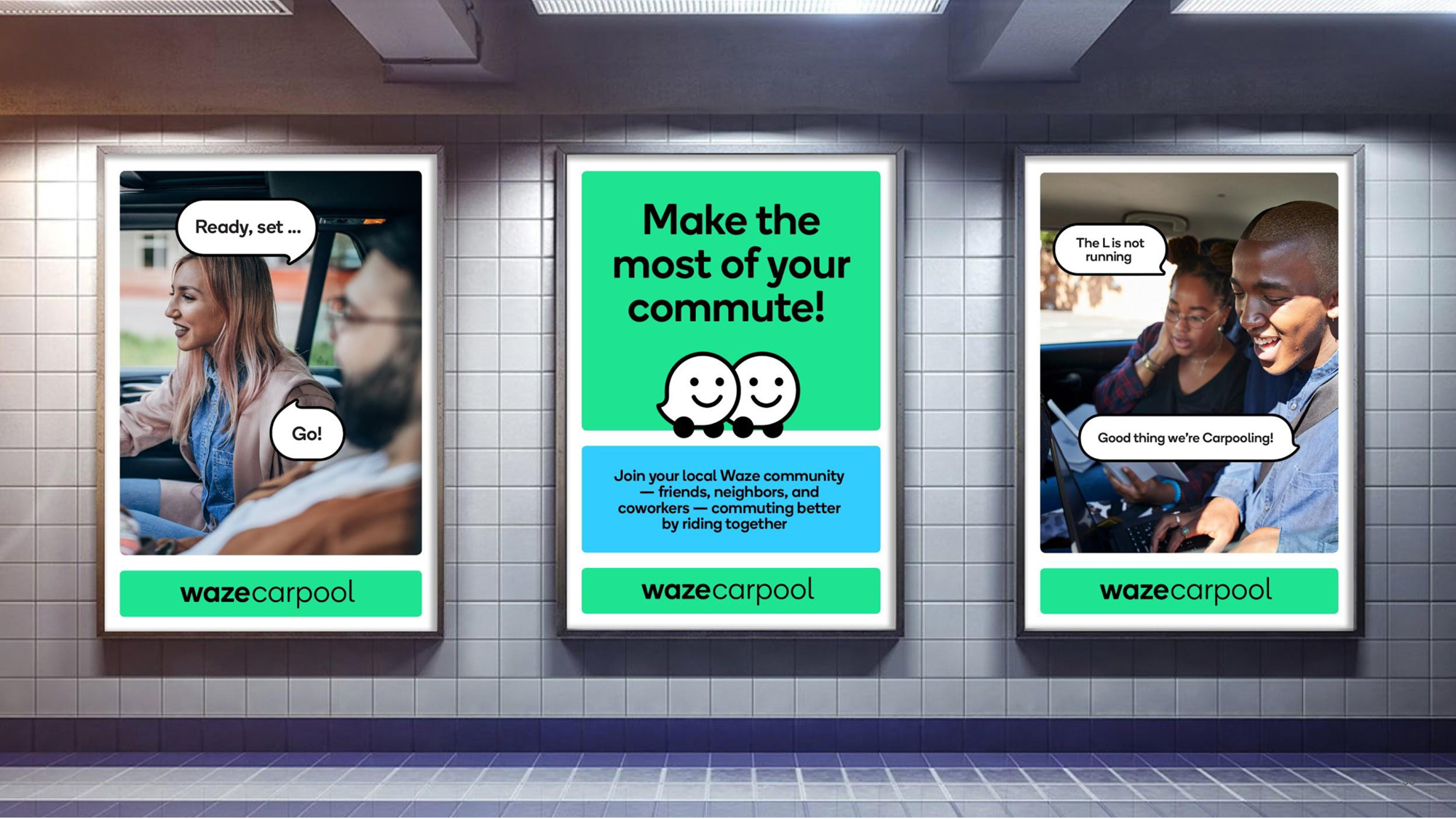
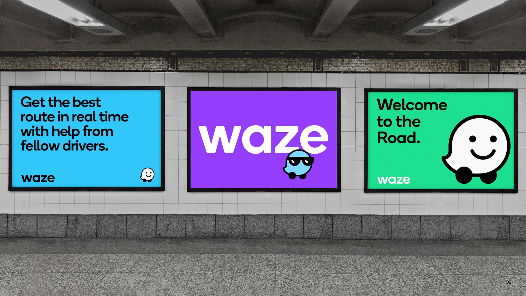
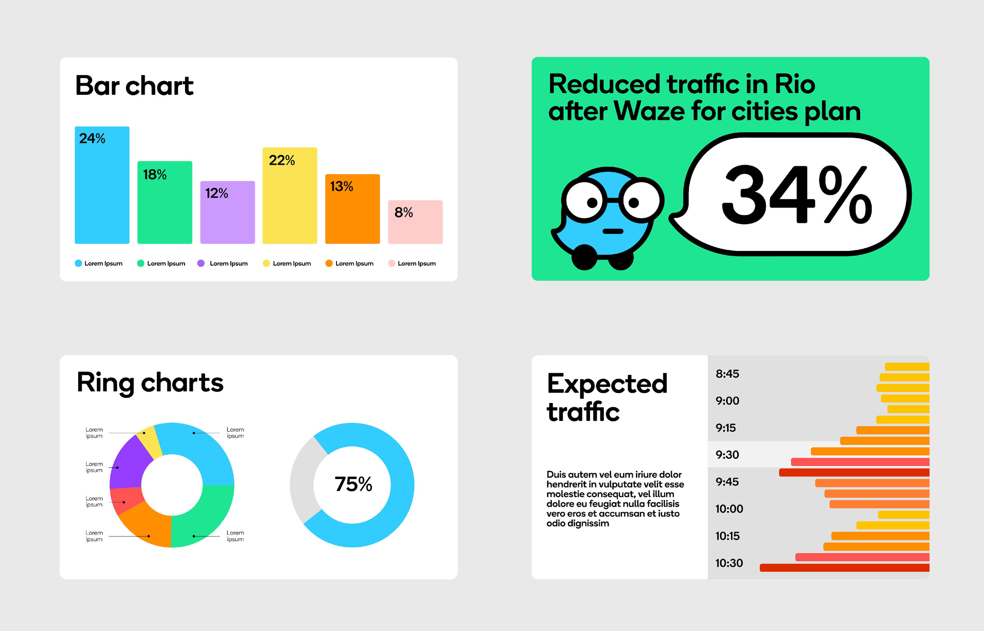
The applications are not super exciting but they are consistent, colorful, and have a common visual purpose — now jumping from the website to Instagram to Facebook to receiving their emails looks like a properly unified experience (whereas if you look at the previous posts on their Facebook or Instagram in relation to their old website, it’s a little all over the place). One complaint is that I do hope the copywriting on the speech bubbles (as seen in the ads above) is placeholder because those are painful. Overall, this is a great evolution that keeps Waze’s playfulness and gamification vibe alive but all done in a much more refined and attractive way.
Thanks to Leoberto J. P. Junior for the tip.

Comments