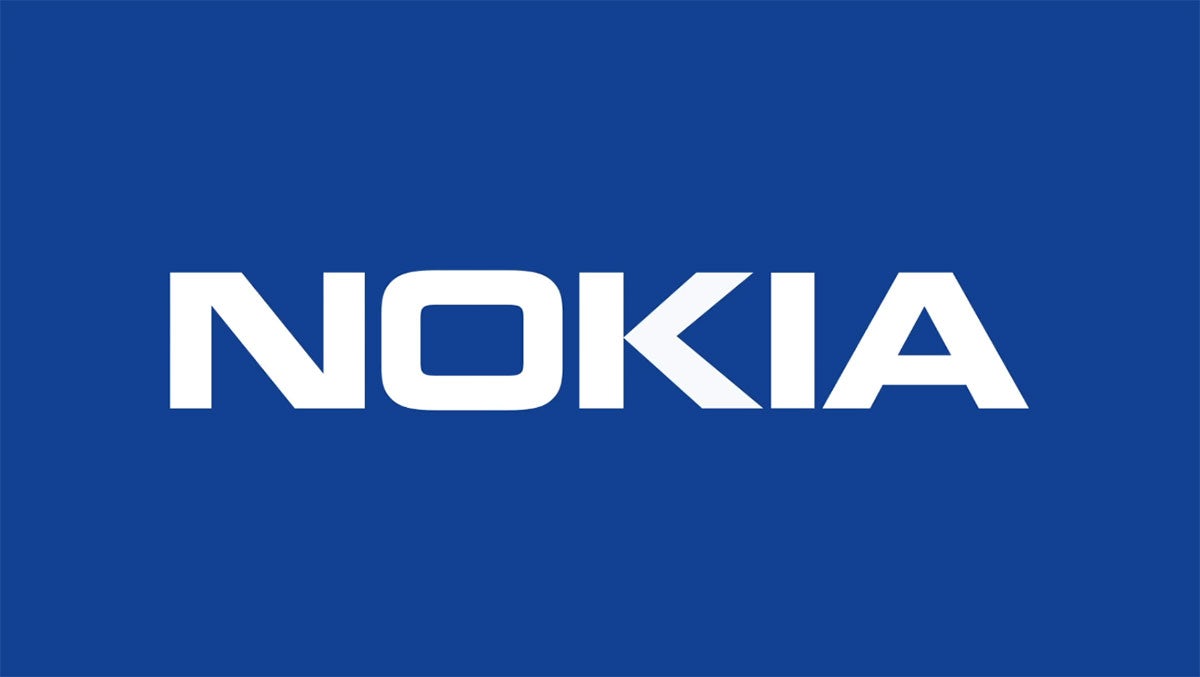
Nokia launches new logo to reflect change in direction
The new identity aims to simplify the logo to create a more dynamic approach to the brand, and to signify a shift in strategy and focus

For the first time in 60 years, Nokia has launched a new brand identity including an updated logo. The change is to help shift perceptions of Nokia from a mobile phone company – which is how it is still seen by many – to a B2B innovation and tech company.
Revealed at the Mobile World Congress Barcelona, the new logo has waved goodbye to the classic Nokia typeface and replaced it with a more geometric and abstract approach. This simplification aims to strike “the right degree of visual evolution so the iconic logo is still instantly recognisable”. But the result is that the individual letters of Nokia have been stripped and chopped so much it’s more a distant echo of the previous logo.


Lippincott, who has worked on the rebrand, and collaborated with Nokia for the last 15 years, says this has been done so that the letters of the logo “only read as ‘Nokia’ when they [appear] together”. Beyond this, the logo’s N, O and K letterforms have been repurposed as bold graphics to use across all content, so every communication from the brand is “distinctively Nokia”.
Accompanied by a bright, gradient-heavy colour palette and imagery, Nokia has also adjusted its brand purpose, which now reads as: “At Nokia, we create technology that helps the world act together.”
In a company blog post about the announcement, Pekka Lundmark, president of Nokia says: “Our new visual identity captures Nokia as we are today, with renewed energy and commitment as pioneers of digital transformation. We built on the heritage of the previous logo, but made it feel more contemporary and digital, to reflect our current identity.”

This stripped back approach is nothing new of course, and instead is a trend that typically occurs when heritage or established brands (especially in the tech, comms or the automobile space) want to head into a seemingly more contemporary direction.
Early online commentators have likened the change to Kia’s confusing “signature-inspired” rebrand from 2021, with some saying it’s “put the Kia in Nokia”. Others have questioned its legibility during a time where brand recognition and accessibility should be paramount.
For those still wistful for the old logo, the mobile phones division of Nokia has been owned by HMD Global since 2017, and the company owns the rights to use the Nokia branding for its own phones. It’s unclear whether this new logo will be used by HMD yet, therefore there could be two Nokia logos floating around the ether for the time being.


