before
after
Reviewed Jul. 16, 2020 by Armin
Industry / Automobile
Established in 1933, Nissan is a Japanese, multinational automobile manufacturer headquartered in Nishi-ku, Yokohama, Japan, with operations in 112 markets globally, making it the sixth biggest automobile manufacturer in the world and, at least in 2018, it was the largest electric vehicle (EV) manufacturer with its Nissan Leaf leading the way. Yesterday, Nissan made the global debut of its all-electric crossover SUV, the Ariya. This debut is presented as a milestone and turning point for the company as it “opens a new chapter for the Nissan brand” and with it, introduced — despite some previous appearances since March of this year when it was filed for trademark — a new logo designed in-house.
While keeping this essence alive, Nissan’s new “calling card” reflects the significant changes in society over the last two decades. It is a reimagination of the iconic Nissan brand logo for a new chapter.
Nissan’s new logo comes alive as it pivots to the future while staying proudly connected to its rich heritage, and tradition of innovation. The company name remains at the center of the logo, communicating an instantly recognizable brand that evokes past milestones and memories while also conveying evolution.
Nissan stories
The team needed to consider several variables, including an early decision for the logo to be illuminated on upcoming all-electric models. This presented technical challenges, such as gauging the thickness of the logo’s outline to ensure a crisp impression when lit, and of course compliance with government regulations for illuminated elements on cars. The logo also needed to make a strong impression when not illuminated, such as when it appeared digitally or on paper.
No matter the medium, this new logo needed to unequivocally stand for Nissan, and do so with impact.
The overall effect of the redesign is a transition from a hard-edged, industrial feel to a refined, familiar and digital-friendly look. It signals the evolution of Nissan as not only a traditional vehicle manufacturer to a provider of mobility and services.
Nissan stories
The old logo — full disclaimer that I am not sure if I have the official “before” logo because there are dozens of different renderings of the same thing — wasn’t special in the same way as the VW or BMW logos are (or were)… it just existed within the realm of badge-like car logos. I mean, sure, it’s somewhat recognizable — I would argue it has more to do with the name than the logo — and that’s what the new logo is betting on, that you recognize the old logo enough to realize that the new logo represents the highlights of the full shield and if that doesn’t work, then seeing the logo in situ, on the car (as below), the general shape of the previous shield remains but, the parts that light up, that is the new logo. In the context of the car, with the shield around it, I find the logo quite great but when the lit parts exist on their own I find the logo quite weak and awkward.
I’ll grant that the sense of airiness achieved in the new logo is welcome, especially in contrast to the more typical bigboldchrome logos — which seem to be going away — and that the liberated wordmark looks pretty good but the half circles with the spurs shooting off to the sides are somehow off-putting to me. I’ll also admit that the more I stare at the logo the less faults I find with it… it’s technically well done… so it may just be a personal thing where I can’t really get on board with the end result.
Like, whoah. I have NO IDEA where these came from. I mean, in terms of computing power and graphic prowess, yeah, they are cool but nothing there seems relevant to Nissan.
The video above makes me question my initial opinion — the logo works quite well here, appearing from thin air and resolving into a monochrome version with soft shadows. There is something very nice going on here and the subtlety of this animation almost makes up for the lack of subtlety in the animations above it.
Making me reconsider things again is how well the static logo is supported by the experience of the logo on the car and that’s probably why I would have loved to see the shield remain as part of the logo, perhaps as a tone-on-tone approach that makes it a subtle element while allowing the lit parts to be the hero. Below are just a ton of photos of the lit logo in different parts of the car.
I also wanted to touch upon the Ariya logo because it establishes a worrisome precedent for logos of new Nissan models that they must include wide spurs on the sides to echo those of the rings in the new logo. And I say worrisome because look at the above, they look quite terrible and out of place.
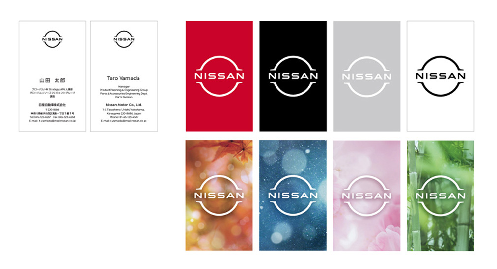
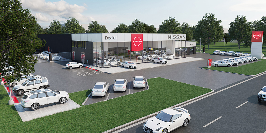
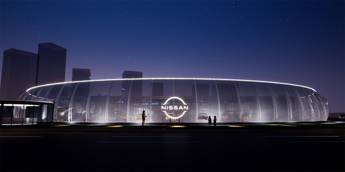
More worrisome, though, are these business cards. Even if they are just pre-pre-renders of the pre-mock-up in round one, these look so cheap and, like the animations, completely out of place for Nissan. I will give them the benefit of the doubt that these are just initial concepts and that they will get better because those are sad. Not much else in application other than the two renders below, which are not exciting but not as appalling as the business cards.
Overall, while I’m not a fan of the new logo, I do appreciate how it lives on the car, its newfound simplicity, and how effectively it signals a new era for Nissan.
Thanks to Daniel Bray for the tip.

Comments