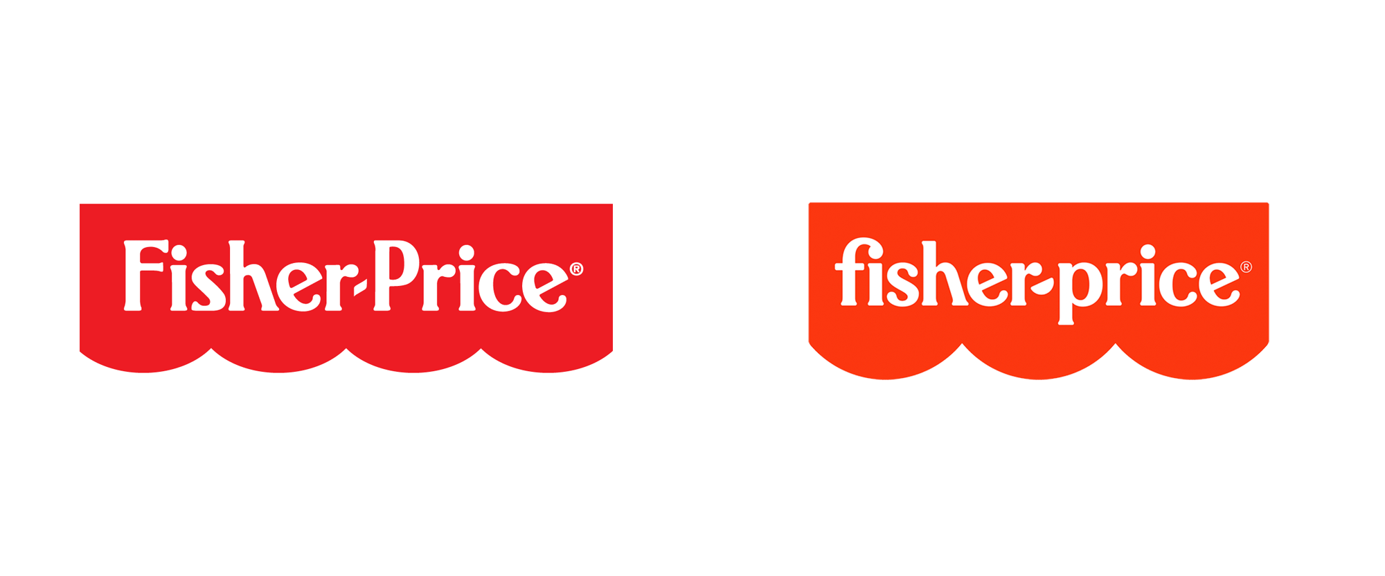
before
after
Reviewed Jan. 7, 2020 by Armin
Industry / Consumer products
Established in 1930 by Herman Fisher, Irving Price, Margaret Evans Price, and Helen Schelle, Fisher-Price is a brand of educational toys for children and infants. Headquartered in East Aurora, NY, the company has produced — among more than 5,000 different toys over the decades — classics like the Corn Popper, the Chatter Phone, and the endless barrage of Little People. If you have kids or were a kid (which you were) you have most likely gleefully played with (or had to endure) a Fisher-Price toy. Owned by Mattel since 1993, Fisher-Price remains a staple in kids toys and at the end of last year introduced a new identity designed by New York, NY-based Pentagram partner Emily Oberman.
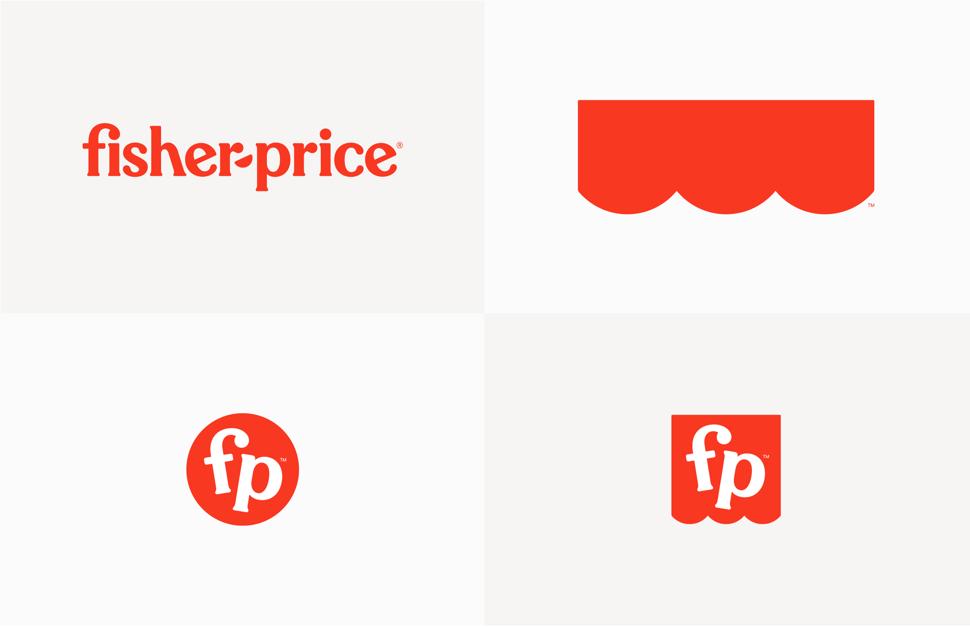
The refreshed identity centers on the bright red “awning,” the iconic mark with scalloped edges that holds the company name. The updated logo simplifies the awning to three semicircles (from the previous logo’s four) and uses its clean, simple geometry as the basis for an expanded visual language. (Internally, the retooled awning also symbolizes the three founders of the company—Herman Fisher, Irving Price and Helen Schelle, as well as the intersection of parents plus kids.) The logotype has been redrawn in all lowercase, with letterforms that are slightly more refined than original but still quirky. The hyphen between the names is now a semicircle, echoing the scalloped edge as well as the smiles on the faces of the Little People.
Pentagram project page
The old logo was pretty good with its funky serif and a holding shape that has become quite iconic (as well as very useful in packaging, aligning neatly to the top of the products). The new logo evolves both elements with the typography getting a lovely and playful lowercase treatment that yields a great “fi” ligature. The one problem with going lowercase is that it’s now missing the uppercase “P” that helped fill some of that vast red space inside the awning, which, in its evolution, now has a lot more vertical space to fill having changed from four half-circles to three. I personally liked the four version better as it created a more balanced shape but I don’t have any major qualms with the three version. The smile replacing the hyphen is a nice touch too.
The primary logo is joined by two monograms, a circular “bubble” and an abbreviated version of the awning called the “flag tag,” both with a redrawn lowercase “FP.” In applications, the red awning can be extended to fit the tagline or other copy (a device the designers refer to as the “red carpet”). By itself, the awning can be used as a simple graphic icon that can be placed anywhere—attached to the typography of the tagline, hidden in promotional photography, or used in packaging and store displays—instantly flagging it as Fisher-Price.
Pentagram project page
The monogram is a solid and fun addition to the identity, keeping the exaggerated ball terminal of the “f”, which allows it to stack well with the angled “p” and I like how it can work inside either a circle or a squared version of the holding shape. I wonder if the monogram needed the hyphen in there as it’s such a key element of both the name and the brand. Still, I think with time it can become as easily associated with the brand as the full logo.
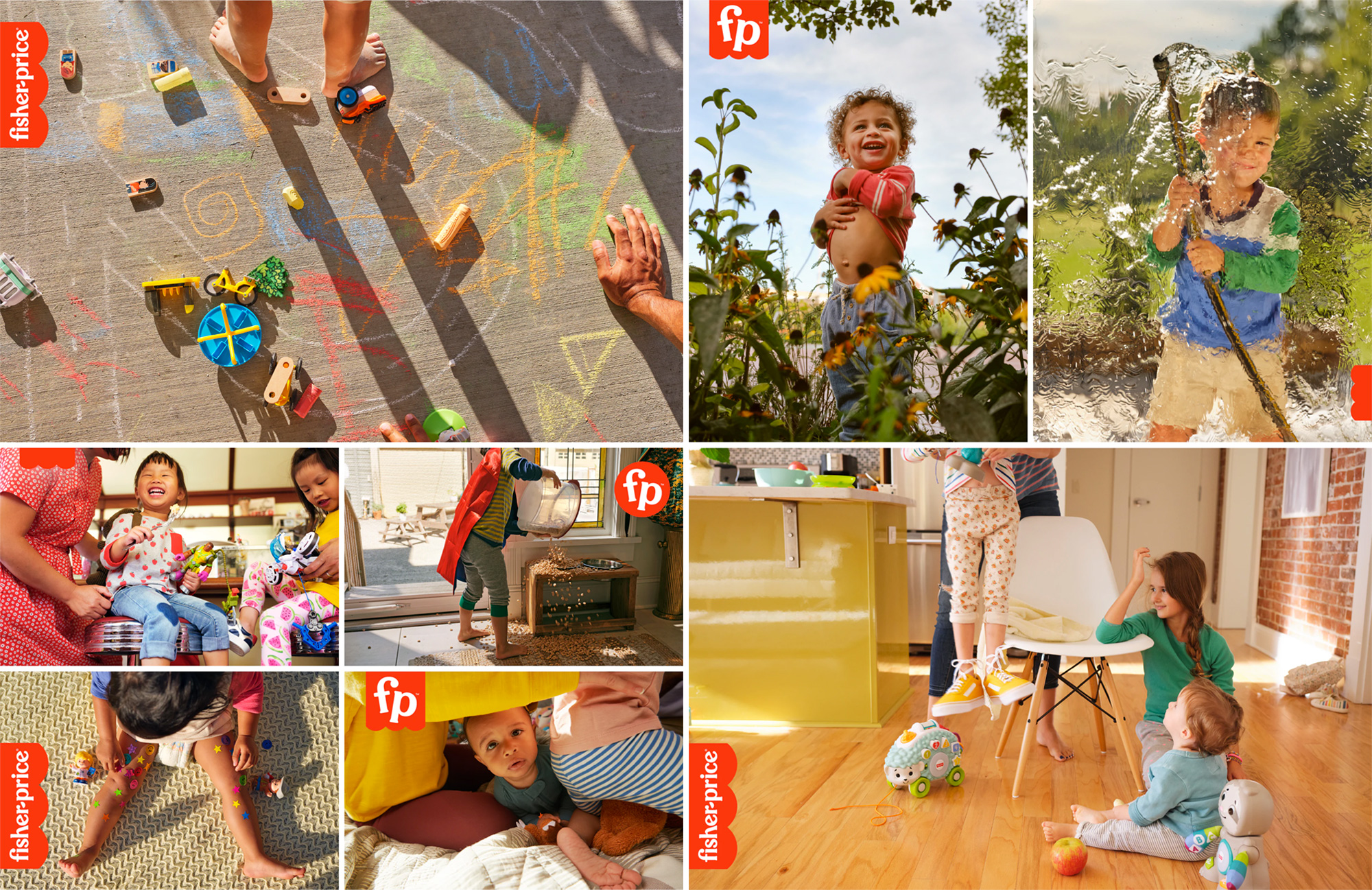
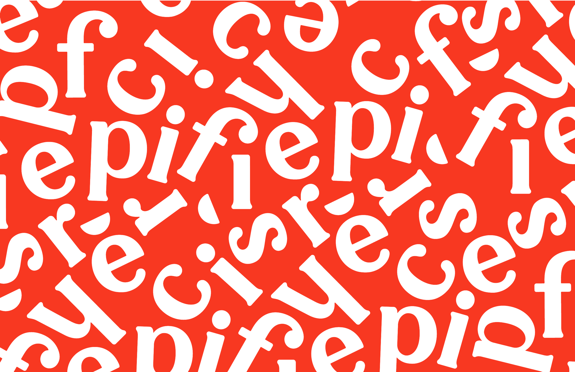
The Pentagram team researched early advertising and packaging in the company archives and saw the typeface Cheltenham was consistently used for everything, creating a smart, cheerful typographic tone of voice for the brand. The new wordmark influenced a full proprietary typeface called Let’s Be Glyphs, a semi sans serif that nods to Cheltenham and the letterforms of the original Fisher-Price logotype, and a playful alternate, Let’s Be Glyphs Bouncy, with rotated characters and an uneven baseline, both created with type designer Jeremy Mickel. Quotation marks and apostrophes appear as semicircles. Secondary type is set in the clean and modern sans serif Maax.
Pentagram project page
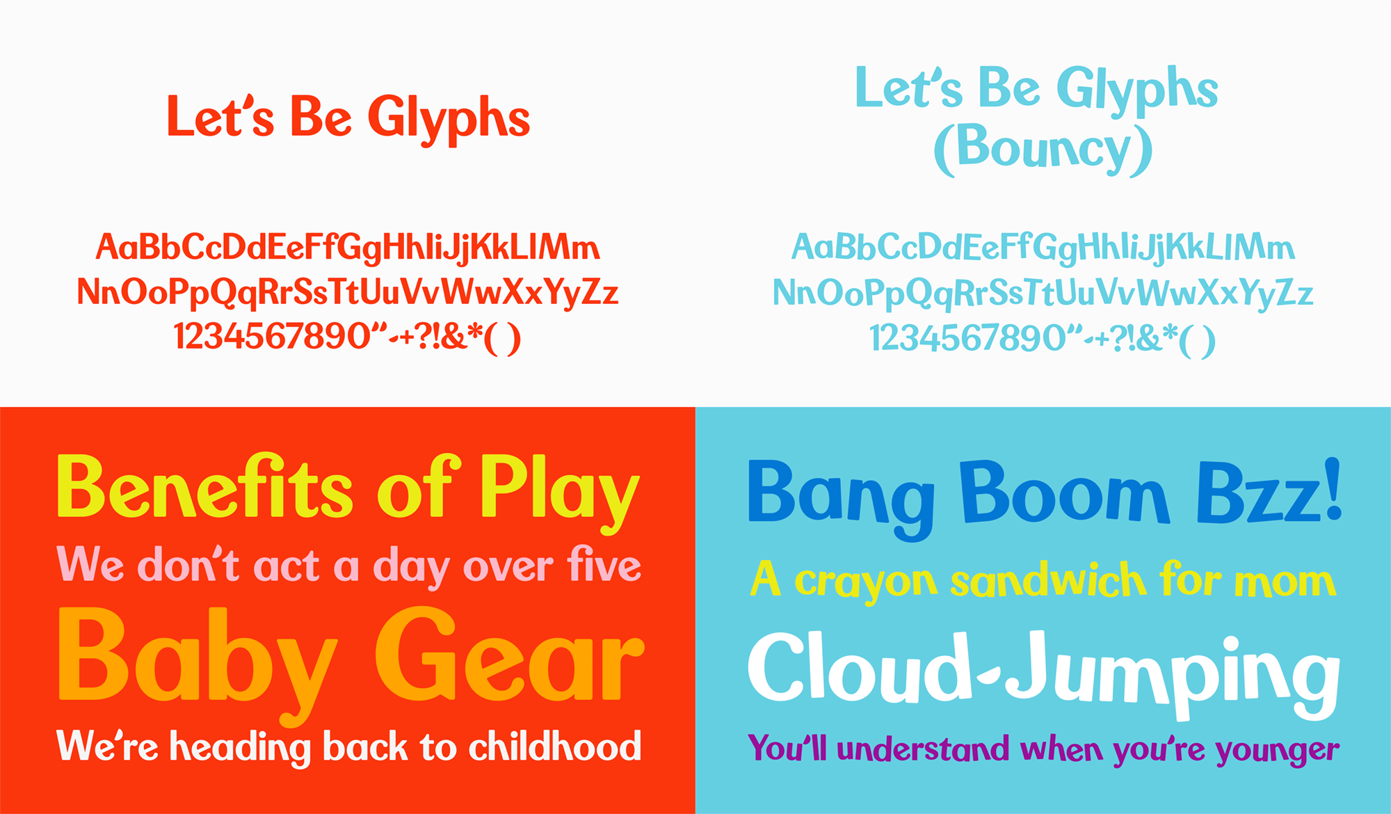
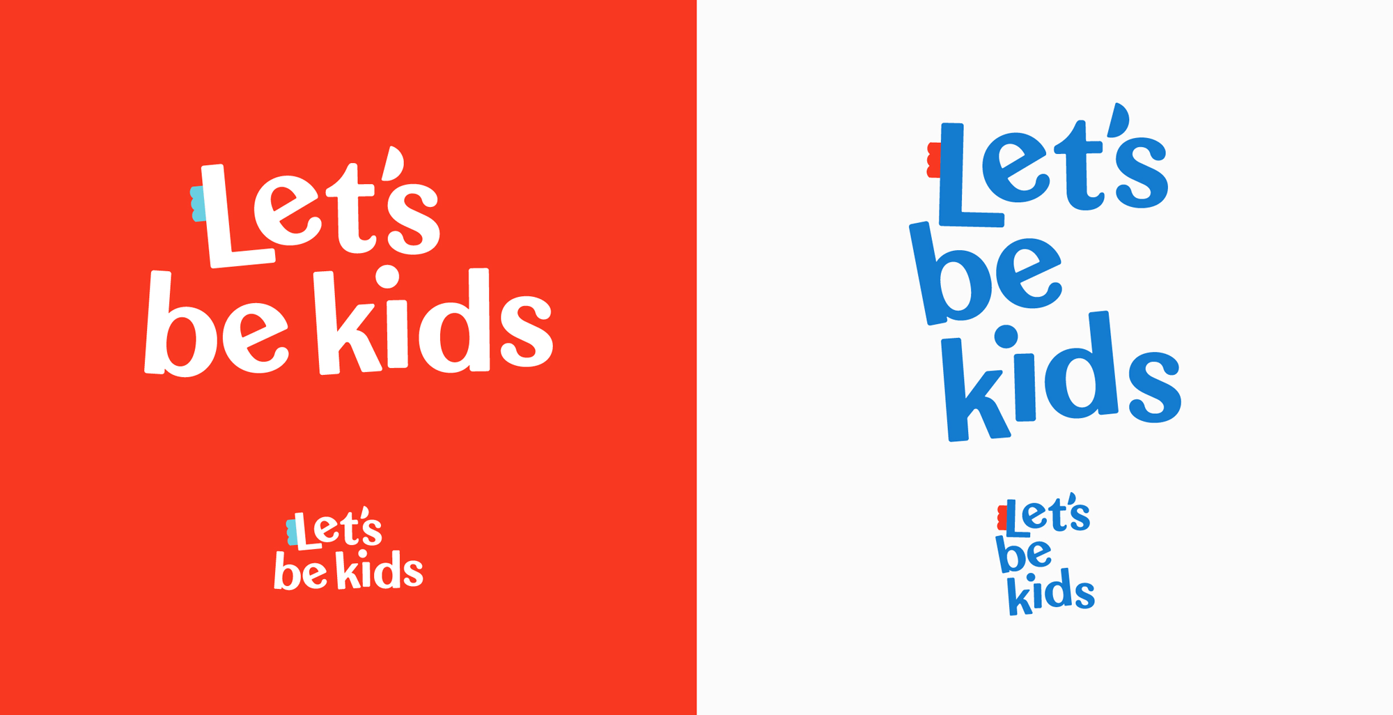
The custom type family, designed in collaboration with Jeremy Mickel is as excellent as we’ve come to expect from him, efficiently mixing a sense of old and new into this typeface. I’m not a huge fan of the bouncy version but I can see how it will be beneficial to the Fisher-Price team for adding some instant fun-ness to their communications.
The graphic elements can be combined into patterns and used to build “Play-moji,” emoji-like illustrations inspired by the Little People faces on toys. The age-appropriate approach transitions from cute illustrations for babies to more “grown up” use of patterns for older kids. The joyful look and feel is carried throughout the branding, including print and digital advertising and retail merchandising.
Pentagram project page
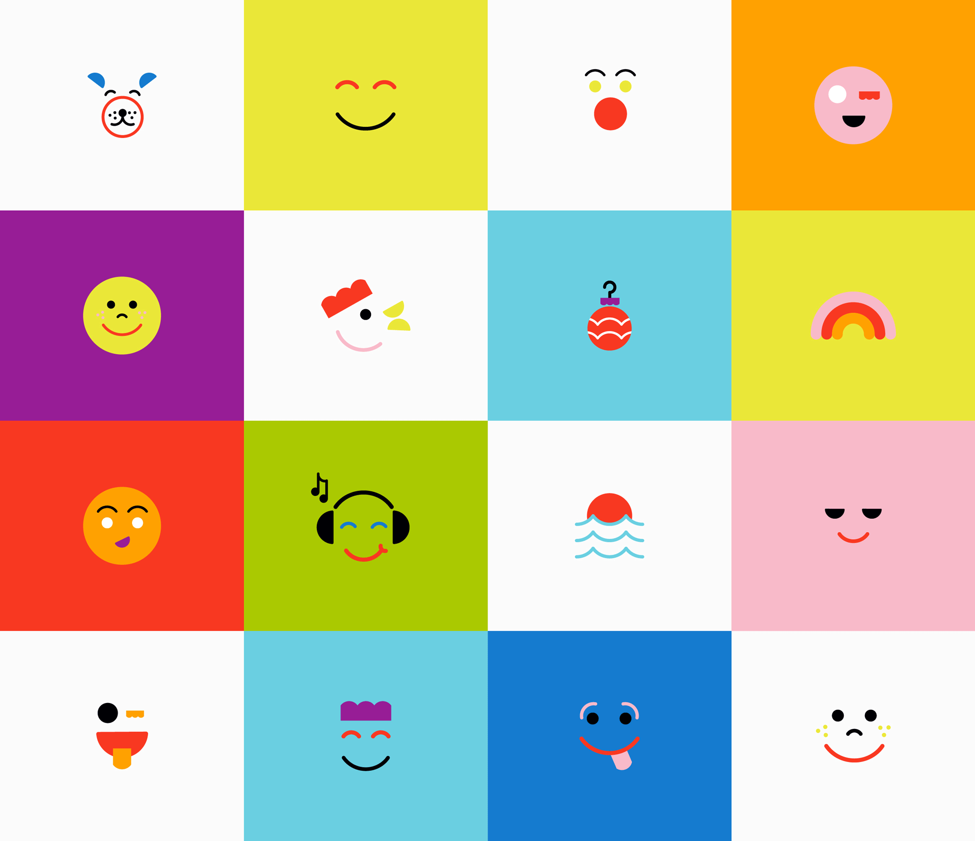
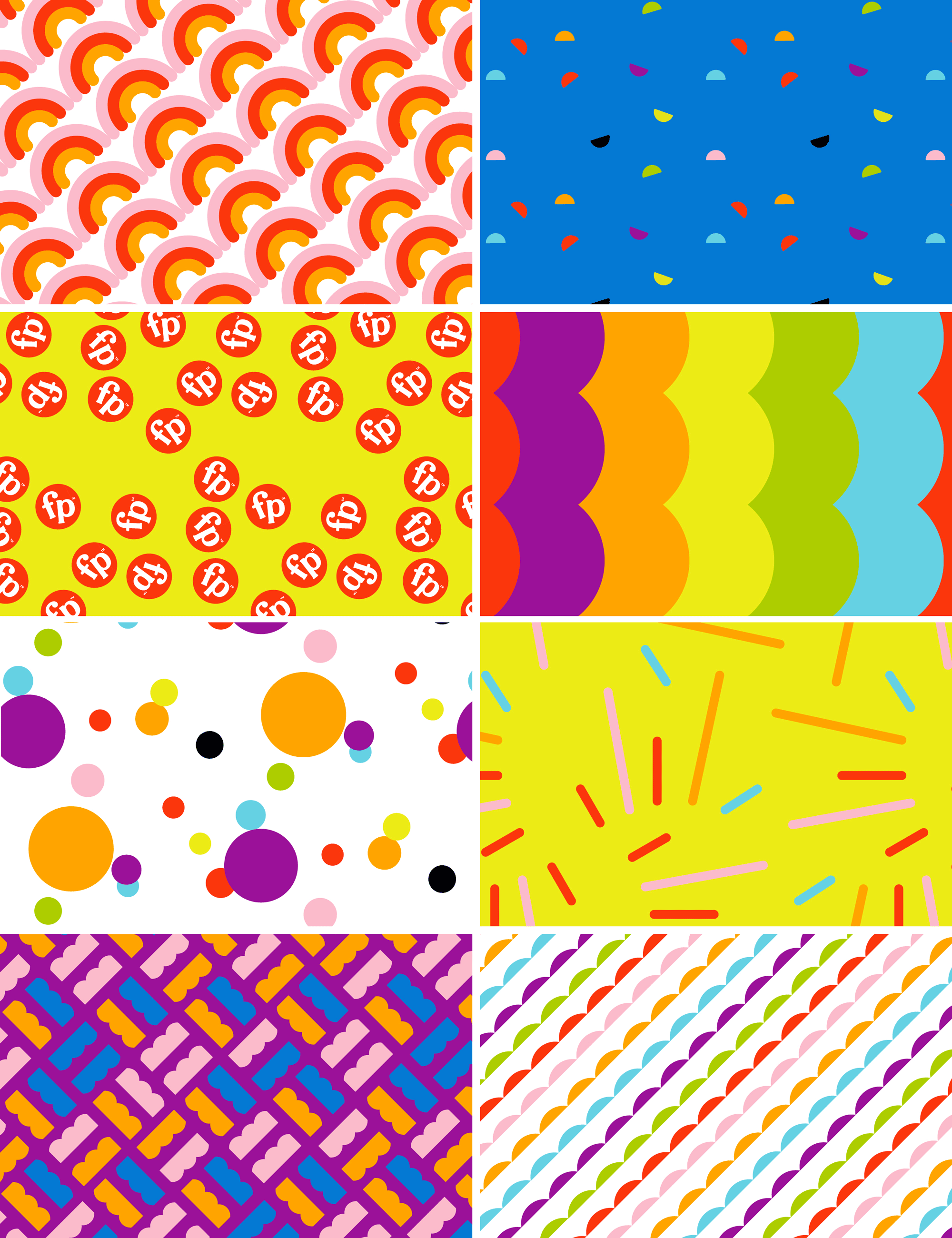
The illustrations and patterns have a great base in that they all stem from the shapes of the logo but there is something not quite there about them — I’m not sure if it’s the overabundance of color or that they are not fully cohesive as a set. This has room to expand and evolve so maybe when they are put to use, it will settle a bit.
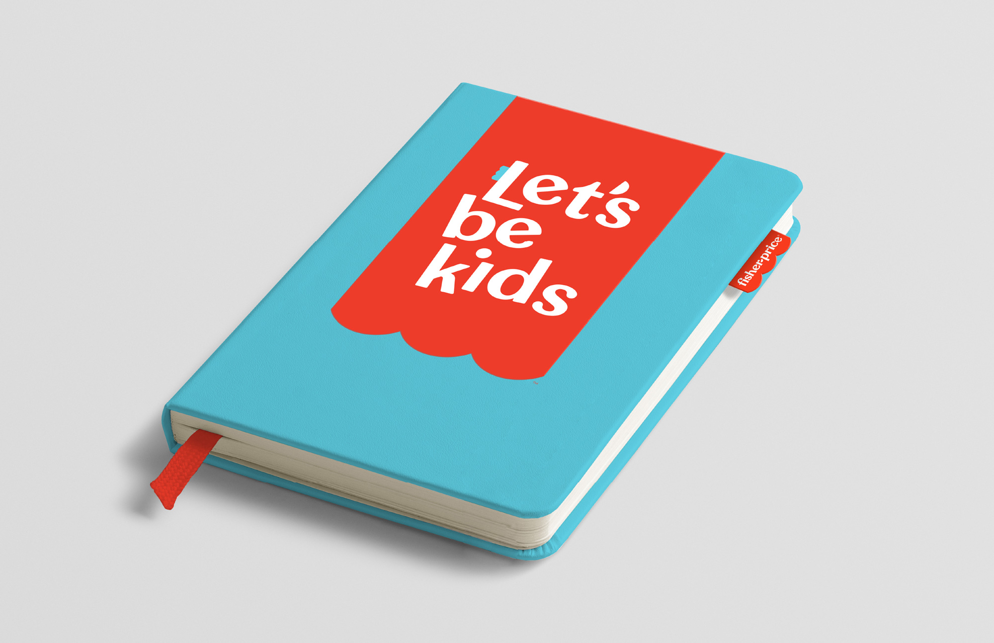
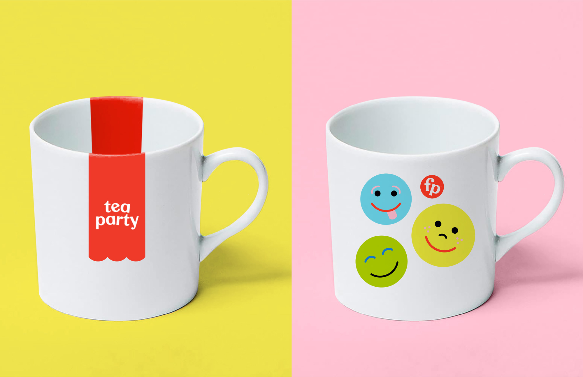


Not much in terms of application given that most of this will be implemented internally as new products are put into the market but the gist of it is that it’s fun, lively, and… effervescent. This isn’t a brand that needed a reinvention or a lot of graphic “muscle” since the toys themselves are what make up the core of the brand and this new identity efficiently supports that while breathing some fresh air into it as Fisher-Price continues its path into the century mark.
Thanks to Shane Richardson for the tip.









Comments