Why Uber Keeps Changing Its Branding
And 4 Lessons on Startup Branding.


Uber was founded in 2009. In 9 years, they have already changed their branding 5 times.
That’s a lot.
Of course, it’s not for the love of design. Branding changes, especially at scale, are expensive and time-consuming.
But if you look at these changes and why they were made, we can learn some valuable lessons.
Every stage of company growth requires a new identity and the faster you grow, the faster you need to redesign it.
Uber’s growth was fast.
A $65b valuation, in only 9 years, is unbelievable.
Here are 4 valuable lessons from Uber’s branding changes.
Lesson 1: When your first and second brandings don’t matter.
The first and second brandings usually have little value. They are not meant to stay.
This is Uber’s first logo. Back then, it was UberCab. Garrett Camp spent a few hours designing it on Photoshop.

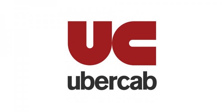
A simple U with a C (same shape as the U), did it.
Then a cease and desist letter from the city of San Francisco came in. It argued, among other things, that this logo led people to think they were a cab company.
The next day UberCab became just Uber.
Uber’s 2nd full-time engineer, again, spent a couple of hours on their second logo:

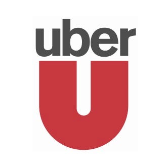
Not a major change right?
And that’s okay, because again, early on, branding doesn’t always matter.
There is, however, one exception to this rule.
The exception is when you have direct competitors with similar products.
If you have direct competitors with similar products there are 2 options:
- they either invested in their branding,
- or they didn’t.
In both cases, you have an imperative/incentive to invest early on in branding.
- If they did invest in their branding, then you need to invest as well. A great branding is now your industry standard.
- If they didn’t invest in branding and you believe your market would appreciate a better-branded product. Then, there is definitely a strong incentive to go for it from day one.
Uber launched in 2009, Lyft launched in 2012.
From day one Lyft invested in a strong differentiating branding:

They had an incentive to do so.
Lesson 2: Your third branding is an improvement but it may be too niche
Uber eventually decided to go for it and they came up with this:

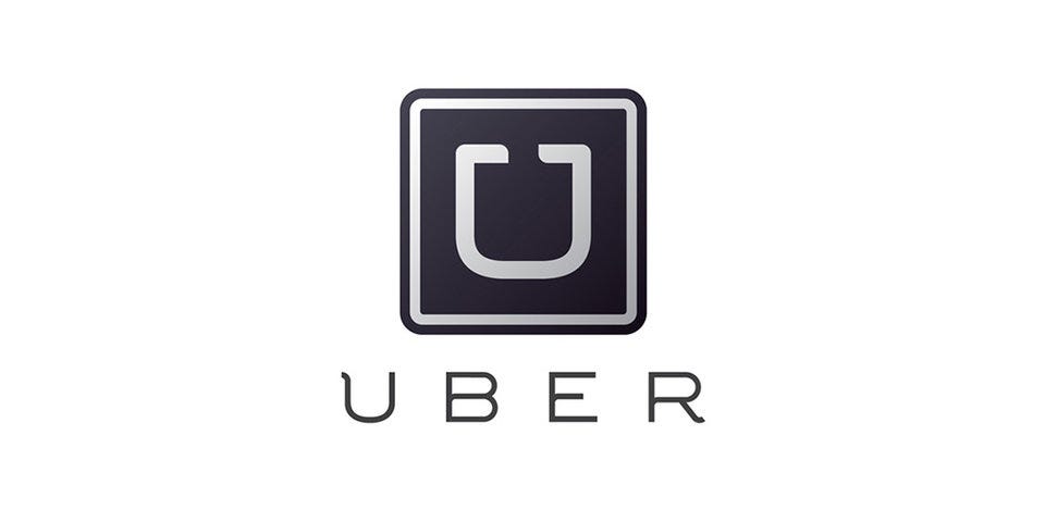
Guess when it was launched? 2012, the same year Lyft was launched.
This logo was how most of us discovered Uber. It marks their entry in the mass market.
Quality of service, luxury, modernity. This logo embodied what made Uber a superior product to the classic taxi experience.
This branding remained the longest. 4 years.
While emphasizing the key selling points of Uber and bringing them to the mass market, the branding was still too niche. It looked too professional, upscale, even intimidating. To get to the tip of that mass-market curve, they needed something more universal.
As you are moving away from early-adopters, things get trickier. You need to please more people without rubbing your first customers off. Your early adopters found you because you were different. You built the product for them. And it’s hard to get away from that.
Your first attempt at a mass-market branding will probably still be too niche.
Lesson 3: Your fourth branding is a mistake
At some point, you are going to screw up. It’s a fact. Some ideas will sound good but they won’t be.
With Uber getting into other product lines (food, goods), becoming more mass and international, their plan for world domination needed to show in their logo.
That’s how we ended up with the smushed eyeball.


This logo represented “bits (technology) and atoms (humanity)”.
“We exist in the place where bits and atoms come together. That is Uber. We are not just technology but technology that moves cities and their citizens.” Travis Kalanick
“Bits and atoms”… say what? What does that even mean?
Needless to say a lot of people didn’t get the joke.
Okay, the branding may have been friendlier than the previous one, solving the universality issue. The problem was that it didn’t speak to anyone.
On top of that, Uber changed its brand colors for each country, breaking the key rule of brand consistency.
The change was radical, bold, extreme but unnecessary.
Brand consistency was not the only broken rule. A much simpler one was broken as well: telling a story. Being universal is good. Being relatable is better. Again, branding is not an exact science. Know that you won’t get it right every time and it’s ok.
Lesson 4: Your fifth branding is here to stay
More than being misunderstood, Uber’s last branding crystallized all the negativity from recent scandals: “systemic degrading of women, wage gaps, harassment, misogyny, career sabotage, sexual assault, boycotts, and its bro-enabling, gas-lighting leadership”.
With Travis Kalanick leaving, it was time for some change:


At a $65b valuation, Uber is preparing for IPO. They need to get that universality right. And it seems like they did.
At this stage, most of the company’s brand awareness is in the name itself: U.B.E.R and the letter U. This latest logo takes that into account.
This latest change seems to be finally putting an end to the series.
Was a change of leadership needed to finally get to this point?
Maybe.
What’s fascinating is how you can read a company’s history through the evolution of their branding.
There is always an exploration phase that seems to last forever.And then finally, it clicks.
Hope you liked reading this story. If you did, leave us some claps and follow me on Medium for more pieces like this.