before
after
Reviewed Nov. 20, 2019 by Armin
Industry / Entertainment
Most of the introduction I wrote for this back in 2014 still applies, which is commendable given that pretty much every cable channel in America has pivoted to doing shows about ghosts: Launched in 1994 and owned and operated by AMC Networks, IFC (Independent Film Channel) is a television channel with a mix of kooky, serious, and pop-culture-y programming. From original comedy series like Portlandia and MARONDocumentary Now! to [new] “classic” movies like Scarface and Napoleon DynamiteTaken and The Big Lebowski, IFC is one of the most entertaining and least pandering channels available. Late last year — which is way beyond my timeliness comfort zone for posting a redesign (but this is worth it and the case study was only recently put together) — IFC introduced a new identity and on-air look designed by New York, NY-based Gretel.
As IFC had expanded and evolved their programming slate, they felt a need to open up the range of expression within the identity system as well. The previous iteration was restrictive by design, meant to stamp a disparate range of content with a heavy dose of IFC.
The new identity still had to be flexible enough to work across a range of original comedies alongside a rolling catalog of movies. Just as important- it had to be nimble, lightweight enough to respond to content and culture in real time.
Gretel project page
Five years for a channel that is not NBC, ABC, or CBS is a really long time to not change their logo so it’s another commendable action from IFC and Gretel that the logo not just remains the same structurally but has been improved by the removal of the stroke that delineated the letters before. The previous stroke was a safe segue from the previous-previous logo as a way to maintain quicker readability at the time of change and Gretel is happy to point out they were “finally able to lose the keyline and present the mark as originally intended.” Well, it looks great as originally intended and pays off nicely in the simple animation.
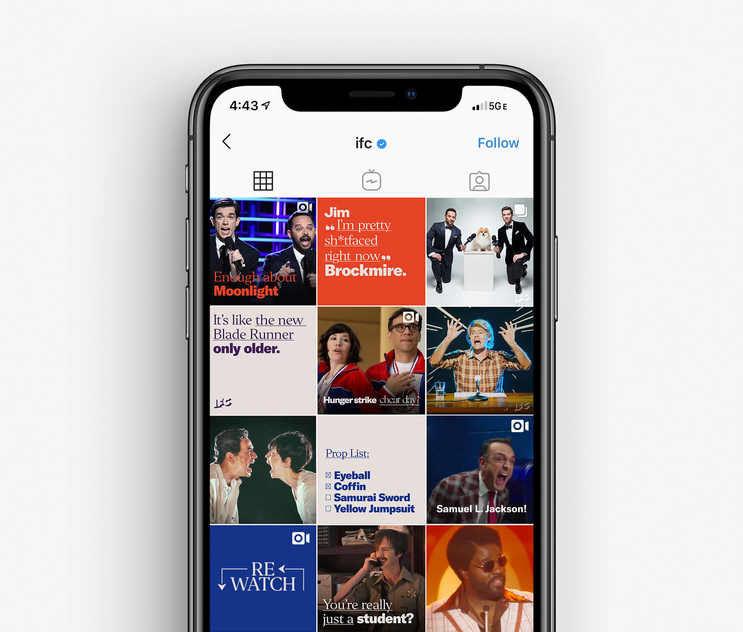
Our solution was to strip down the brand to the core: the Slightly Off voice. This was something no competitor could copy, and we put it front and center. In fact, the graphic identity is entirely typographic.
To capture IFC’s enthusiasm for and expertise in comedy and movies, the system is inspired by modern fan culture. We’re implying the conversations around content that can unfold everywhere from 4chan to fanzines, social media to Subreddits. Our voice can hyper-link content and characters together ala Wikipedia or IMdb but the design and motion behavior remains decidedly analog, anachronistic even.
Gretel project page
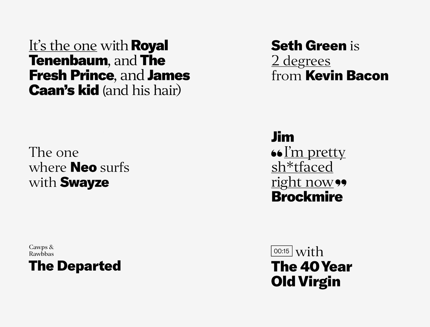
The new identity revolves around two fonts: GT America Black and Editor Regular. The contrast in style and weight is simply 💯. It’s almost a throwback to design school of learning how to pair typefaces and this is the exercise of the kid that got an A. In less metaphors: I love the type combination. A slightly clunky, in a good way, and minimally animated set of glyphs is the only additional graphic decoration for the system, which manages to still be highly textural and engaging.
The same “basic”-ness of the typography is applied in motion, with very subtle and quick behaviors that move the type around in ways to support the pithy and clever copywriting, which has always been one of the key aspects of IFC’s on-air persona, perfectly brought to life by Gretel’s motion timing. Everything here is pure 🔥. Sorry, I don’t know why I’m writing in emojis today. I’ll 🛑.
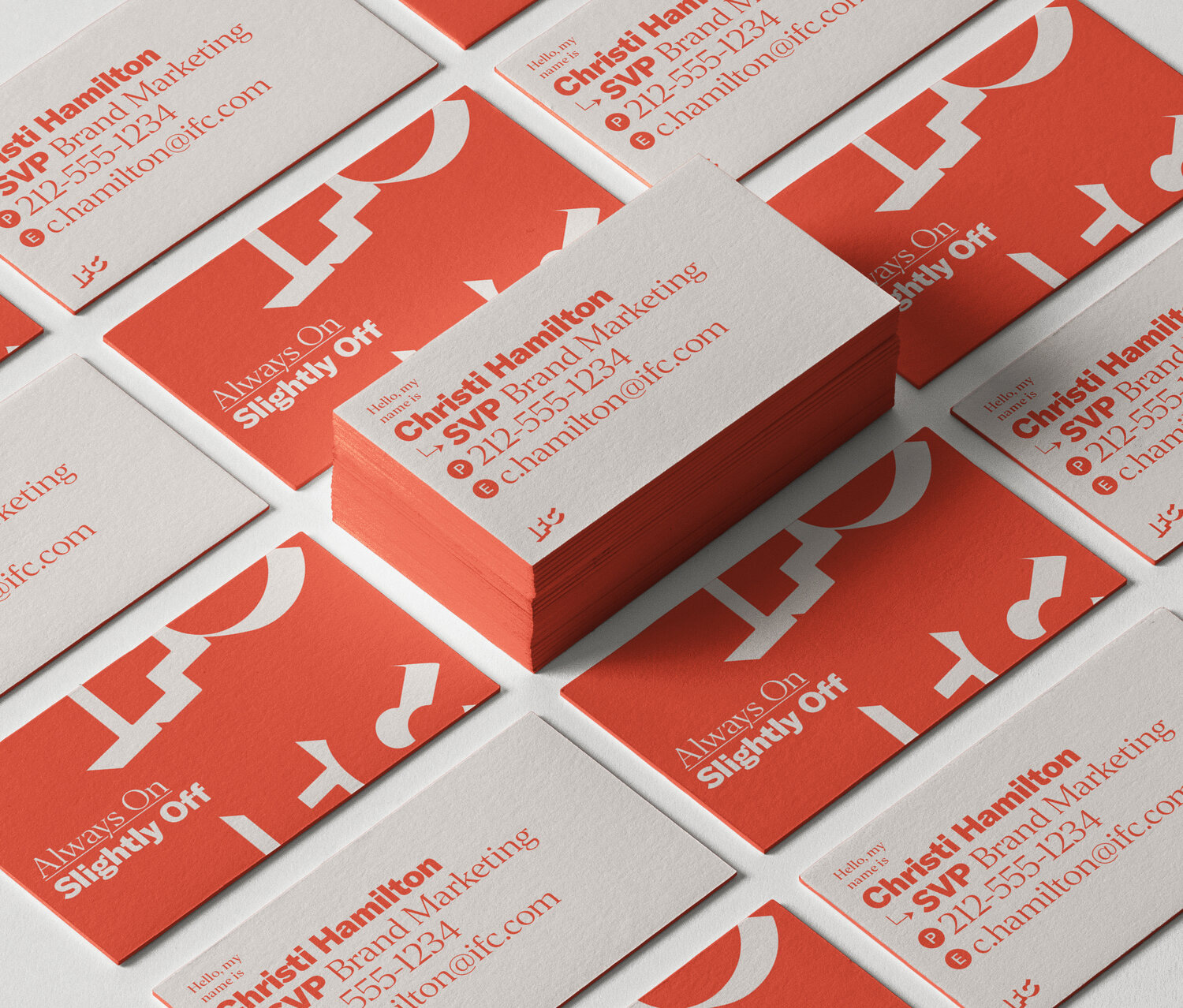
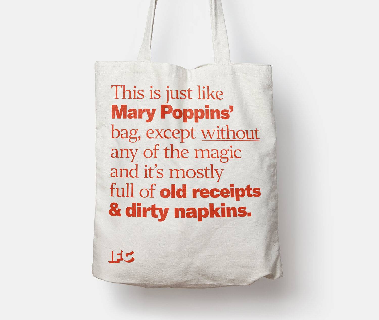
Even in its static applications, the identity has some of the liveliest “corporate” typography we’ve seen on Brand New in some time — those business cards are great and that tote bag is the truth. Overall, not to over-emphasize this but at a time where most cable channels are struggling and changing programming to chase viewership, IFC has remained constant in its focus and the way it presents itself in an unapologetically nerdy and astute way that relies on pop-culture intellect and not just snazzy graphics for the sake of it. 👊.

Comments