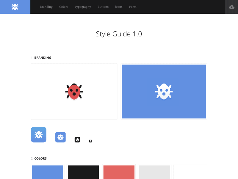
How to design a style guide for websites
To make the work of designers and developers easier, it’s wise to keep all the rules that determine the key elements of the website in one place — we’re talking about the style guide for the visualisation of the website.


Elements
Inside the style guide we determine:
- Colors: primary and secondary colors, typography layout on colored backgrounds, primary colors for highlights, link and button colors, etc.
- Typography: the size of the main titles (H1-H5), the size of the body text, quotes, spacing between titles and body text, typography color and background colors where the text can appear.
- Grid: determining the spacing inside the elements, styles.
- Graphics: drawing the key icons that will represent the main content. The color of icons and graphics.
- Other: determining the main style of the website, the color variations of pictures, button style, contact form style, call to action section, testimonials, etc.

Style guide benefits
It’s easier for designers to design a website if they follow the rules that can be found in the style guide. This enables greater transparency and organization of elements, which are being used by the designer, and it also helps the developers to a clearer CSS code.
When the website is finished, we usually have to deal with various corrections or additional subpages and since you may not be the only one who is designing the page, it’s easy for other designers to pick up where you left off with the help of the style guide. The guide offers us greater transparency over the look and feel of the website elements, so it is indispensable in potential cooperations. It is advisable or almost necessary in bigger companies, where we have several designers working together, since it helps us keep a more consistent website.
Style presentation
Before we can decide on the elements of the website, we need to analyse the operations of the company, the existing and potential clients, the company’s vision, mission and the services it offers. It is especially important to analyse the clients or (potential) buyers who will visit the website. If we want it to serve its purpose, we need to design a website that will offer a great user experience. When designing the first outline, the goal is to pick a middle ground that will take into account the client’s wishes and the user experience. For a good final result or, in other words, for a conversion (purchase, signing up for e-news, inquiry, registration, etc.) it is extremely important to predict the behavior, habits and wishes of potential buyers and to analyze the customer journey with the help of analytics.
1. Colors
First, we need to choose the primary and secondary colors. The primary colors are the main colors that are specific for the company, while the secondary colors represent the additional colors used for highlights.
When you’re deciding on the color of the main titles, it’s recommended you choose a darker color and use a brighter or the same hue for body text. Keep in mind that black isn’t the best choice for the color of the text because it’s not a warm colour and is less readable, so choose lighter tones of black. When you have the primary and secondary colors, you basically have your color pallet with different shades for elements exposure.
Now that we have selected the colors, it’s important to compare them with different background hues in order to ensure easy readability. We have to keep this in mind if we want to choose the right background hues for the text.
When choosing the appropriate color for buttons, wallpaper, etc., it is good to consider what effect colors have on humans (i.e. the psychology of colors), which is especially important from the point of view of the users on the website because, after all, people are visual beings. Using the correct colors, we can get closer to the target audience and the potential customers and ensure a better user experience.


2. Typography
Did you know that typography represents 95% of your website? Even more reason to make sure you use the appropriate typography, which will best describe your company.
We need to choose the sizes of all titles, compare them with each other and arrange them in the right hierarchy. The hierarchy goes as follows: H1, H2, H3 and so on. How many titles we choose, is up to us and, of course, the text on our website.
The size of the body text can be determined by using different sizes and comparing them with each other to see which one has the best readability. It also depends on the typography you decide to choose and the background color that you have.
When we choose all of the above, it’s important to determine the line height, character spacing, paragraphs, the color of body text, quotes, the emphasized parts, different links, etc.


3. Grid
On our website we also need to determine a grid for the content and other elements, such as pictures and graphics. That way the programer has an easier job and it also helps us maintain the consistency of the visual image.


What is a grid? It’s an element we need to pay special attention to because it’s important for spacings, the elements of a layout and also for responsive design. When we have chosen the size of the display that we believe will work best, we also need to determine the grid of the website, which is usually divided into 12 columns; depending on the content on our website.


4. Graphics & icons
When we’re preparing the icons we need to focus on the style and position of the icons or graphics, whether they will be filled or line icons, colored, black-and-white and so on. Besides the listed items it is also sensible to predict all hover effects for whenever someone moves over the elements with the cursor.


5. Photos
When it comes to photos, we need to be careful about their style and colors. Pictures can contain a colored filter or a gradient, they can be monochrome, they could contain text on the background, etc.
We also have to specify the width and height of the picture, which needs to be balanced with all other elements on the site.


6. Other
We also need to choose the look of the input fields and the style for secondary and primary buttons. The latter need to be more exposed than others because they are usually used for inquiries or more important parts that especially need to be visible.
It’s important to decide on the effects for the buttons and other animations for the page; it helps us create a meaningful story while we’re making the style guide for our company’s website.


Style guides differ from company to company. If you’re searching for inspiration for your guide, you can find great material on the Medium blog.
The only constant are changes
The style of certain elements can change during the actual design process of the site. When you check the design as a whole, you can see what could be improved with the design of the website or the user experience. When you have the final visual image, be sure to update the guide for later use. Editing a landing page for your company will be a lot easier and faster with an existing style guide.
When the style guide is completed, you can present it to other team members who are working on the same project. With the help of the style guide it’s also easier for new team members to get up to speed with other designers on the same project.
However, a style guide is never actually completed; we can constantly add new functionalities and improvements so that we keep the guide up to date. When creating a style guide, it is recommended that we include the whole team, such as the project manager, other designers and programmers on the same project. Only then can we ensure a quality style guide that will be useful for the entire team.


