Formula 1 unveils new identity by Wieden + Kennedy London
The new identity cements a year of change for F1 as it hopes to re-engage its global fanbase. We talk to W+K’s Richard Turley, who headed up the project, about the new logo and suite of typefaces that look to the heritage of the sport while aiming to drive it forward
Formula 1 will unveil a brand new identity today after the conclusion of the final race of the 2017 Grand Prix season in Abu Dhabi. Created by a team led by Richard Turley at agency Wieden+Kennedy London, the project includes a new logo that replaces the ‘F1’ mark originally designed by studio Carter Wong in 1994.
The work has been overseen by Ellie Norman – who joined Formula 1 in August as its first Director of Marketing – and represents the most significant change to the sport since its acquisition by Liberty Media in January this year.


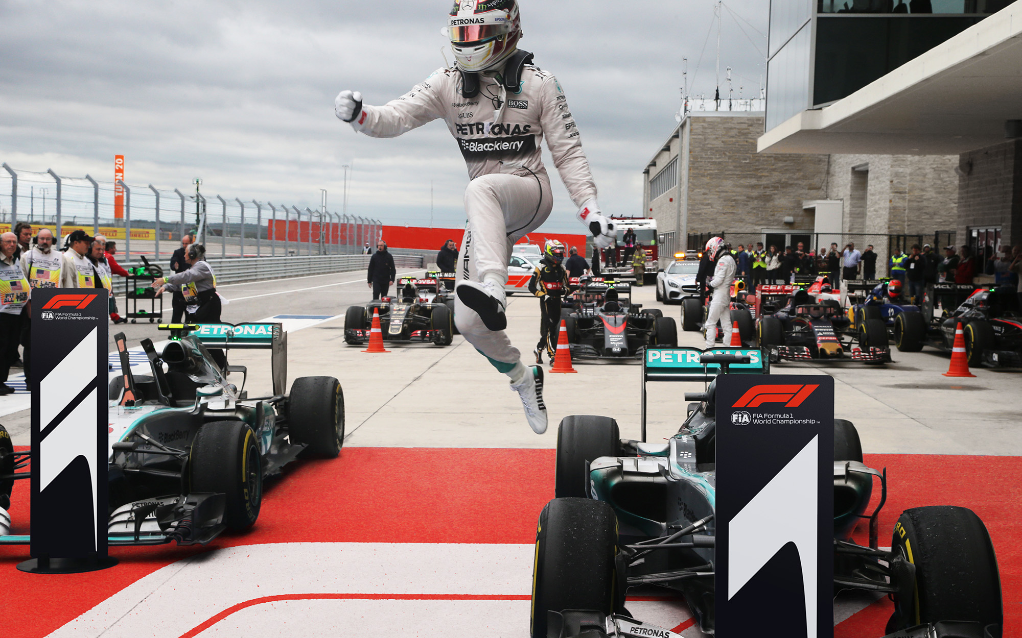
Liberty has already brought in a host of changes that it hopes will attract new fans, from new FanZones at Grands Prix weekends and immersive live events to new broadcast and digital deals. The new identity is seen as the next step in Formula 1’s ongoing transformation and a recognition of its aim to celebrate the stuff that makes F1 exciting – the speed and drama of the racing.
“The impetus has been to really make it more fan-focused, to understand that that is the heart and soul and future of the sport,” says Turley, who is a year into his role as Executive Creative Director of content and design at W+K, having previously worked at MTV, Bloomberg Businessweek and the Guardian.

The Formula 1 project came about through Wieden’s previous work with ESPN in New York, says Turley – the sports channel’s Sean Bratches moved to F1 to be its Managing Director of Commercial Operations when Liberty bought the company and was keen to continue working with the agency. F1’s new owners had begun to look at how they might reach new audiences and talk to existing fans in more interesting ways, while trying to communicate via a host of new platforms.
The project initially involved an in-depth research campaign that sought the opinion of F1 fans across the world. Turley says the results indicated that some had become disengaged with the sport and felt its glory days were behind it. There was also the understanding that the “engineering” side of F1 had perhaps overtaken its personality-driven “human” side; that the stories of the drivers had been eclipsed by the cars they were driving.
“Seeing that research [and] how people talked and thought about the sport enabled us to write a brief for ourselves in terms of the design and media around it,” says Turley. “The strategy all came out of that intensive fan-focused [activity]. That was the starting point, then we could write a brief in and around what the identity needed to do.”

Norman sees this research as key to the direction the rebrand then took. “Fans want to heighten their association with Formula 1 through the drivers, competition, the human side of the sport and the feeling of being on the edge when watching wheel-to-wheel racing,” she says. “This moves us away from the perception of F1 being inaccessible and just about the cars and business.”
The result is an identity that Turley says “represents these values, [is] forward-facing, surprising, dynamic”. The logo is constructed from three simple shapes that form an ‘F’ and a ‘1’ and that evoke both the speed of the cars and the bends of a racetrack.
In terms of influences on the project, Turley name-checks the work of the Designer’s Republic and the Pre-Op Art graphics of Italian designer, Franco Grignani, whose work was exhibited across two London exhibitions this year. The tDR mention is interesting as the identity (logo and type included) certainly shares an aesthetic with the sci-fi racing world that the studio designed for the classic mid-90s video game, Wipeout.
“Perhaps one of the problems that [F1] inherited is that they had a logo but they didn’t really have an identity,” says Turley, who recalls that W+K’s initial work on the logo was an update of the Carter Wong mark. “What [Formula 1] wanted was something that was simple.” Initially, Turley recalls, the team went through a process of trying to distill the F1 brand through a graphic device that eschewed the pairing of the letter and numeral, but kept coming back to it.

Several versions of a logo were drawn up (and form part of an internal booklet that put all the variants together in one place), but the final logo was actually a favourite throughout the process. “When that [one] went on the board … it just didn’t come down; it’s one of those ones that had a kind of presence to it,” he says.

“Quite frankly I just thought, look, there’s no way that we’re going to do an ‘F’ and ‘1’ any better than they’ve done it; it’s a beautifully simple way of doing it. We knew that we were up against a very good logo, [one] that has a huge amount of heritage to it, and that if we were going to blow it up then there had to be a methodology and a reasoning to it.”

And rather than thinking of it as a standalone mark, the new logo is clearly designed with its application in mind. “The identity is also built out of this idea that Formula 1 is full of logos – it’s the sport of logos,” says Turley. “And we wanted to celebrate or lean into that as opposed to trying to resist it. So we have an identity that’s flexible, that’s going to take up the colours of the sponsors and actually use [them] as a central part.”
Formula 1, he continues, “is kind of completely reliant on the visual identities of third party sponsors [and we] just thought that was a really interesting place to play.”

The logo is complemented by a suite of typefaces designed by Marc Rouault, a young French designer whose portfolio had impressed Turley and the design team. A headline font, F1 Regular, is joined by two display faces, F1 Turbo and F1 Torque. “Hopefully the [main typeface] is evocative of motorsport – there’s a kind of retro aspect to it,” says Turley. “[We] tried hard to think about differentiated letter forms – [so that] a pop-up or immersive event has an identity.”


And while much of the application of the new identity will surround the spectacle of the races, Turley is also interested in its use across some of less glamorous parts of the F1 experience, particularly in its printed media. These elements, he says, also help connect fans to F1 and should be celebrated.
“The print stuff that they do actually has a bit of resonance to it,” he says. “And people collect these [things]. The lanyard is the perfect example of this – you hang it in your door, that’s something that you want to keep, it’s a memory. The programmes you want to keep hold of too, so it’s important that every time they make a gesture, to make it sincere and give it a kind of heft, a value and quality to it.”

It’s clear that Turley and his team have given considerable thought to the identity’s wide and varied application – from the lanyard to the impressive hoarding designs that neatly incorporate a sponsor’s logo (whatever it may be) within a subtle ‘drawer’ device.

It’s also worth remembering that this is perhaps an unusual project for an advertising agency to take on. “It’s ideas first,” says Norman of what she feels W+K has been able to offer. “They’re open, take time to listen and work collaboratively through the entire process. Working with them can be chaotic, but always fun and I particularly like that they’ll take inspiration from outside the industry and cultural trends into everything they do.”

Turley believes that it’s the mix of talent available within the agency that has proved crucial to taking on a big redesign project of this scale and reach. “Although our primary output is advertising, strategy etc, we take people from a broad selection of different backgrounds,” he says of W+K. “So we have people who’ve worked in branding agencies, we have these skillsets internally. My position, being global, is that I can just apply myself to whatever brief suits or requires my services … and tailor a team around me.”
There are discernible benefits to having a range of different units working under one roof, he adds. “You’re coming in and looking at it, talking about it, liking it, loathing it – you get a cleaner and more efficient line, certainly as far as the client’s concerned,” he says of the F1 work. “As for the design portion of this, we can provide people with the tools that they need, knowing what they need, because we’re in the same room talking about it.”
The new identity will be unveiled in a promo film made by W+K to be screened following today’s Abu Dhabi Grand Prix.
Credits – Executive Creative Directors: Richard Turley and Tony Davidson; Designers: Luke Timothy, Sean Rees, Kelly Satchell; Typographer: Marc Rouault; Animator: Daniel Swan; Group Account Director: Matt Owen; Project Director: Trisha Comerford; Account Director: Matt Shaw; Account Manager: Vicki Sinclair; Planning Director: Paul Colman; Planner: Rachel Yoes
