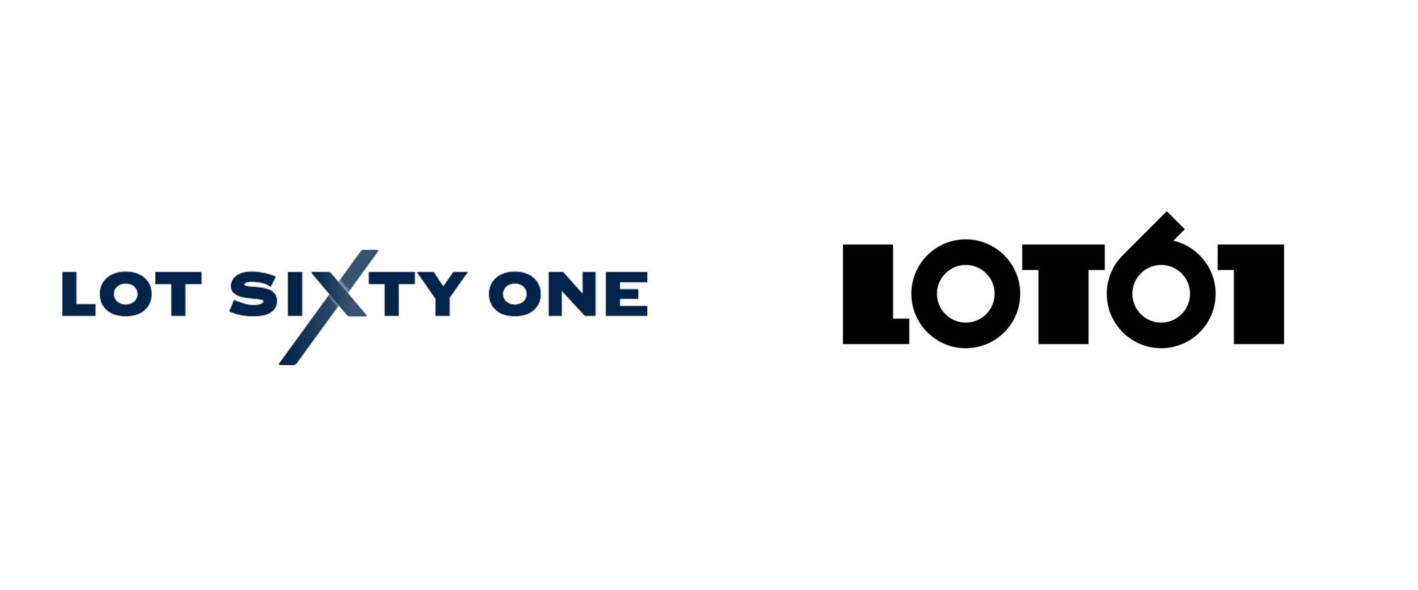
before
after
Reviewed Aug. 12, 2020 by Armin
Industry / Restaurant
Established in 2013, Lot61 is a specialty coffee roaster based in Amsterdam, Netherlands, with one retail location and a booming wholesale business. Started by two friends and business partners who have known each other since their childhood growing up in Australia, later opening multiple coffee bars in New York, Lot61 was a big part of kickstarting the “third-wave coffee” scene in Amsterdam when the two set up shop seven years ago. Ethically sourced from farms that have been implementing environment and social responsibility, Lot61 is on a mission to be “the most circular specialty coffee brand to ever exist”. In the meantime, they have introduced a new identity, designed by local firm Smörgåsbord.
LOT61 had been going through somewhat of an ‘identity crisis’ adopting two or three brands in as many years. In business terms being too busy roasting and selling coffee to focus on future brand strategy and positioning is not such a bad thing but the owners deemed 2020 the time to align and elevate the brand. Our brief was to create a contemporary brand with longevity and a baked-in ‘sense of place’.
It’s no secret that the coffee sector is well served with thoughtfully designed brands so we set about making LOT61 stand out from the crowd. We started by doing an inventory of the world’s leading coffee brands, placing them into one of four (aesthetic) categories: Minimal/Hipster; Traditional/Established; Source/Origin; and Mainstream. We sought to position LOT61 at the intersection of the first two categories which led us to look at the Amsterdam School of Architecture for inspiration.
Smörgåsbord project page
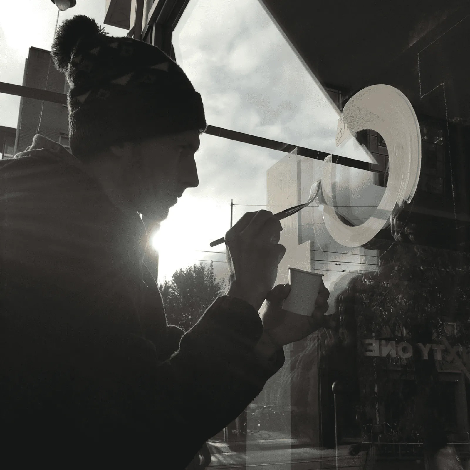
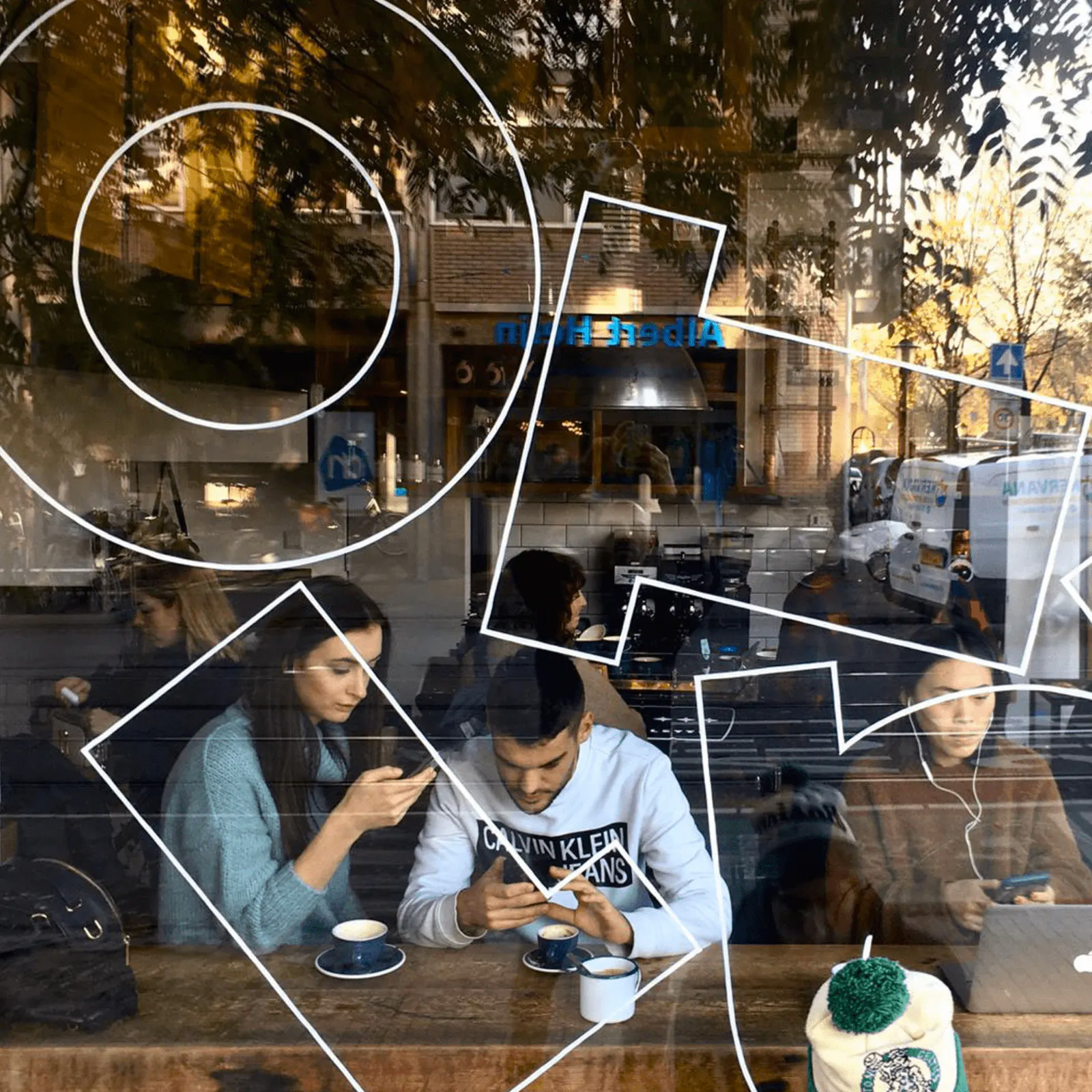
The new logotype is informed by the Amsterdam School — a style of architecture that arose in the city between 1910 and 1930. Whilst dialled up with some contemporary touches it retains its ‘sense of place’. The hand drawn characters’ ‘thicks’ and ‘thins’ are all 2:1.
Smörgåsbord project page

The old logo was so strange for a coffee shop and brand, looking far too corporate and the emphasis on the “X” made it feel very harsh. Nonetheless, to their credit, they had managed to cobble together a decent identity out of it. The new logo goes for the more compact “LOT61” spelling which leads to a very pleasing stick-circle-stick-circle-stick configuration that highlights the quirky 2-to-1 ratio of the thicks and thins in the letterforms. It’s not a super easy read — it can almost be interpreted as “Loto1” — but once you know the name of the business it’s all good. There are moments where the stark contrast of volume between each of the letters throws me off but, in the end, I really like the new logo, in part because it takes the geometric sans serif trend into a more exciting territory.
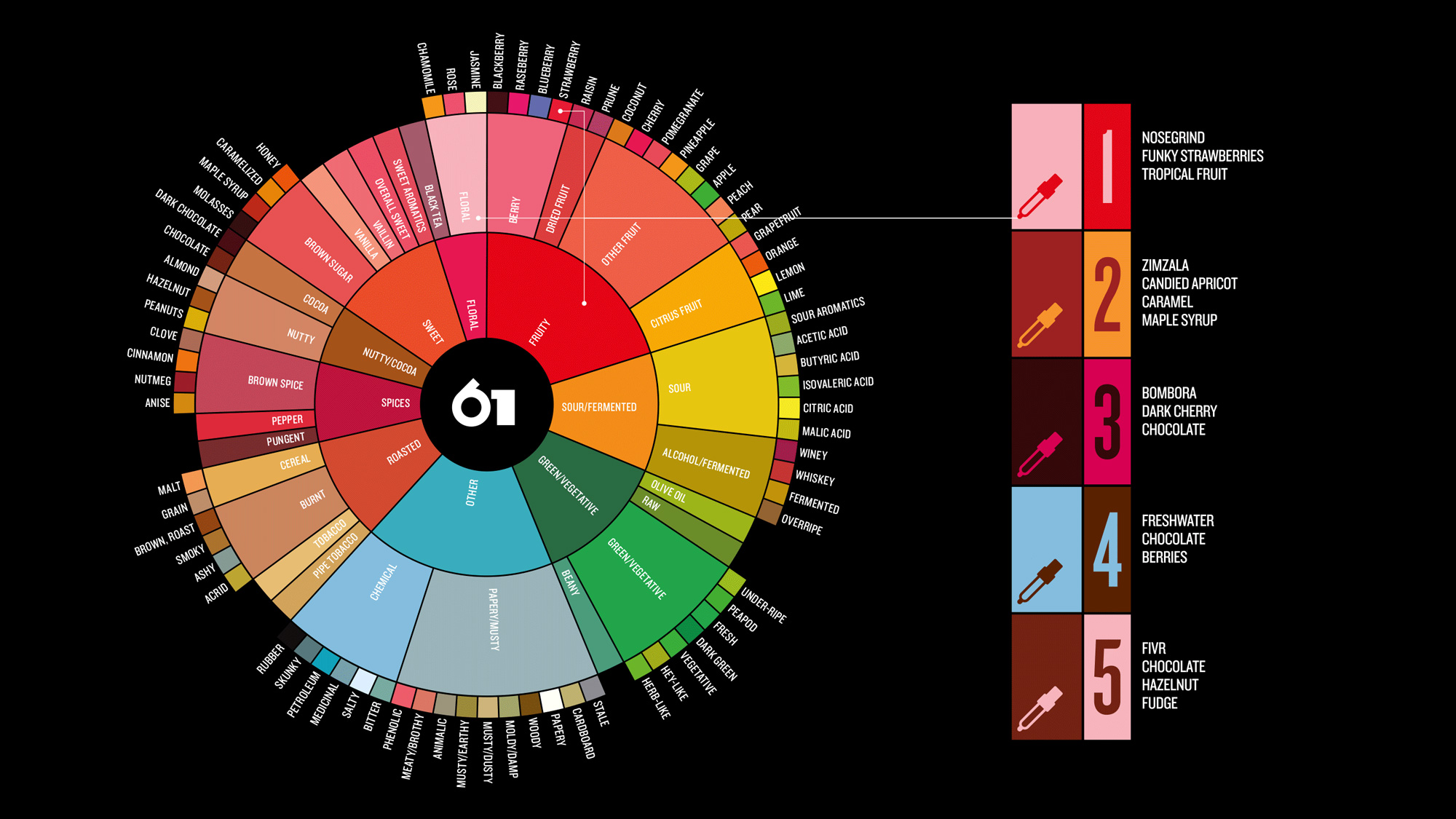
The Coffee Tasters Flavour Wheel was created using the sensory lexicon developed by World Coffee Research. The wheel is beautiful, like the greatest coffees can be, and is an intuitive tool for the coffee taster. It represents a comprehensive and kaleidoscopic picture of coffee flavour but has never been used as the basis for a coffee brand’s colour palette — until now.
Smörgåsbord project page
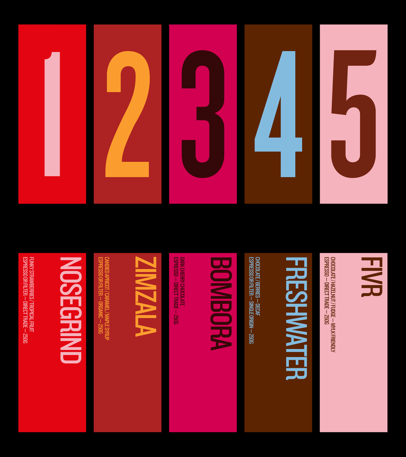
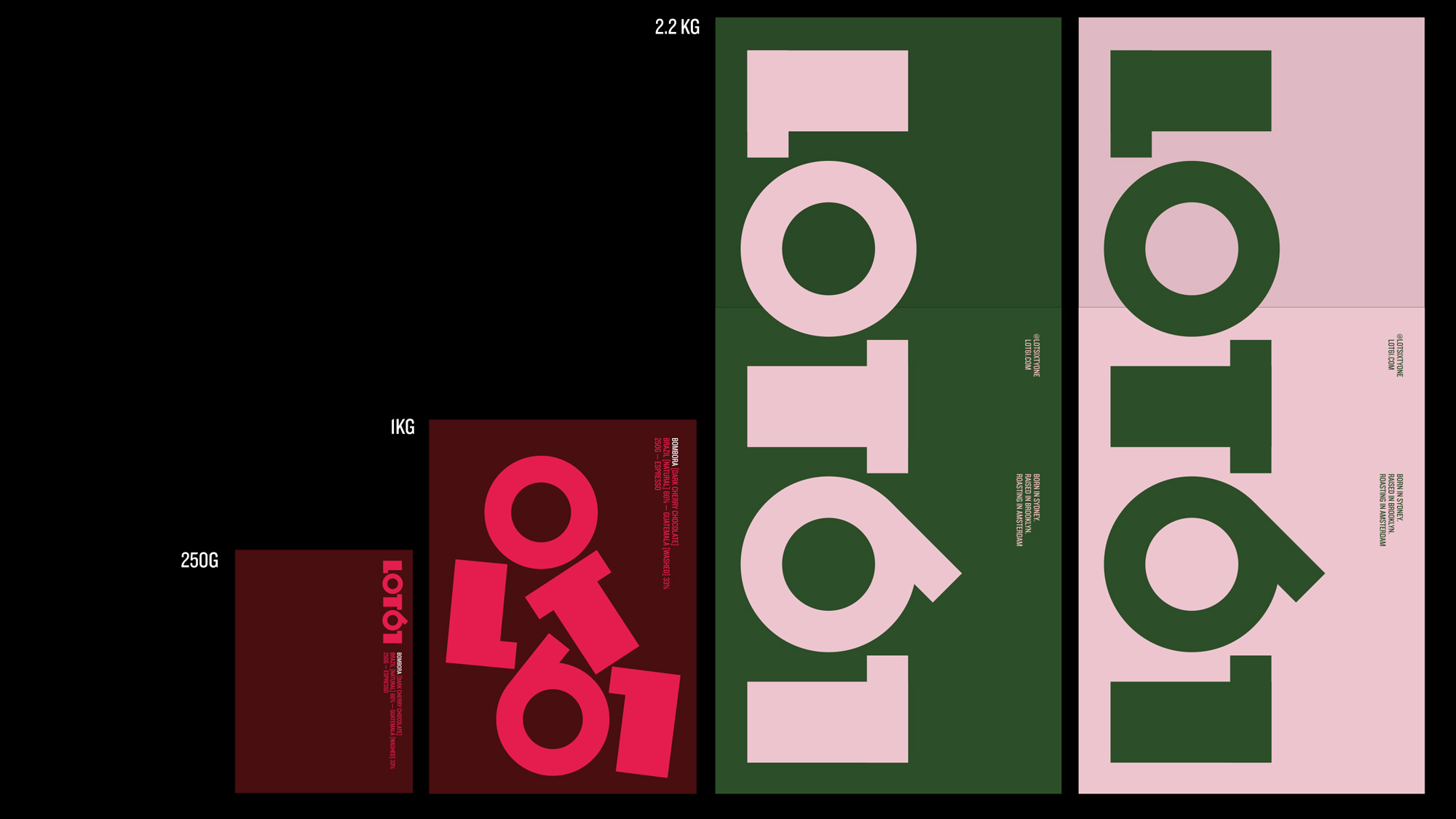
Many coffee roasters are currently opting for plasticised pouches that would look more at home stuffed with muesli. Our client was keen to use bags that he used to buy in grocery stores in NYC — bags that felt substantial and ‘brick like’. The 250g and 2.2kg bags feature the standard logotype whilst the 1kg features a playful, disrupted version.
Smörgåsbord project page
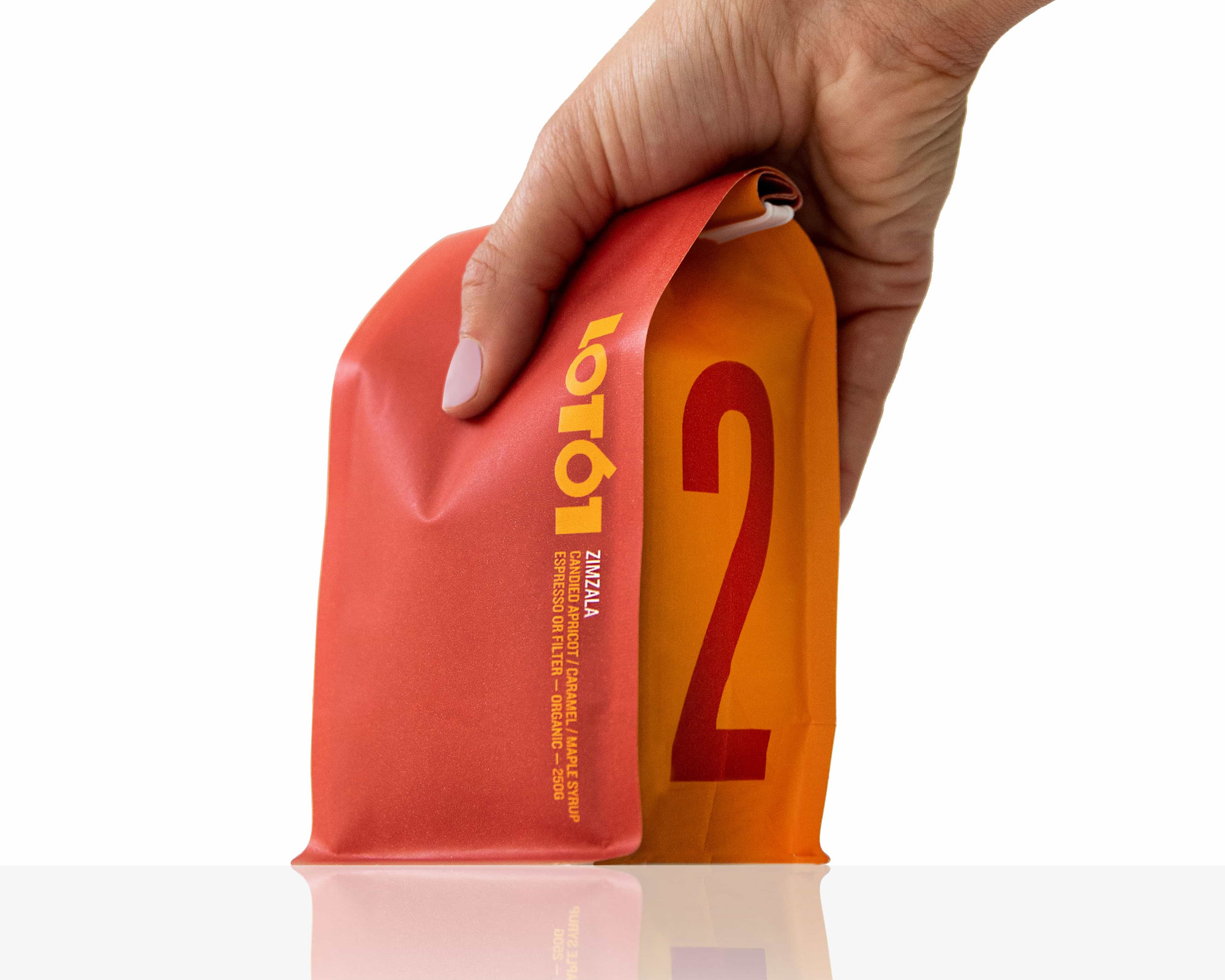
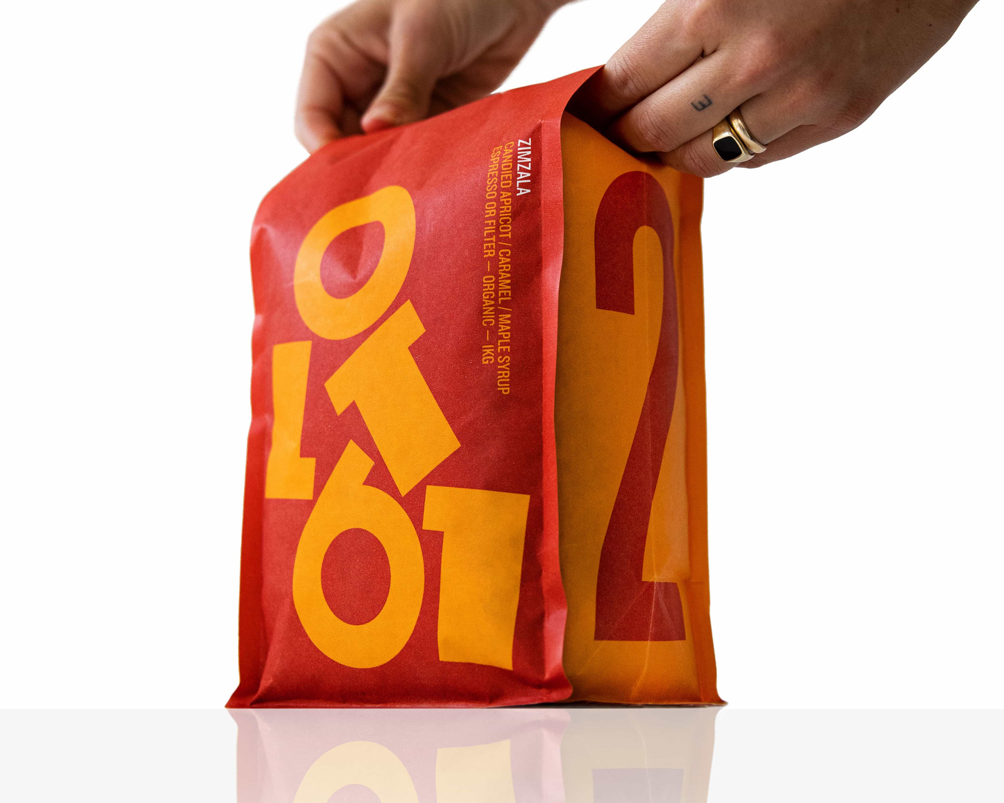
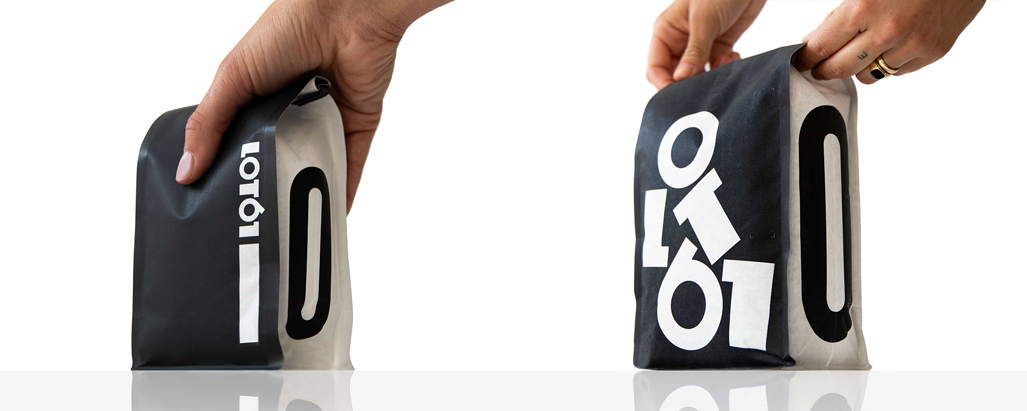
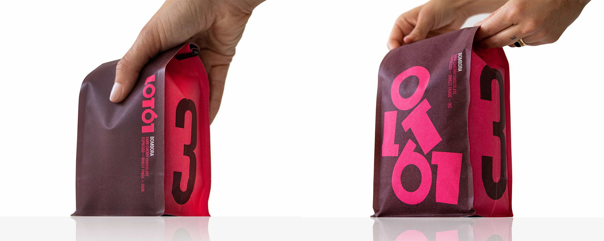
The old packaging was fine and serviceable but these new bags are pretty amazing. The color combinations are great and I love how different the small and big bags look. I would buy the 1-kilo bags for the jumbled logo alone even if it took me a decade to drink all that coffee… except that it wouldn’t because coffee is life. The condensed typography on the front of the pack in small and on the side in huge certainly looks good but I wonder if that needed a little bit of weirdness too somehow or a way to tie in more with the logo. Still, I’m a fan.
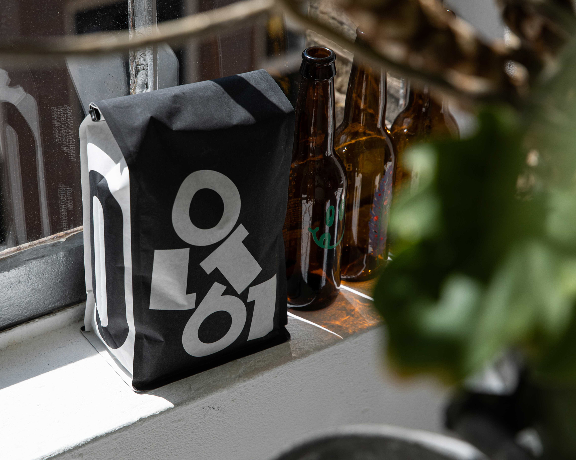
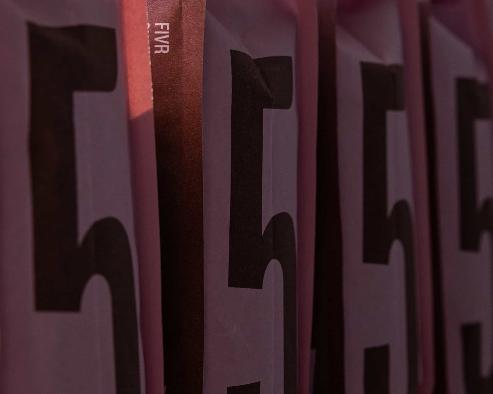
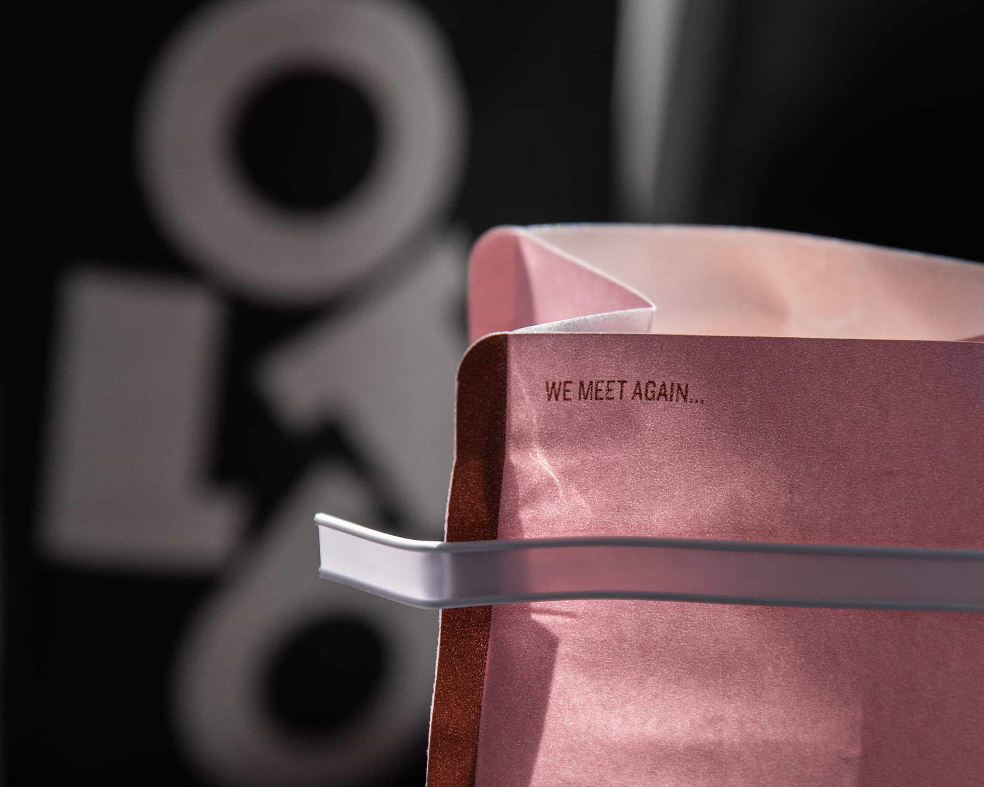
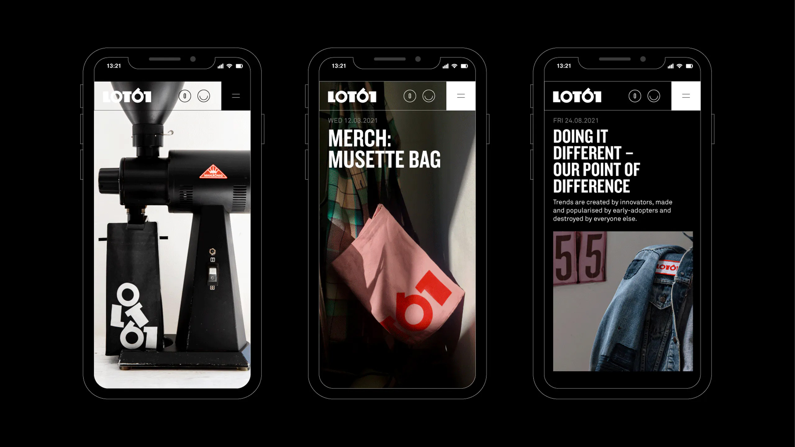
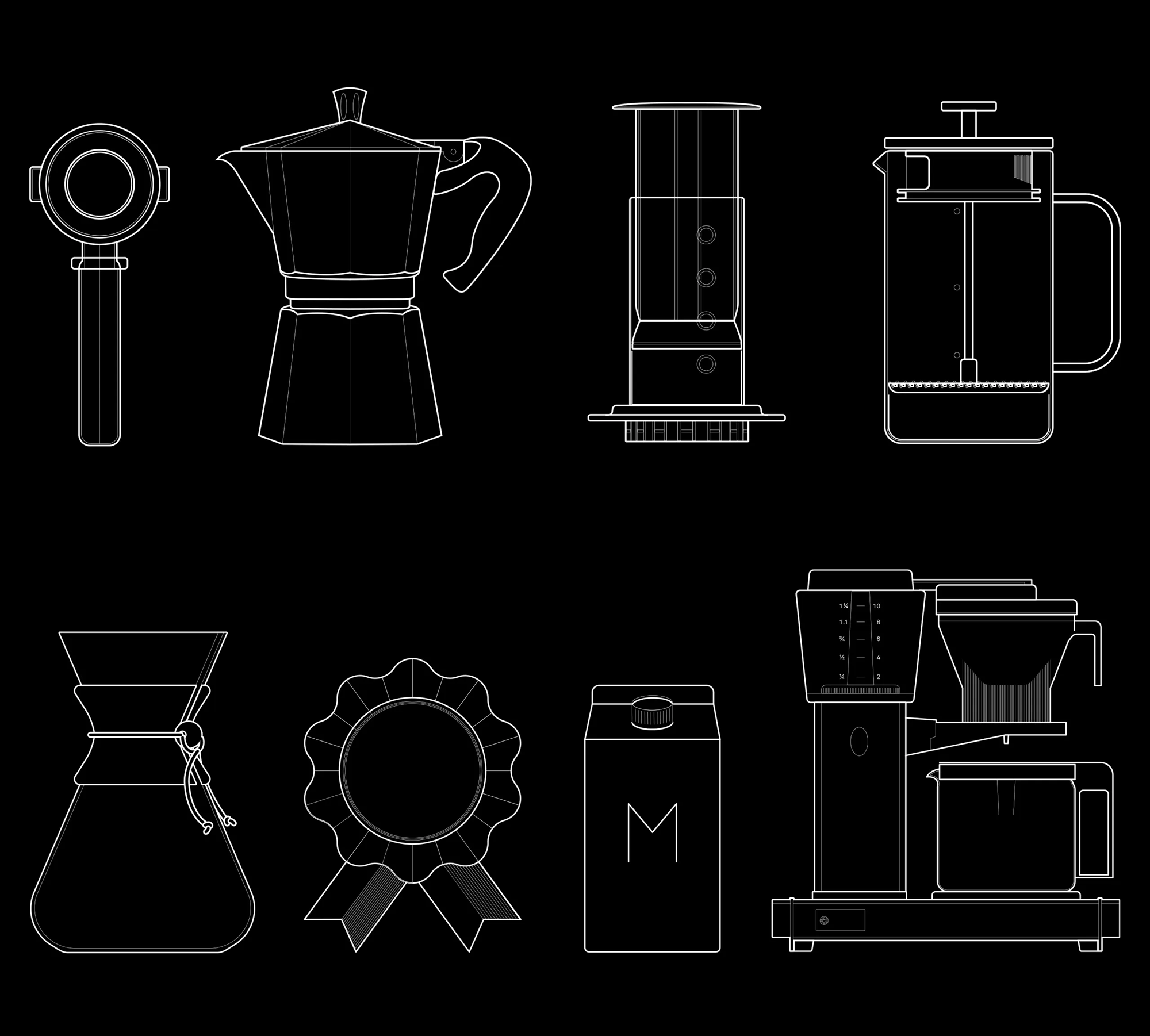
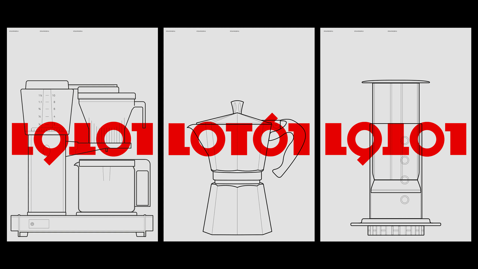
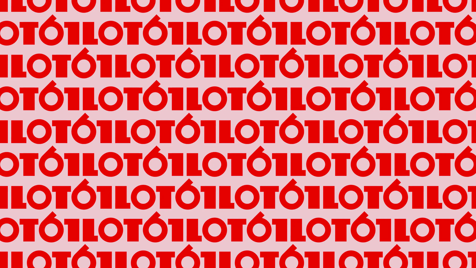

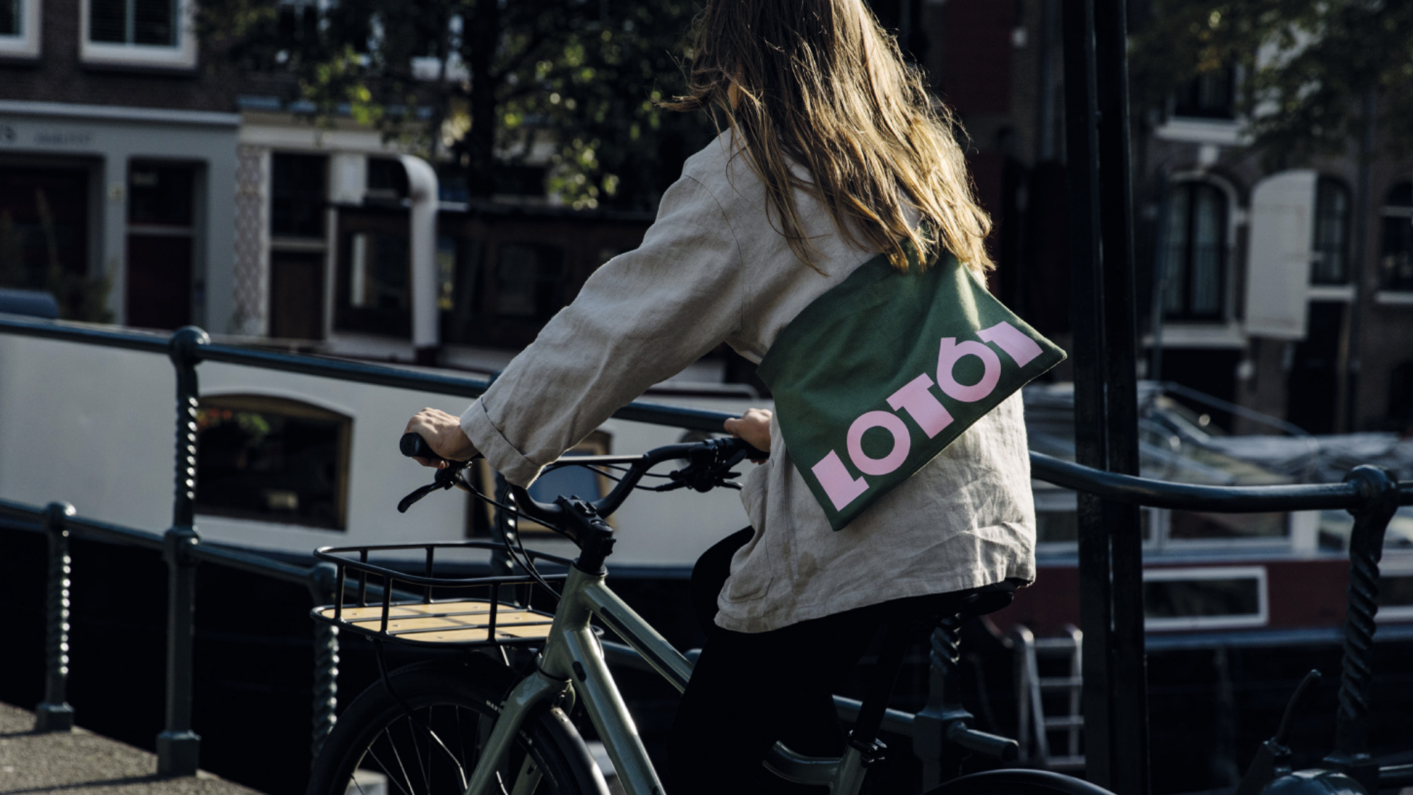
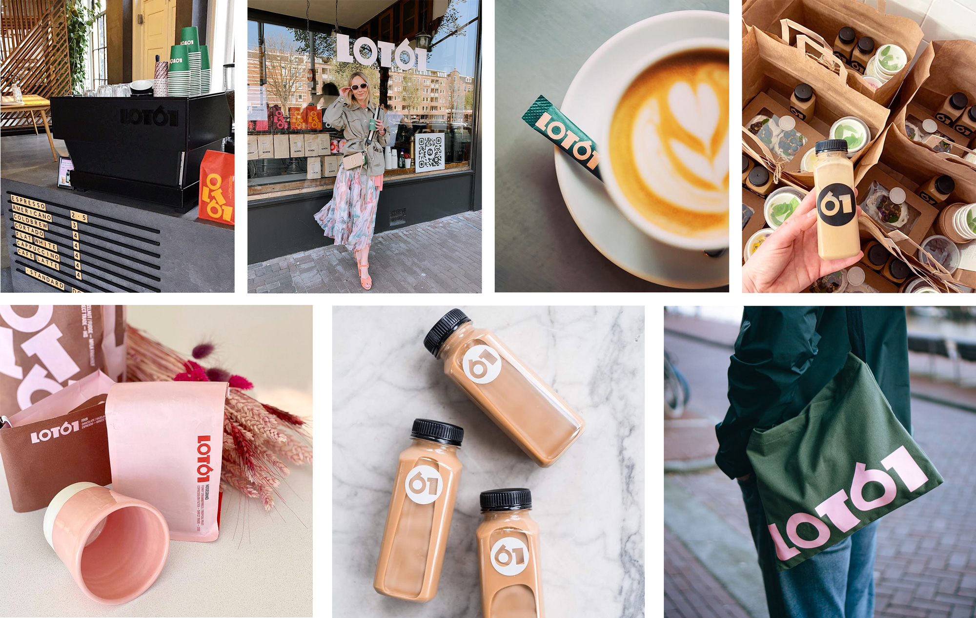
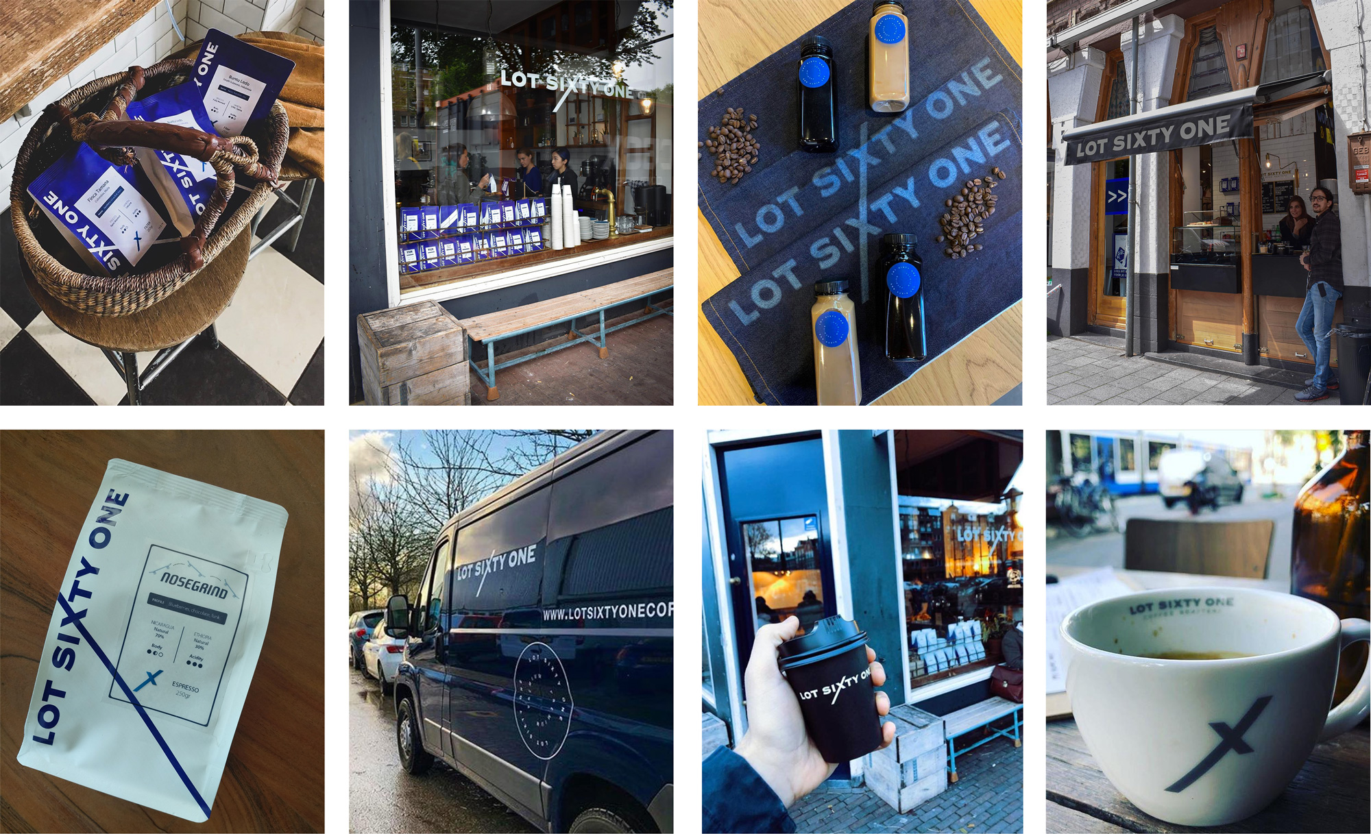
From the image grid above you can see that Lot61 has really embraced their logo, putting it on everything possible, including their black espresso-making machine in the top-left corner. The “61” shorthand logo in a circle is a nice extension of the brand that has the potential of making the number itself, regardless of design, a high-recognition element for the small coffee roaster. Overall, I appreciate how this doesn’t conform to any general coffee roaster trend — a little on the minimalist side, perhaps — and builds a bold visual language almost through the logo alone.








Comments