before
after
Reviewed Apr. 15, 2020 by Armin
Industry / Consumer products
Established in 1824, Cadbury is one of the most well-known chocolate brands in the world and the second largest confectionery brand in the world after the U.S.-based Mars. Cadbury started as a single grocer’s store owned by John Cadbury in Birmingham where they sold tea, coffee, and drinking chocolate, introducing its signature dairy milk chocolate bar in 1905 — the company (wholly owned by Mondelez International) is now headquartered in Uxbridge, west London, and operates in more than 50 countries worldwide. This coming May, a new identity and packaging, designed by London-based Bulletproof is launching in Australia, followed by South Africa and Malaysia later in the year, with further markets, including the UK and Ireland, launching at the beginning of 2021.
The revitalisation of the Cadbury wordmark drew inspiration from the hand of founder John Cadbury himself, to create a beautifully crafted signature with a more contemporary feel.
Bulletproof provided text
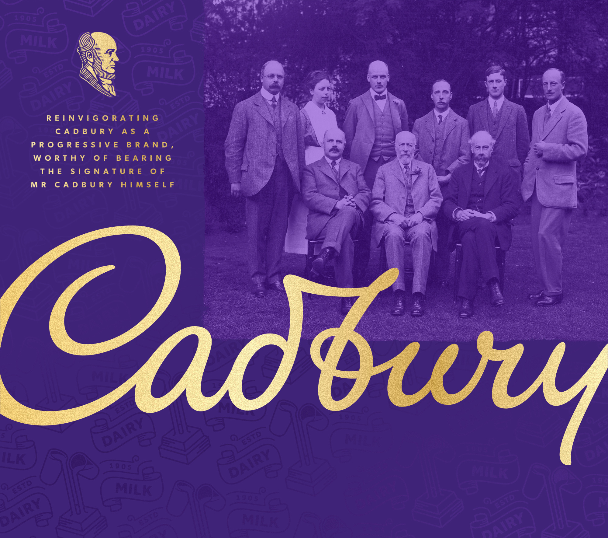
The old logo was nice, globally recognizable, and hard to disagree with as it perfectly embodies the product — I’m happy to argue, though, its setting at an angle as it defeats the purpose of an italic script wordmark, taking the leaning motion out of it but I wouldn’t go to war with anyone about it. The new logo is a lovely evolution that presents a thinner, more elegant iteration that most people will likely not notice — a good thing in this case. The new logo is also more true to John Cadbury’s signature as it first appeared for the brand, which features a tasty loop in the “b” and a slightly more swash-y “y”. The new logo feels more open and airy and its normal baseline alignment better showcases the newly reworked curves. In short, I really like the update.
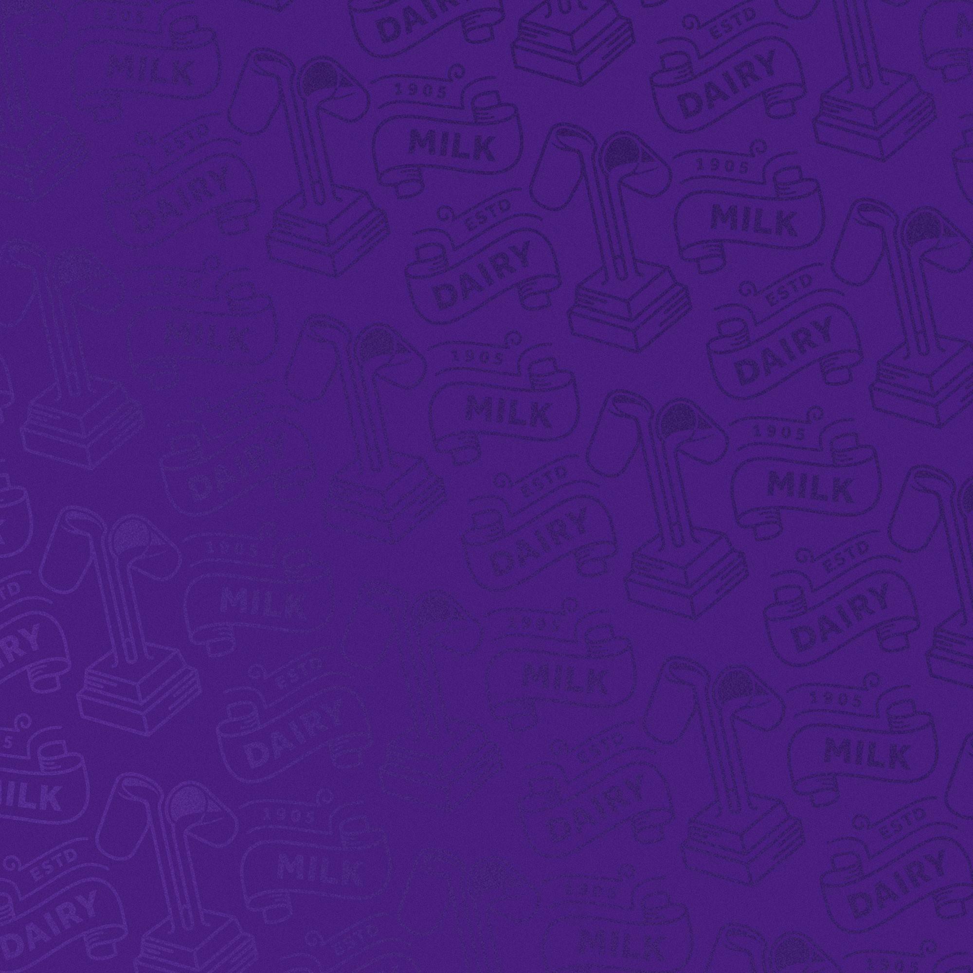
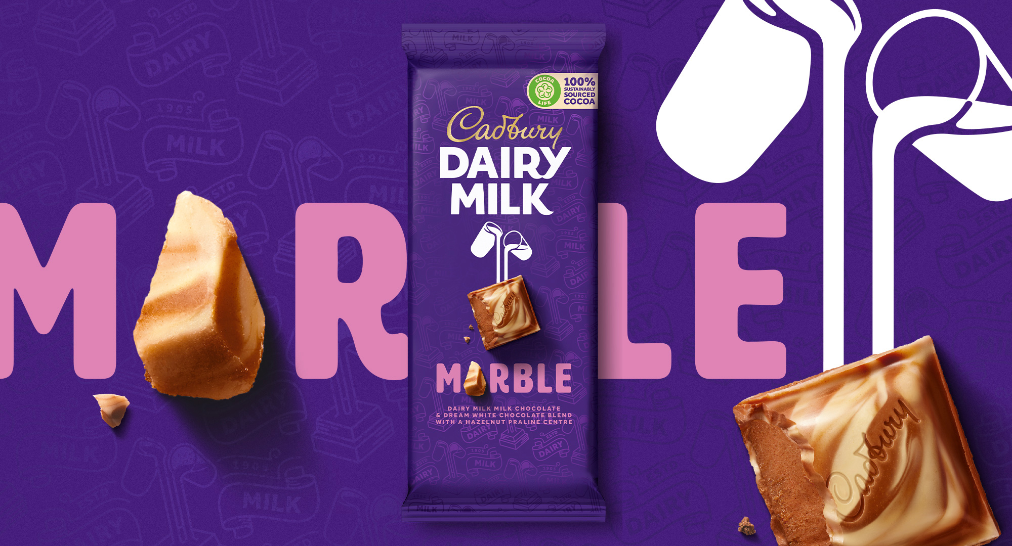
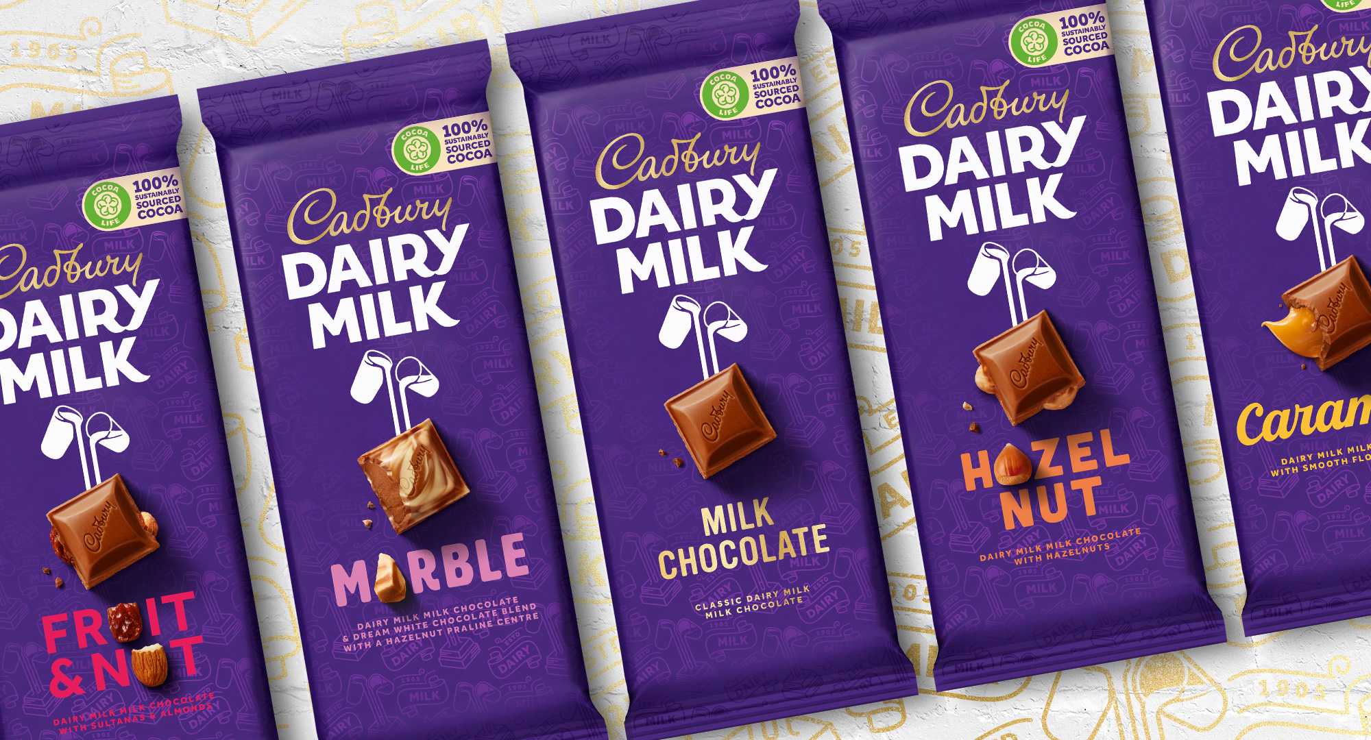
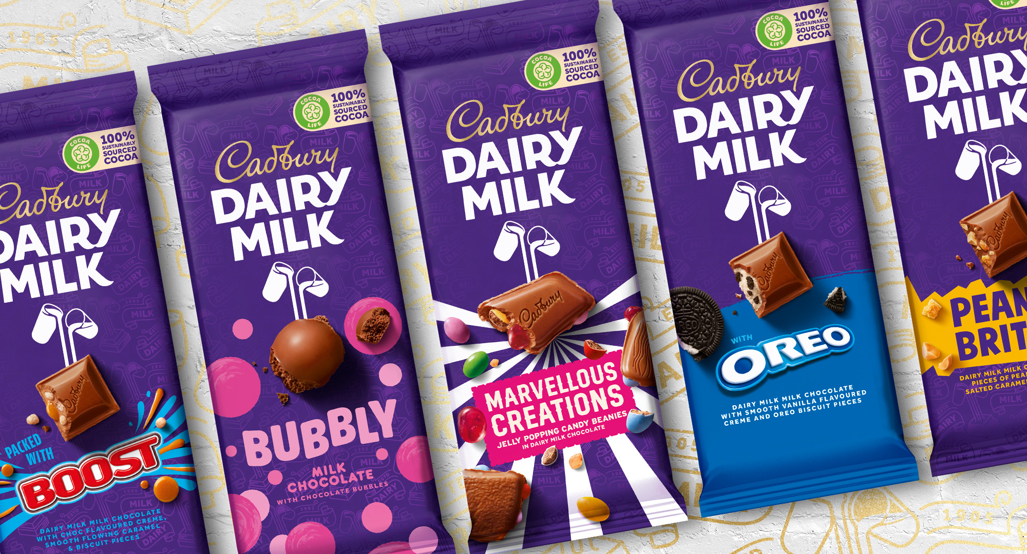
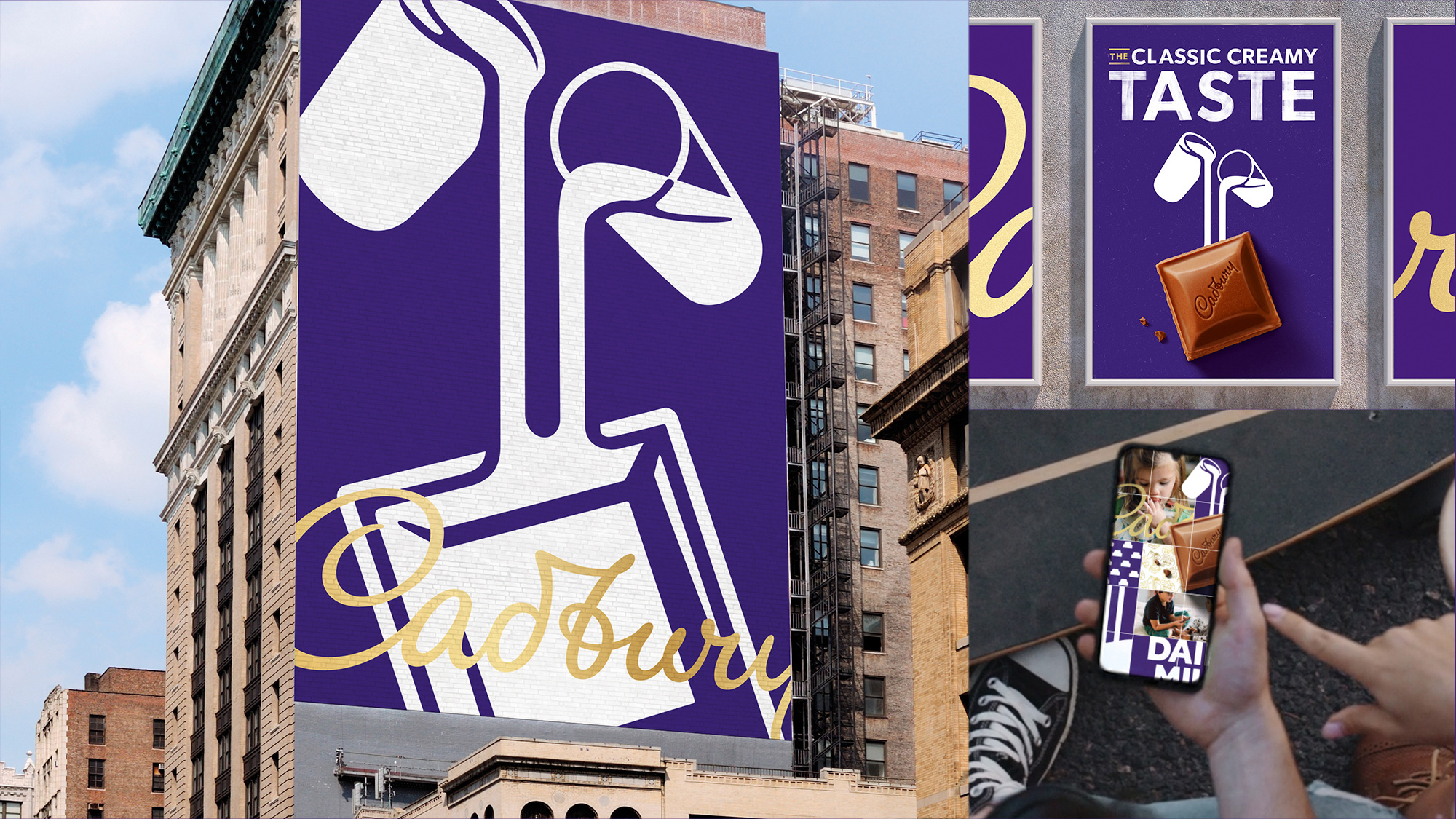
Taking cues from the archives, the Dairy Milk logotype has been recrafted and a distinctive Dairy Milk pattern based on the original 1905 pack has been created, which gives greater depth and purpose to the iconic Cadbury purple and provides an element of discovery on the packaging.
Bulletproof provided text
Both old and new Dairy Milk logos are fine in their own right. I’m not particularly passionate of either, either negatively or positively. I think both are fine interpretations. If I had to choose, I would go with the new one because it provides a better contrast with the main logo, whereas before the two elements were maybe a little too in synch. On the new one, the “RY” ligature and the “K” stand out oddly from the rest of the letters as the only ones with curvy, swash-y elements but, at the same time, those are the details that make the DAIRY MILK type interesting. I also prefer the vector milk glasses much more than the realistic approach of the old logo.
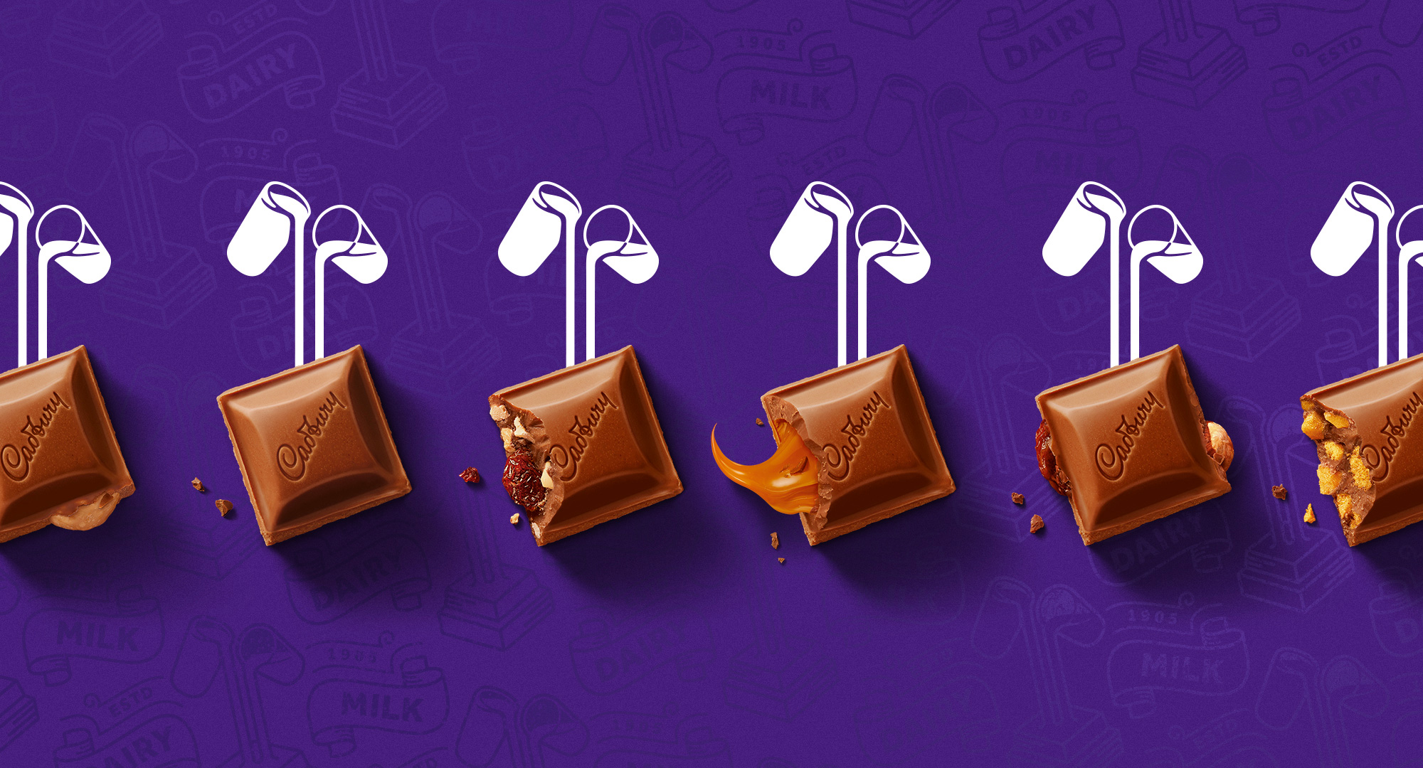
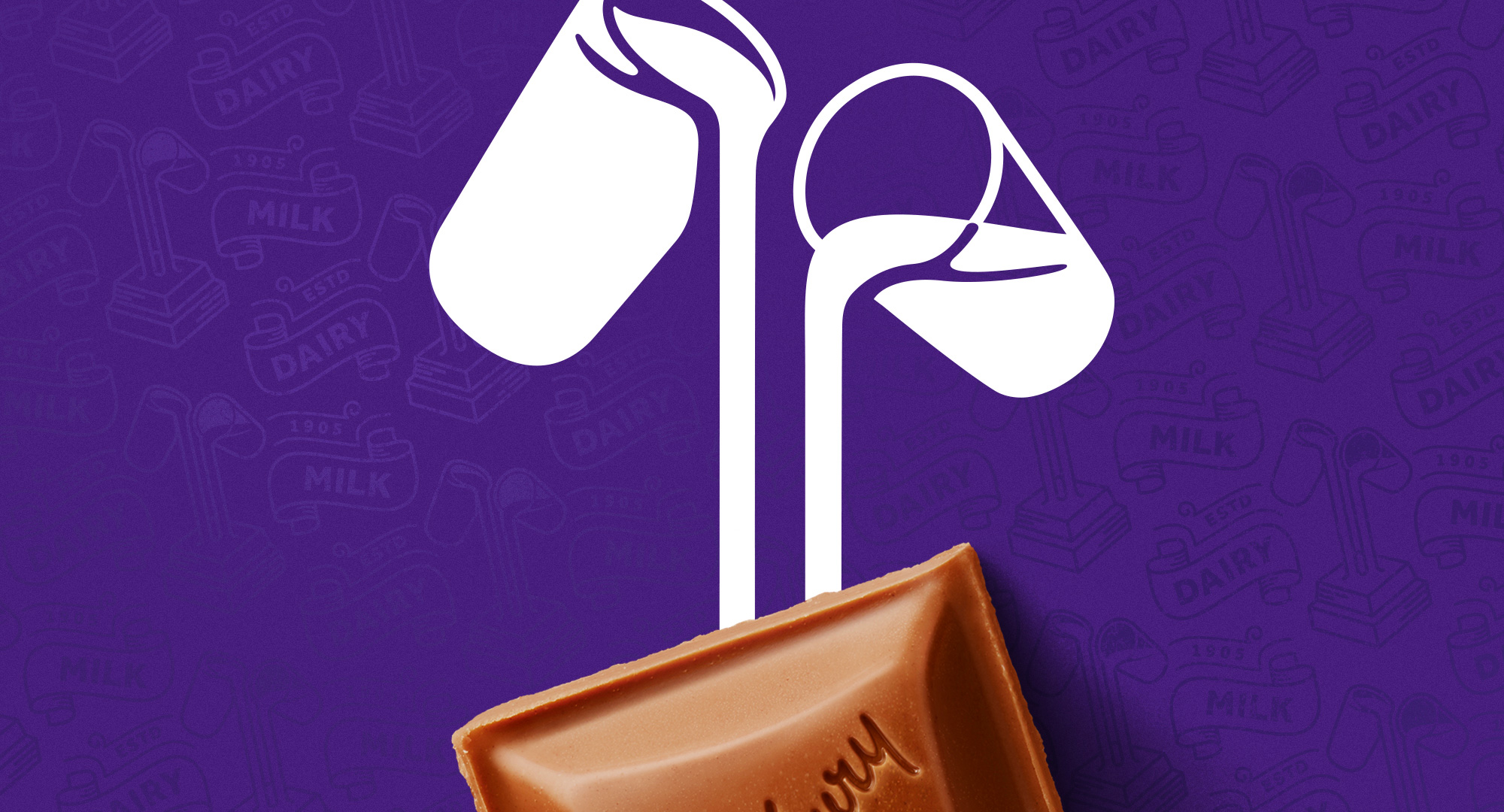
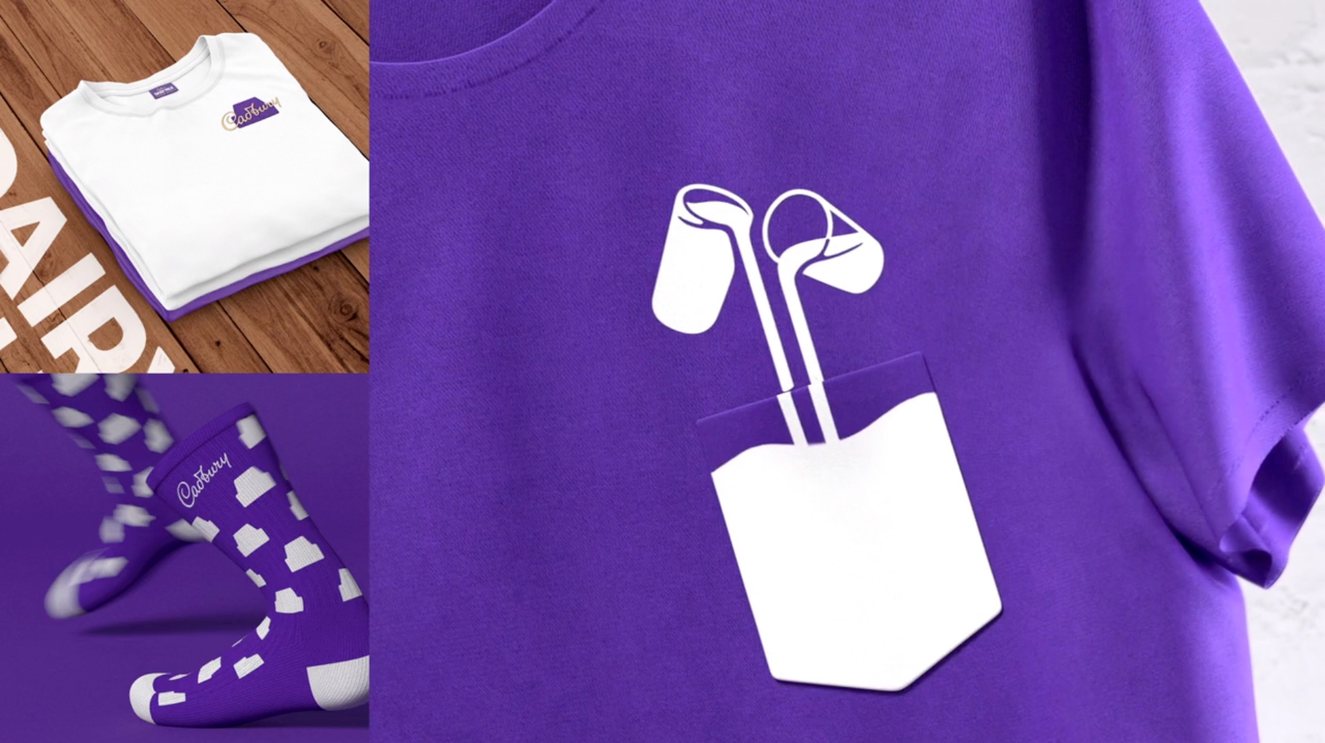
The iconic Glass and a Half logo has also been redesigned so that it links directly with the chocolate chunk, further emphasizing the quality of the ingredients and the classic creamy taste of Cadbury Dairy Milk that the nation loves.
Bulletproof provided text
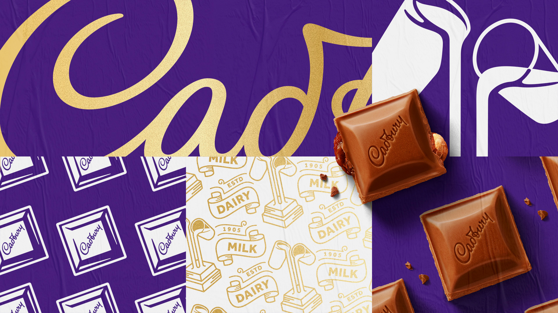
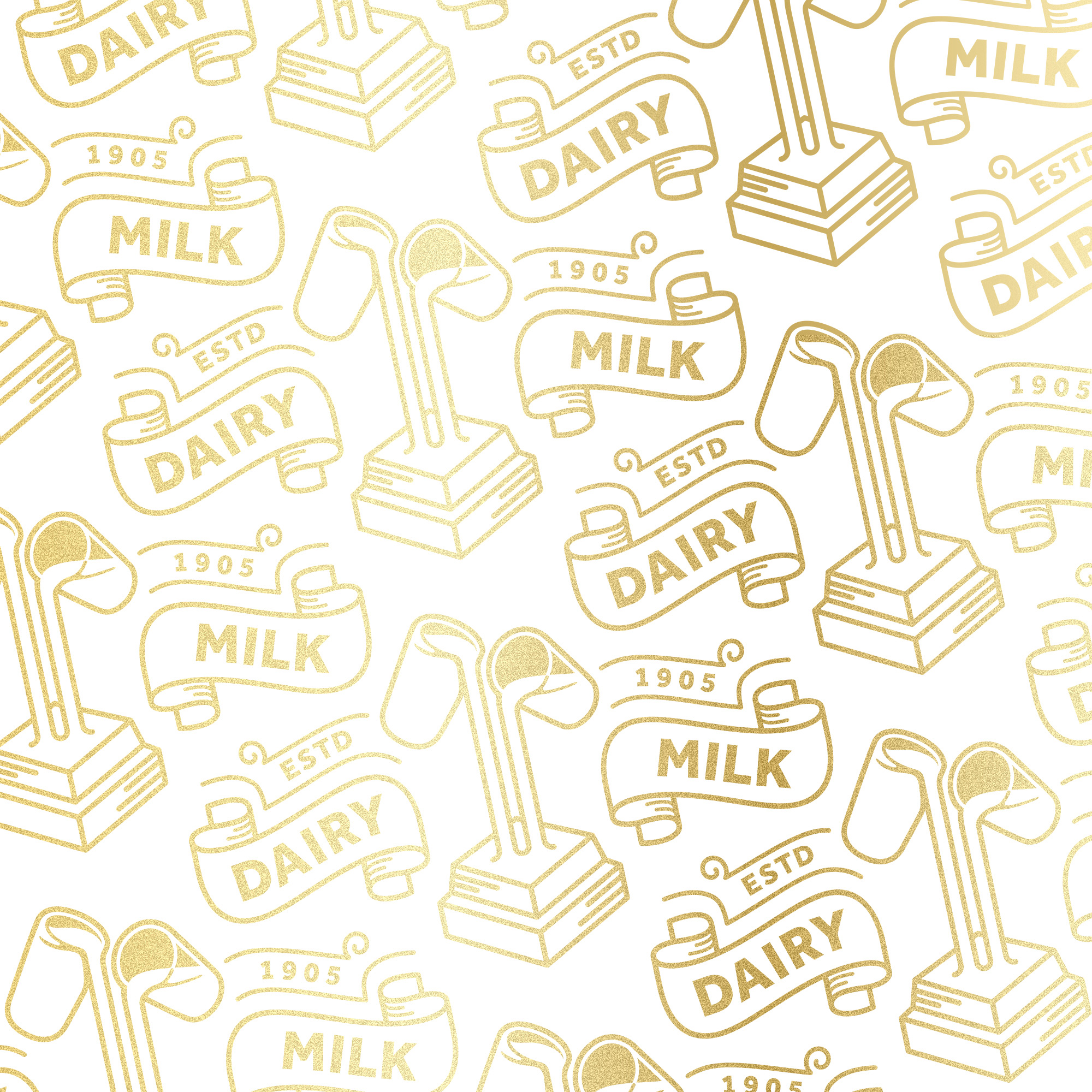
My favorite element of the identity is the new pattern, bringing back the ribbons used in the packaging during the first half of the 1900s but rendered in a crisp, contemporary way. I would go as far as saying that these are some of the best ribbons I have seen, just very nicely executed and curvy and flow-y.
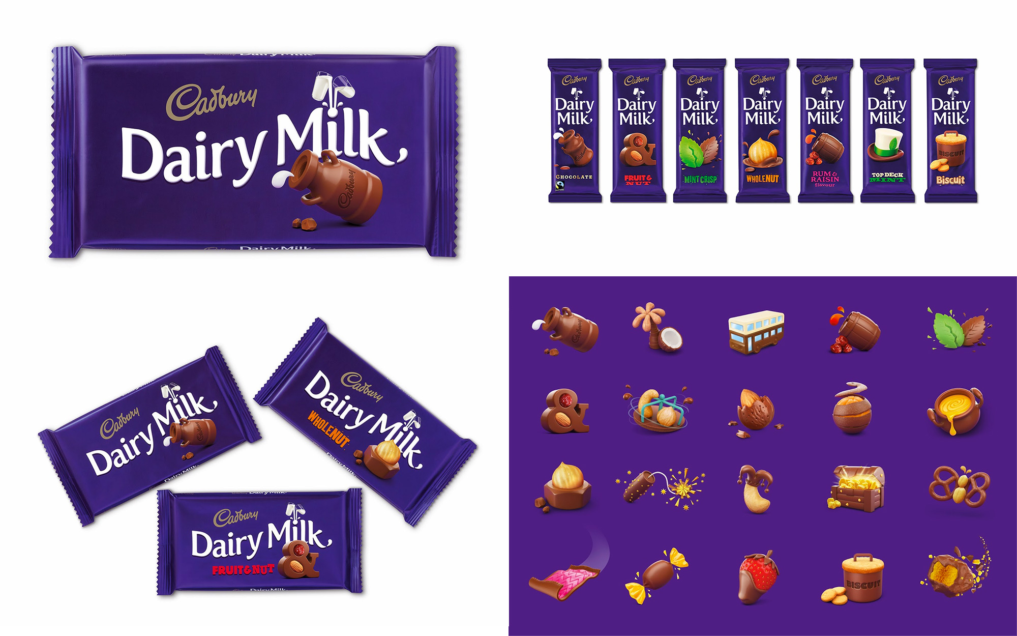
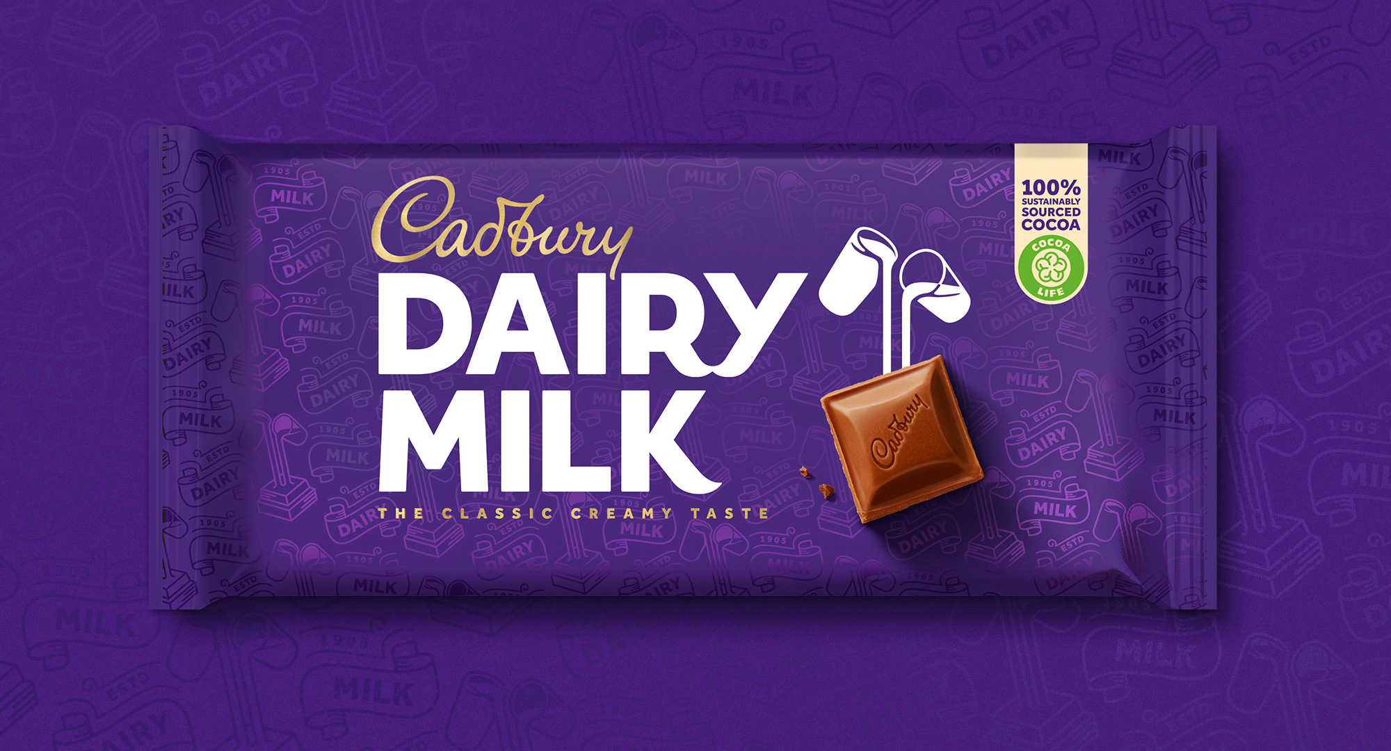
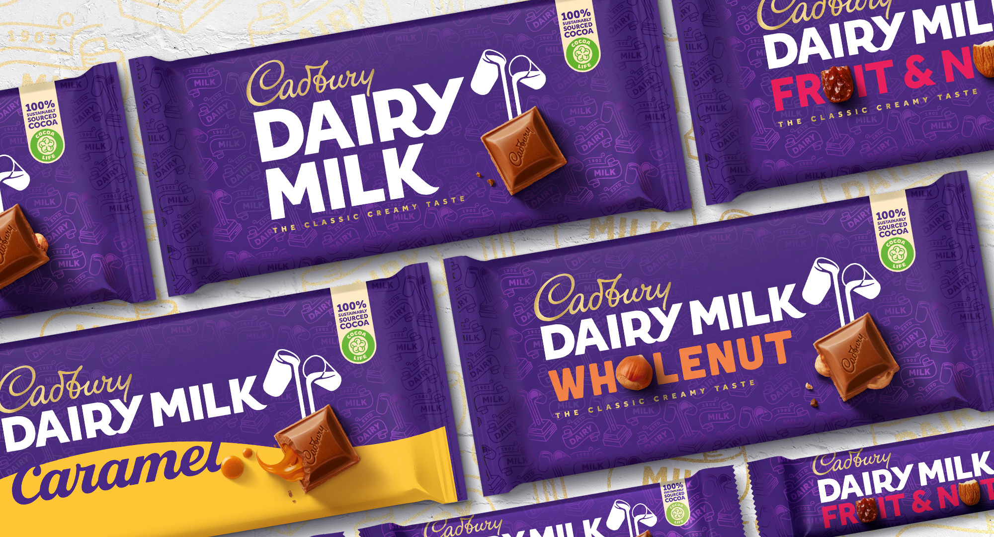
The old Dairy Milk packaging, designed by Pearlfisher, was pretty nice and had those fun flavor illustrations that were maybe a little too playful but definitely enjoyable. The new packaging is a little busier as it introduces the pattern in the background which I am guessing will be some kind of varnish in real life, which will make the effect a little more subtle than in the renderings above. I do like the simplicity of the previous packaging more than the new ones and I think part of it is the left-aligned arrangement of the Dairy Milk logo in the horizontal UK packaging because it looks so much better and cleaner in the vertical Australian packaging — like, those I really like. In general, though, I do like the richer, textured new packaging.
Perhaps swayed by the tight video above, I do think that this is a great evolution that keeps what’s known and recognized about the brand — purple + signature logo — while dipping into its archives to unearth some treasures that have been very nicely modernized and add a more premium but still accessible aesthetic to the comforting appeal of mainstream milk chocolate.


Comments