before
after
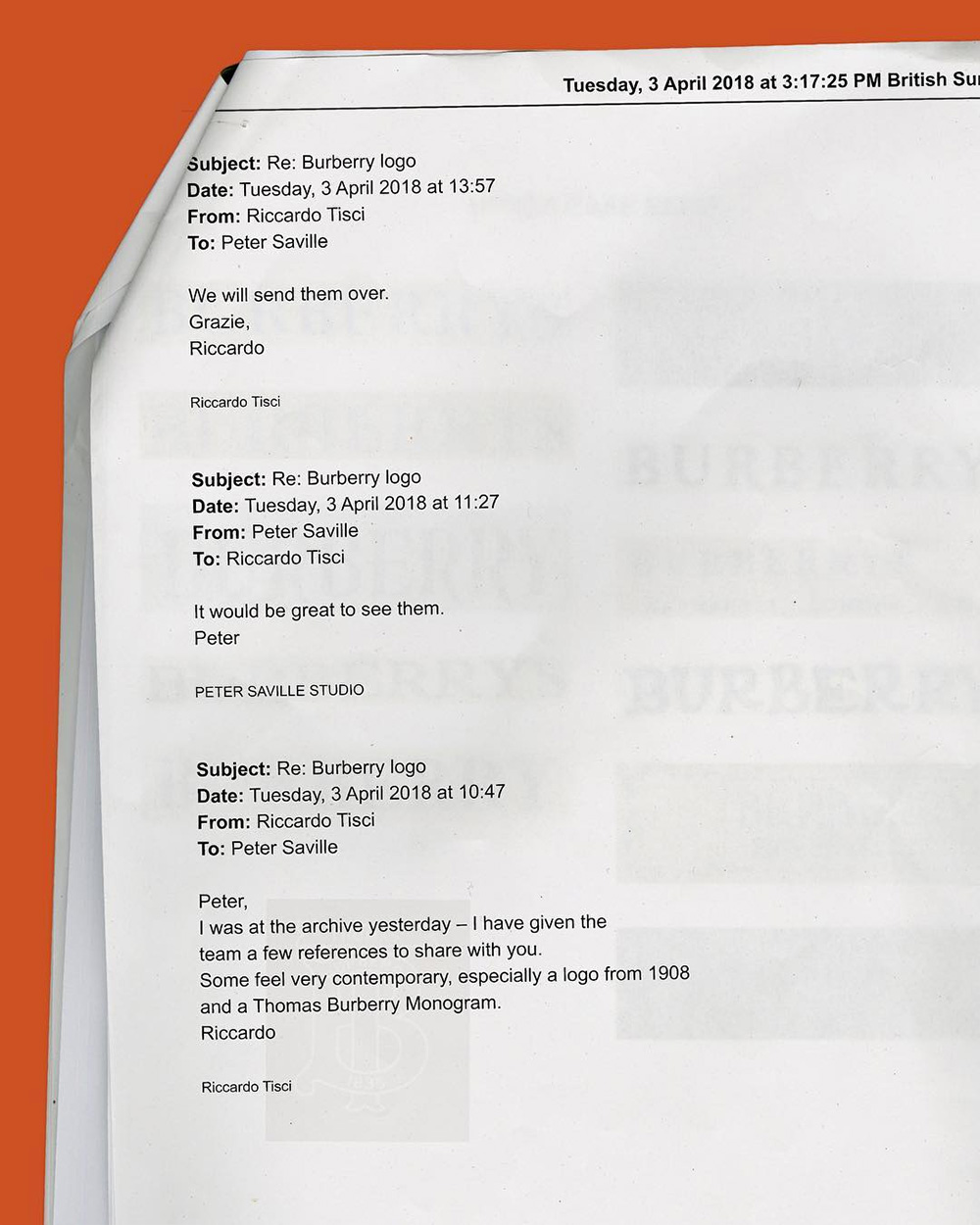
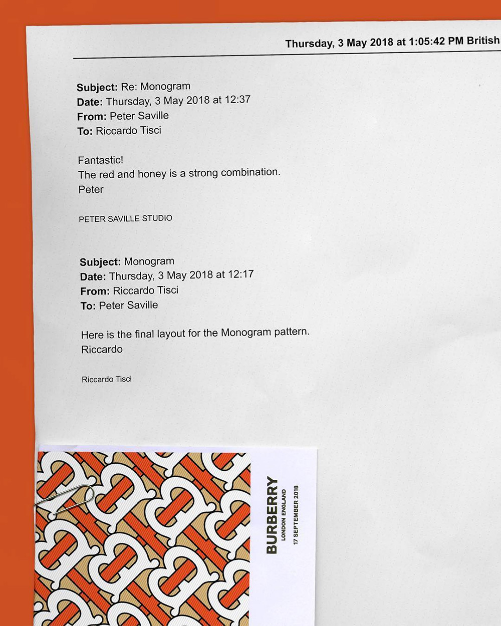
About
“Founded in 1856, Burberry today remains a quintessentially British brand, with a closely connected, creative thinking culture at its heart. Burberry believes that to be a great brand it must also be a great company and constantly leverages the energy of its culture. Headquartered in London, the brand has built a global reputation for innovative product design, digital marketing initiatives and dynamic retail strategies.”
Design by
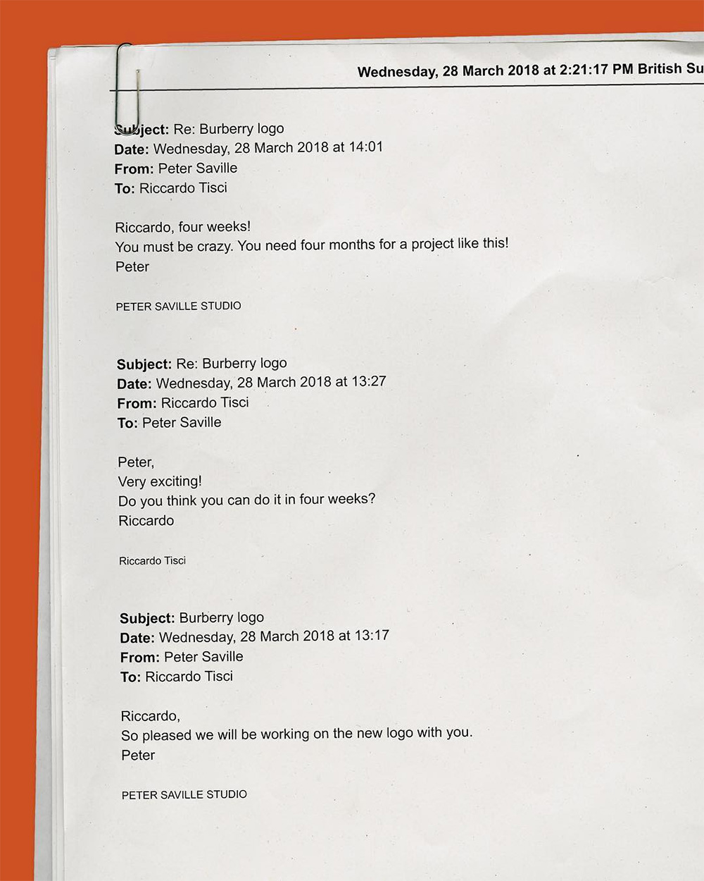
Peter Saville
Related links
Dezeen story (with further comments from Saville)
Relevant quote
"The new logotype is a complete step-change, an identity that taps into the heritage of the company in a way that suggests the twenty-first-century cultural coordinates of what Burberry could be," Saville exclusively told Dezeen.
Dezeen story (with further comments from Saville)
Images (opinion after)
Opinion
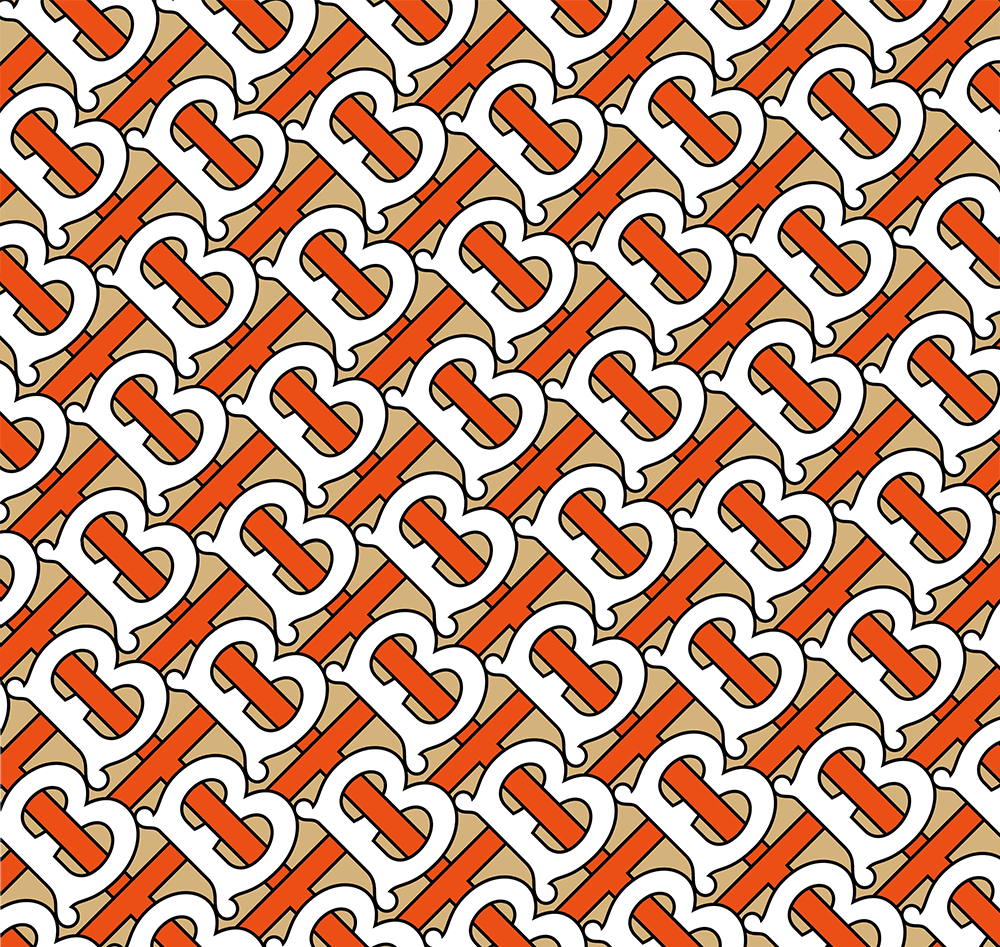
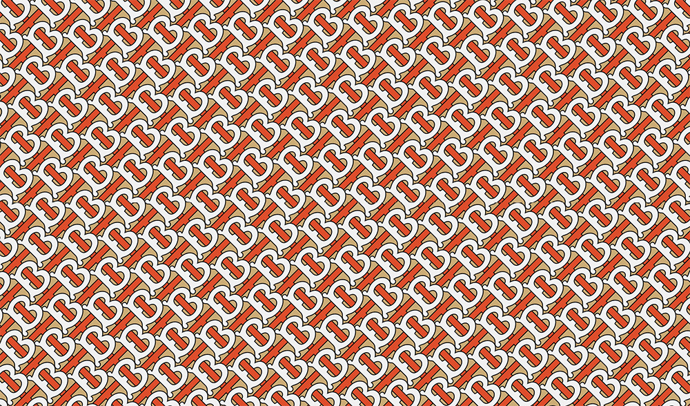
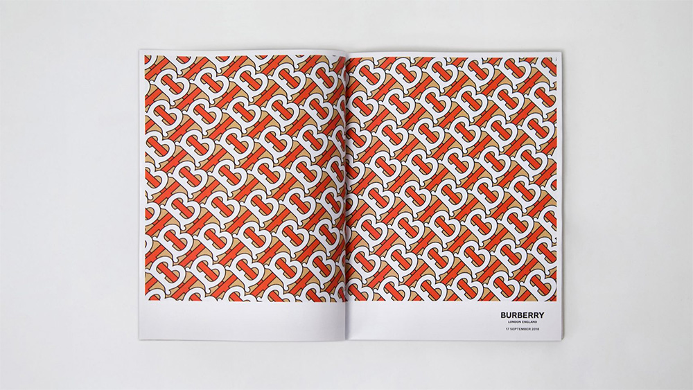
The old logo can be categorized as classic simply by longevity and recognizability. There was nothing particularly great about it; a literal drawing of a knight would not get many “Great” votes today and the Bodoni-esque wordmark was as ubiquitous in the fashion world as dry sans serifs are today, which is where the new logo lands. It’s a nice wordmark, I guess, but… yeah, that’s about it. It is no more different nor more or less interesting than any other fashion sans serif logo, whether it’s Balenciaga or Peter Saville’s own recent Calvin Klein redesign. I mean, sure, I see the visual differences in weight and proportions but they all become a blur much like the Bodonis did before these. The old logo at least had the knight as a mnemonic trigger and maybe the idea is that the monogram pattern will become as linked to the Burberry name as the knight was. The pattern is kinda quirky and not at all what you would expect from a high-end fashion brand and that’s the one aspect I like about it, that it’s sort of a cartoon-ish monogram with the bulby “B” and the funky colors as opposed to something sharper or more serious — although I don’t think anyone at Burberry’s would appreciate me thinking of it as cartoon-ish. It’s awkward, though, and there is a lack of fluidity to the pattern that makes it slightly uncomfortable. The color palette is the one thing I really like — it’s a classy but modern mix. Overall, the logo is as expected as it gets nowadays while the pattern has a decent chance at becoming a thing.
Comments