State
of UX
in2018
Illustrated by Fernando Bittar
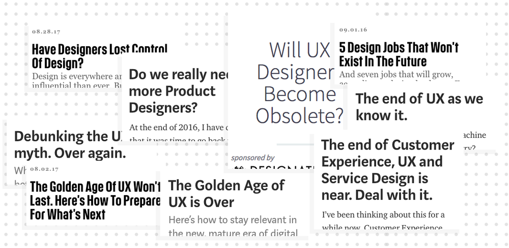
Is your app onboarding experience off? Here’s a checklist of best practices. Not sure which type of menu to use on your site? Just follow this pattern library. Is your homepage headline uninspiring? Let's just A/B test it. At the same time UX Design gained attention from companies and the media over the last few years, a significant portion of its practices have been commoditized. Or like pessimists say: UX is dead.
In our 2016 trend report, we pointed out that the concept of being a UX Designer is becoming so pervasive that will soon disappear. Heading into 2018 this transformation is finally taking shape. The variety of platforms and channels we design for demands a new set of skills, methods, and body of knowledge that go beyond what the classic website-and-app UI designer can deliver.
Sure, UX is dead. Now let's get back to work.
Click-bait-y articles about the fall of UX can make designers anxious about their careers. But if you have been working in this industry for long enough, you have probably seen this happen before. From “webmaster”, to “information architect”, to “interaction designer”, to “UX designer”, we have always been able to adapt what we do and call ourselves – while maintaining our mission of creating meaningful experiences for people.
What we see now is not any different. Our field is maturing, budgets are increasing, and the design landscape is getting more complex and competitive. We can’t expect every designer to be the jack of all trades. We can't be doing our job in 2018 the same way we did in 2008.
As the broad "UX designer" title starts to dissolve, we see fellow designers focusing on new paths and specializations:
Some designers are adventuring in new fields and technologies, like virtual reality, conversational design, voice interfaces;
Some are focusing on more specific areas of the design craft, like motion design, prototyping, UX writing;
Some are updating their titles to Product Designers, broadening their scope beyond interaction design to focus more on product strategy and business.
This shift from UX Design to Product Design is only accelerating in 2018. As our role and responsibilities grow inside our companies, understanding more about business and design strategy becomes inevitable.
Being comfortable with business lingo is just the first step. We have to be able to talk to our business peers about lead generation, CRM, metrics, EBITDA, targeting, retargeting, revenue models, search engine marketing, direct response landing pages. Even more than that, we have to know when and where to put on business hats ourselves. A blue-sky design proposal might sound great in theory, but if not feasible from a business perspective, it shouldn't be where you invest most of your time.
2018 will be the year where designers will, not without struggle, learn to be more strategic about the features, screens, and experiences they design. It’s about time we accept the fact we are not artists and embrace being part of a business. For the best.
Live streaming on social apps is growing fast. Snapchat puts everyone's lives on the map and lets you follow your friends’ steps in real time. Messaging platforms, from Whatsapp to Intercom, allow businesses to have real-time (and automated) conversations with their customers. The constraints of tools, infrastructure and geographical barriers that used to limit or delay communication have fallen.
The only rule is that you have to share it. Live stream it. Now.
Why would I visit a museum exhibition if their camera restriction policies won’t allow me to share the experience with my friends? Why would I choose one friend to hang out with on a Friday night, if I can connect with all of them at the same time via Snapchat?
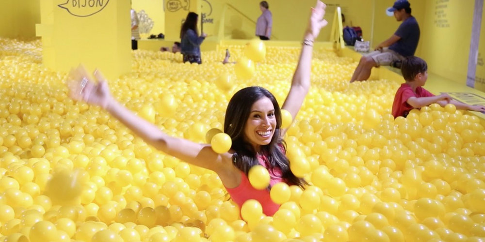
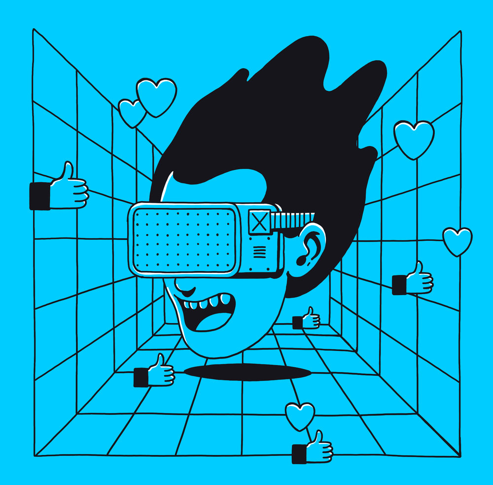
Slowly, physical spaces are being re-shaped in cities covered by wi-fi. Instagram is pushing restaurants to be colorful and irresistible to photographers. Augmented Reality is making mundane urban landscape something of your own. Hearts, laughs, and claps are taking over reality, giving the feedback and social confirmation we’ve gotten so used to expecting.
The Color Factory, in San Francisco, sets the stage for very likable Instagram shots (Source)
Expectations are changing fast.
Sorry to be the ones to break the news: but users expect the same level of immediacy from the product or service you are working on right now. Endless product backlogs and feature requests that never go live can hurt your brand and frustrate your audience. Businesses need to drastically change to deliver value for users earlier, faster, and more clearly.
These expectations also carry over across channels. If your company is on Snapchat, it has to update and respond to users in the rhythm of the platform. If your website has a chatbot, it needs to know when to transition users to a customer service rep to better serve them.
In 2018, we have to step back and look at the full ecosystem that brands and users share, to define how the business can still be relevant in a world ruled and disrupted by immediacy. Anthropologists, ethnographers, and service thinkers have been researching these behavioral trends for some time. As a designer, how will you incorporate that thinking into the product you are working on right now?
2017 was the year of sexism scandals in the Silicon Valley. The year engineers published out outrageous memos on how women are simply not biologically shaped to code. The year the world started to pay attention to the importance of empathy in business and beyond.
Luckily, UX Designers are trained to design with empathy in mind. The whole reason why User-Centered Design exists as a discipline is that the audience of a product is inherently different than the designer who created it. They have different ages, genders, religious beliefs, cultural backgrounds, political views, They come from different cities or countries, But most importantly: they think differently than you.
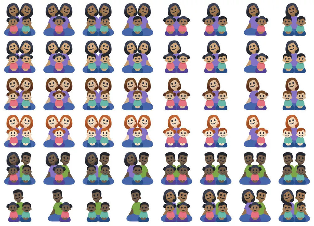
When you don’t close that gap, you end up designing Snapchat filters that stereotype Asians, or a set of emojis that don’t include interracial families, or the Chinese man in New Zealand who couldn’t have his passport photo recognized in the online system because “subject eyes are closed”.
Facebook's family emojis forgets to consider interracial families (Source)
There are two broad strategies you can use to close that gap:
You can reduce the gap, by incorporating user research methodologies into your design process. This allows the team to find out, ahead of time, if a particular feature in your product is not working for a certain audience segment (e.g. testing the Snapchat filter mentioned above with the right users before launch would have saved the company leadership a lot of trouble).
You can prevent the gap, by hiring a diverse design team. This doesn’t eliminate the need for user research, but having a plural team can help ensure different perspectives are taken into consideration. A designer with an interracial or mixed background would have raised their hand when reviewing the set of emojis above.
We have written quite a lot about Diversity in Design at uxdesign.cc in 2017. Actually, we stopped all publications for an entire month to focus on articles that explore how to bring Diversity to Design, and how to use Design for Inclusion – featuring the work and vision of really smart people and organizations like Timothy Hykes, Ladies That UX, Jen Heazlewood, Rachel Tomas and Sabrina Fonseca.
In 2017, forward-thinking companies started to take more tangible action toward more inclusive teams, processes and methodologies: Airbnb launched a toolkit for designing inclusive experiences, Microsoft announced a framework for Inclusiveness in Design – and there are tons of bottom-up initiatives emerging from the community itself, like Dreamer Stories showcasing beautiful portraits (illustrated by Pablo Stanley) of young Americans recipients of DACA.
Let’s make 2018 the year when diversity and inclusion stop being only a topic at design conferences, buzzwords on a slide, or a box to be checked by HR, to becoming actionable within design companies and teams everywhere. What are you doing about it, today?

We have been hearing about the term microcopy for some time – a few years, maybe. But 2017 was the year the design industry has finally awaken not only to the importance of choosing the right words when crafting interfaces, but also how the experiences we design are part of a broader, more holistic narrative.
Browsing a well-crafted interface is like reading a great story. Which means that every designer is a storyteller — whether they are designing a landing page, a product page, a signup form, or a chatbot conversation.
When you design a page, you are essentially telling a story to your audience. Forget modules, column grids, iconography, colors for a second, and think about the core of what you are trying to communicate. What if, before jumping into a design software to start wireframing, you created simple story outlines using a text editor?
The popularity of conversational interfaces amongst designers and developers has also raised a lot of awareness to the importance of copywriting for the user experience. Chatbots, for example, are experiences that rely almost entirely on a word exchange between user and machine; every word has to be carefully selected, to make sure people know how to interact naturally with the bot.
And the reality is that an increasing number of users are consuming your content in a design-agnostic fashion – whether they are using a screen reader, the reader mode in a certain browser, subscribing to your content via an RSS feed or newsletter, or even viewing your site via Google AMP.
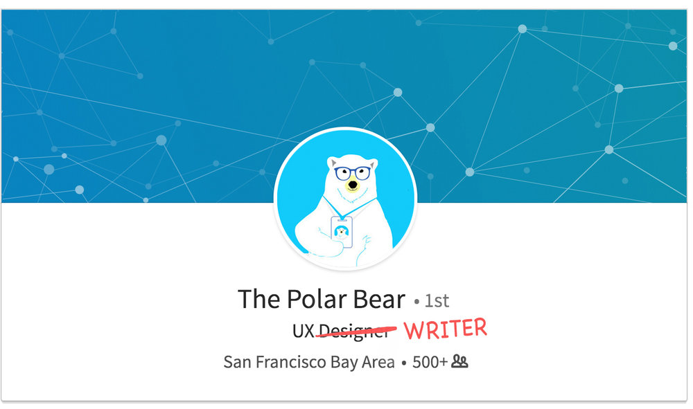
2017 was the year of unseen collaboration between UX Designers and Copywriters. The cross-pollination between UX and copy tends to grow in 2018, as the term “UX writing” starts to be used to describe not only a technique, but also job titles within design companies.
In 2017 we started seeing more and more UX Writers in our industry.
As a designer, how can you incorporate more sophisticated storytelling techniques into the experiences you create? In the end of the day, what is your design really trying to say?



Illustrated by Fernando Bittar
When the smartphone breakthrough happened a decade ago, UX design was at the spotlight for software and hardware; it was all about reimagining the traditional desktop experience into a new interface, form factor, and behavior.
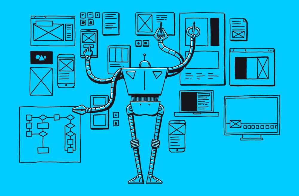
In the next decade, UX designers will have a more secondary, humble role. With artificial intelligence, virtual reality, blockchain, chatbots and other emerging technologies, visual interfaces are no longer the focus. The value we add is not just on how polished they look; it is bringing and sharing our toolbox and process to help businesses create healthy, sustainable ecosystems and narratives.
None of this should be new, though. As UX designers, our brains have been shaped to see the world in a systematic, non-linear way.
We see patterns everywhere. We understand structures. We create frameworks. We test, iterate, and test again.
This architectural thinking can be used in many more exciting ways than sketching out sitemaps or doing card-sorting to organize an app’s menu. It can go way beyond digital UI.
What if we applied this same systematic thinking to our company’s org chart? What if we applied user-centered design principles to the meetings we run everyday? What if we applied our user research abilities to understand what other teams in our company want and need?
In the process of adapting to the behaviors of a predominantly millennial workforce, companies have become much more open to listening to feedback from employees – and to completely reimagining their process in some cases. In fact, the work skills for the postnormal era go way beyond professionalism and dependability; companies expect employees to speak up and help design, collaboratively, their own process.
Quick break to celebrate the most popular stock photo of 2017 ☝️☝️☝️
This trend becomes even stronger when it comes to UX. Formulaic design processes are less and less capable of accommodating the complexity of the products we design. Question your process. Design your process first, before designing your product. In 2018, how can we apply our design tools and skills to create better experiences not only for our users, but also our teams and colleagues?
Prototyping is the most tangible way to share an idea with the team, to gather feedback from users, and to raise new questions or solutions for the problem you are trying to solve.
Every week in our newsletter we feature many new tools and plugins that make prototyping easier for designers. Just pick your flavor; there’s a tool for every type of project and every type of designer.
However, design is a collaborative process that starts way before prototyping and continues way beyond it. In 2017 we saw a shift from an extreme focus and interest in prototyping tools, to a new set of tools that consider the design process more holistically:
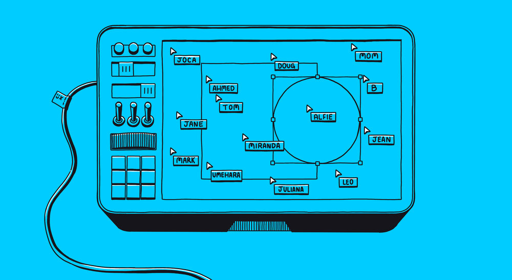
Rather than passively watching someone sharing their screen, live tools allow everyone to take a turn sketching and participating in the discussion. Real-time collaboration removes time-consuming barriers that came with formalities and closed iteration cycles. This is especially valuable for remote teams. Google Docs was the first remarkable one, Freehand by Invision and Figma are well-known by the designers, but there are other players like Mural.co, Stickies.io, Pixelboard, and even Slack with its new screen share features.
Figma's real-time collaboration features. Source.
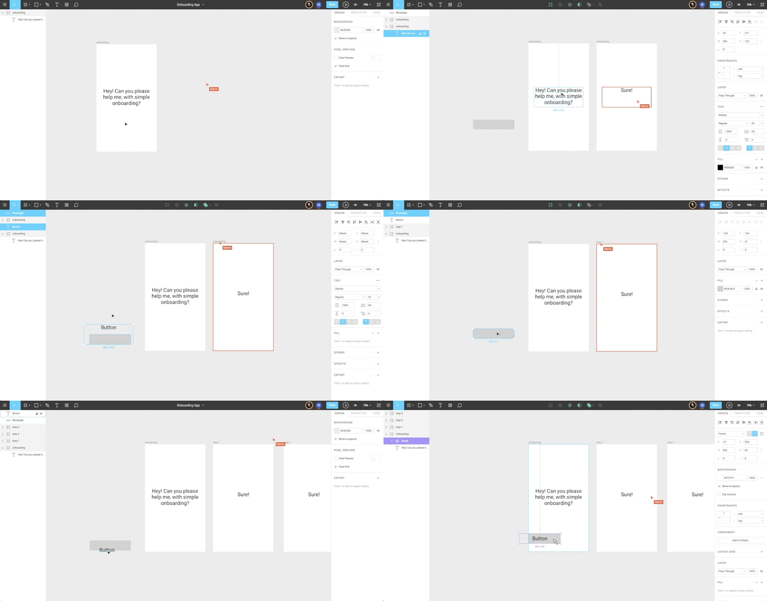
As we learned from our dev friends, git can be a great system to keep our work open to ideas and explorations at the same time we track changes and don't have to figure out what the heck is in final_alt_v02_04.sketch. Folio, Abstract, Kactus, and Plant are leading this front, but we expect to see more tools solving this problem next year.
Abstract vs Kactus vs Plant: the gold rush for version control. (Source)
Collaboration goes beyond live sketching and file management. The most significant opportunity is in sharing knowledge and results from research, discovery, and workshops. We collect so many insights from users that we can't let them die in a Google Doc somewhere. Creating a repository with the learnings from a project and making it accessible to all is a big challenge and opportunity in 2018. WeWork is sharing research data internally with Polaris; Milanote lets you create boards to organize anything; but a robust research tool to collect and share data among the team is still needed, more than a yet another Sketch plugin.
These are just some of the tools that have been growing in popularity recently – but there are tons of opportunities in that space. If you are looking for a side project in 2018, what about exploring new ways to improve collaboration, knowledge sharing, and communication within your team?
Illustrated by Fernando Bittar
Less than a decade ago, branding style guides used to be a colossal PDF covering multiple visual aspects of a brand, such as typography, colors, and photography. When digital came about, style guides started to account for pixel-based touchpoints between brand and consumer, including things like header styles, grid systems, and more detailed interaction design patterns. Over the years, they have continuously evolved. Static PDFs were not appropriate for representing hover states, animations, drags and drops, and other user interactions anymore.
Brands are becoming more fluid; they don't need to have a single color or a single form anymore. (Source)
In the past couple years, we started creating living design systems, covering interface behaviors that can only be represented in real code – such as motion, responsiveness, transitions and accessibility features.
Interfaces are gradually becoming invisible as we move toward a world of Zero UI. Screens will start to go away, and interactions will primarily happen via voice, gestures, glances, or even by thought. Branding means a lot more than just visuals these days.
In 2018 we expect to see branding taking other forms, in particular:
Voice. Google Assistant’s tone of voice, timbre, speech cadence, all had to be designed – as much as Google’s logo, brand colors, or screen-based interaction patterns used in its sites and apps. The experiences we design are quickly expanding to voice-based channels, and we have to make sure they feel like coming from the same brand.
Personality. With the growth of chatbots and other text-based interfaces, the words chosen by a brand have a huge impact on how people perceive and interact with the company. The concept of tone of voice has expanded to include other aspects of a brand’s behavior and personality, from the jokes it makes to the emojis it uses.
Action. When Airbnb decides to ban alt-right users from its platform who were organizing an extremist rally in Charlottesville, US, people admired the brand more. Same thing when it exempts service fees for people offering shelter after natural disasters. The actions a brand takes through its products will have more impact than the way it looks or what it communicates in mass media. Like any other type of branding, actions taken by brands have to be coherent and consistent with the brand’s beliefs, design principles, and mission in the world.
But wait, why would UX designers have to worry about branding?
As designers of experiences, we are frequently looking at the brand’s ecosystem holistically, to ensure its customers can frictionlessly transition from one channel to another. Whether you are accessing the brand’s website, downloading their app, watching a TV commercial or merely reading a story in the news, all these moments are adding up to the experience you have with a brand.
Now, more than ever, the efforts from the design team have to be orchestrated with the efforts from marketing, PR, customer service, and other groups within your organization. Our discipline can be the glue that connects these experiences, given our ability to look at journeys from the perspective of the user, regardless of the channel they are using.
Have you considered inviting your brand and marketing peers to your next design review?
Every year, as part of our State of UX report, we like to look back at how the design community is organizing itself and sharing content online.
Over the last two decades, designers all over the world have been leveraging trending platforms and tools to communicate with each other. IRC channels and email distribution lists were really popular in the 90s. Online forums and blogs took over in the early 2000s. Twitter and other social networks exploded closer to 2010. And more recently, we have seen a few channels dominating the hearts and minds of designers – including a comeback of online forums, the rise of Medium, and a few Slack groups focused on design.
Hoping in 2018 we use those channels to discuss more relevant topics than in 2017. Maybe notch.
In 2017 two new channels emerged and became quite popular among designers:
Our good old friend the-electronic-mail has made a comeback in 2017 and is not giving any signals of going away – at least when it comes to design and tech-related mailing lists. Every company has a newsletter. Every design blog has a newsletter. Every designer has a personal newsletter.
Emails are a more controlled alternative to the chaos of the web, and a lot of the newsletters we see (including our very own ux.email) focus on curating and organizing design links in a more digestible way.
Email opening rates rarely go beyond 20% in the design industry, though. Multiple monologues are happening simultaneously from inbox to inbox, and no one is listening. Doesn’t that go against our empathy principles, which we hold so dear?
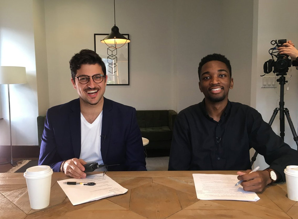
High Resolution was by far the most exciting piece of content created by and for the UX and Design community this year. Incredibly well crafted, with smart questions and pretty awesome hosts Jared Erondu and Bobby Ghoshal, the series featured 25 video interviews with terrific designers and thought leaders in our industry, and has set the bar high on video content about design.
High Resolution's hosts Bobby Ghoshal and Jared Erondu
But 2017 was also the year where a handful of design-related YouTube channels popped up (or were reactivated) and started sharing content in a more casual way. With video creation and distribution tools becoming more accessible, the content we see online will likely become even more cinematic in 2018 – bringing multiple perspectives to the table and making UX knowledge easier to absorb. Also, expect way more live streams in the coming year.
As content creation in UX evolves and grows, we should keep in mind the right balance between the energy spent creating the content vs. the value it adds to the community. Are we spending all this energy to genuinely give back to the community, or are doing it for the claps, likes, and for the visibility that it brings?
Illustrated by Fernando Bittar
As designers (and human beings) we have a natural curiosity to want to understand the potential and limits of a technology by pushing its boundaries and asking all the "what if…?" questions. After all, experimenting is a great way to understanding.
It’s a pattern that repeats itself now and then.
In 2018, every service we know will add the label "AI-powered" to it. An AI that creates bodega vending machines; AI that controls your meetings; AI that checks in on your kids for you; AI that replaces you at work. Oh, and an AI church as well.
And again, we are surfing on a buzzword without even knowing what it really means.
First and foremost: AI is not a new channel (like mobile, connected devices, or chatbots). AI is an aspirational term reflecting a vision, that can be executed in many different ways.
Calling everything AI does a disservice to our industry. Designers pretend they know what AI is and how it works, and start using the term almost as a band-aid, when all they are trying to say is “a smart algorithm”. The term “intelligence” itself presents the technology as a monolithic, all-or-nothing endeavor, benchmarked against a human – which might not be the right way to start.
Before attaching the term “AI” to your product or feature idea, ask yourself:
How is this different than just a simple algorithm?
What exactly is this intelligence going to learn to do by itself?
What is the user need for this "AI" feature? Can it be solved in other ways?
What are three ways in which this intelligence will benefit users?
Do you really need to tell users the product is "powered by AI"?
If that’s the case, how can you communicate what "AI" is, with clarity, simplicity and trust?
How much visibility, transparency and control will you give users about how the AI operates?
What if this time around we leapfrogged to thinking about “why” we are creating these AI-powered services and what it really means for our users?
Product of the year:
(for leveraging the platform to provide relief after natural disasters)
Portfolio of the year:
(for balancing technical innovation with user-centered design)
Buzzword of the year:
UX writer of the year:
Book of the year:
Talk of the year:
We dedicate this project to all readers, authors, and friends of uxdesign.cc. Thanks to Fernando Bittar and Jackie Fok for making this possible.
