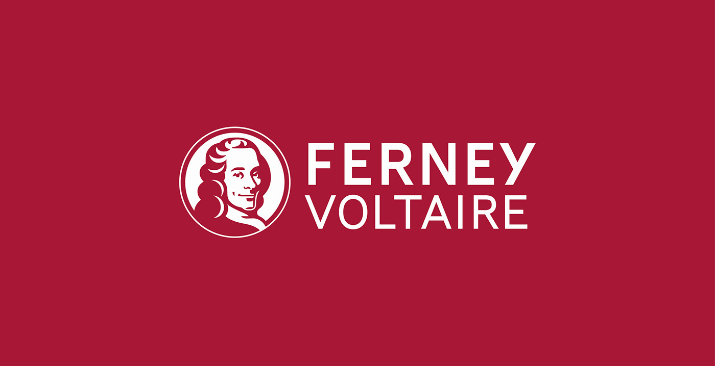
New visual identity for city of Ferney-Voltaire
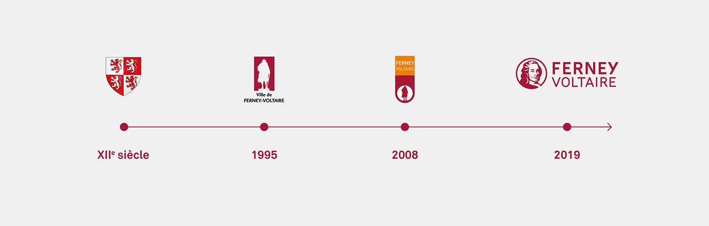
The city of Ferney Voltaire approached Graphéine for the redesign of its visual identity. The old graphic charter, had existed for 11 years and no longer reflected the dynamism of the city, located at the gates of Switzerland. The entire graphic charter and communication media have also been revised to make them easier to read.
The first challenge was to build a contemporary identity, in line with Ferney-Voltaire's demographic, economic and cultural growth. The Ferneysians are very attached to the history of the city, which was already depicted in the previous logo. They wanted to redesign their logo while preserving its heritage value.
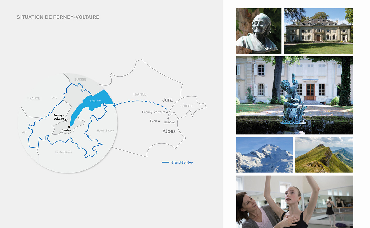
In 1758, the renowned Enlightenment philosopher, Voltaire moved to Ferney where he spent his last few years. During these years, the author contributed greatly to the improvement of the population's living conditions, transformed the city and developed its cultural dynamism. As a tribute to Voltaire's commitment, the city of Ferney was renamed Ferney-Voltaire.
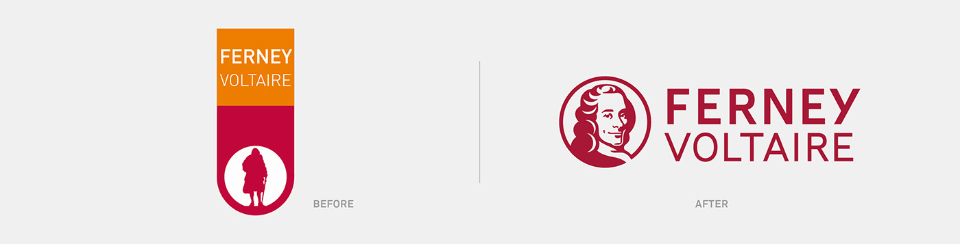
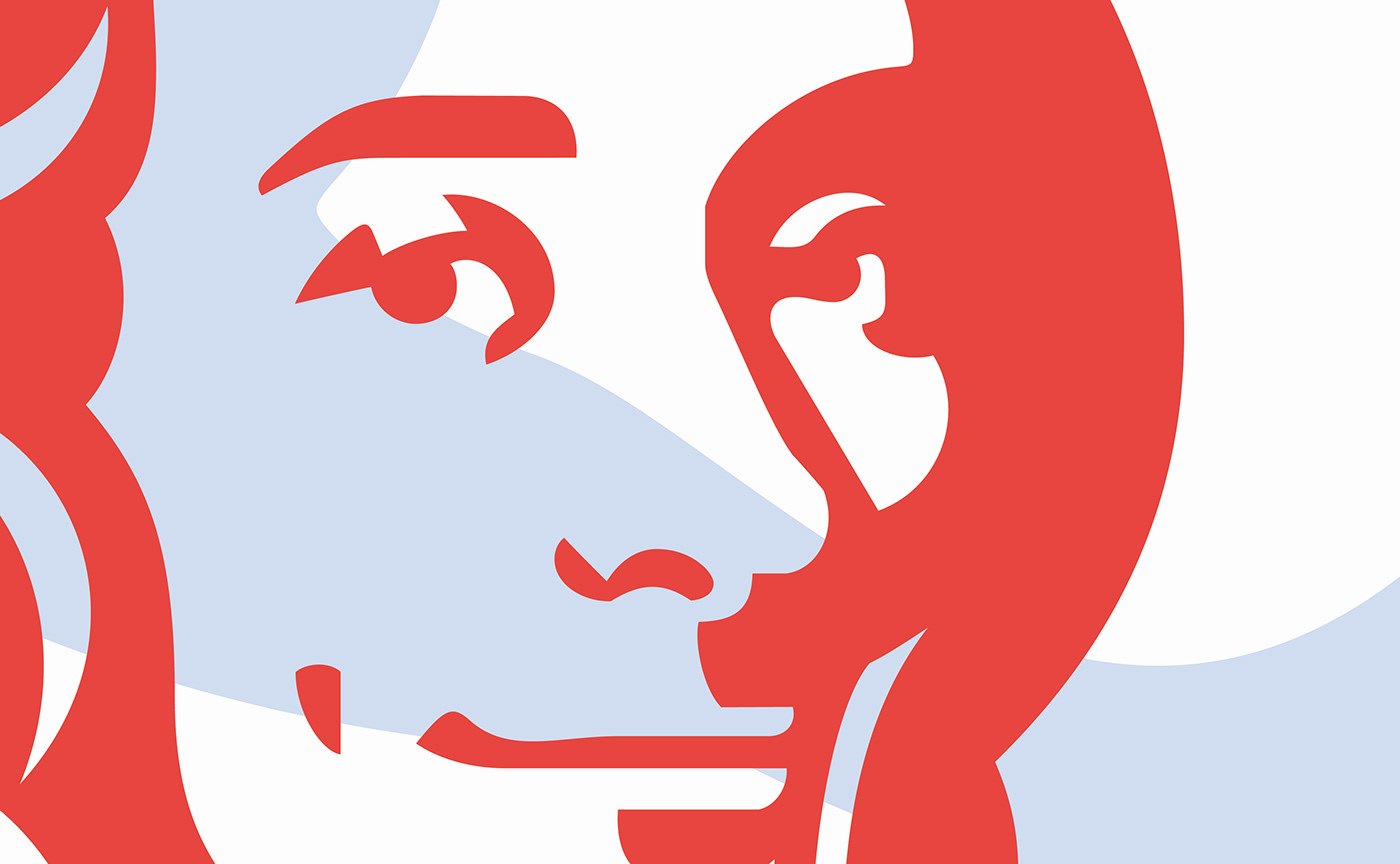
The old logo incorporated the benefactor's silhouette inspired by a statue of him located in the heart of the city. However, the back posture, bent and resting on a cane, showed an aging Voltaire, far from the desired modern image.
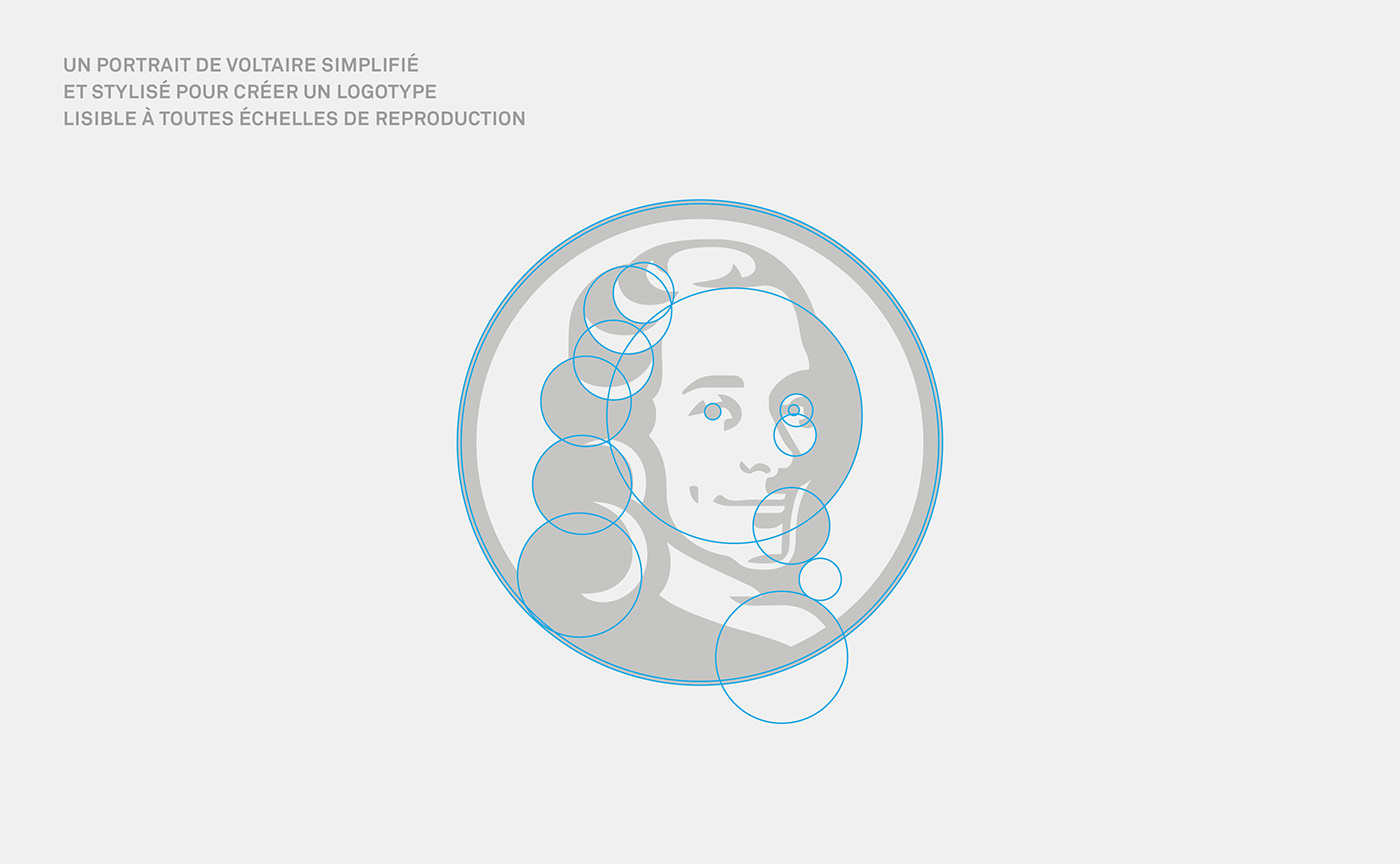
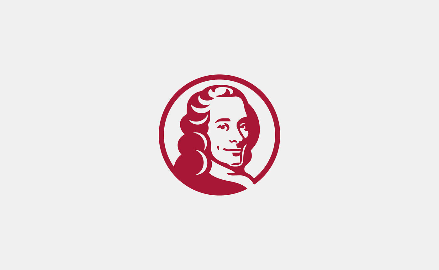
Our redesign work was built around the idea of representing this emblematic figure in such a way that it would be easily recognizable, even by people not aware of the statue. But also, to give a more dynamic image, in accordance with the major projects of the territory.
Our redesign work was built around the idea of representing this emblematic figure in such a way that it would be easily recognizable, even by people not aware of the statue. But also, to give a more dynamic image, in accordance with the major projects of the territory.
A logo that rejuvenates Patriarch Voltaire's image
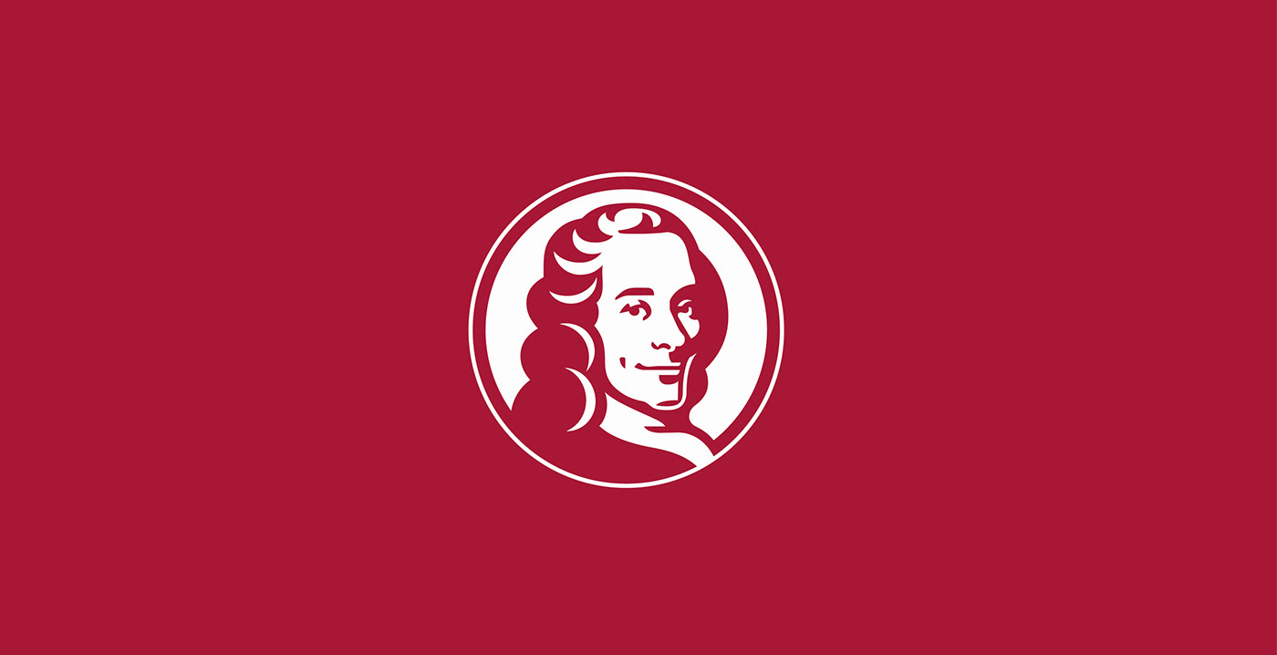
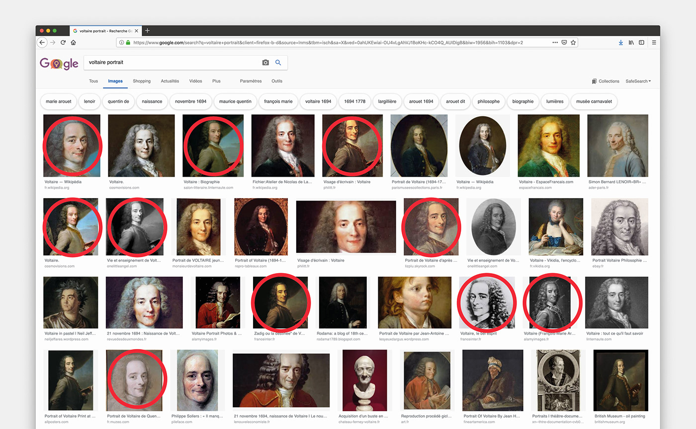
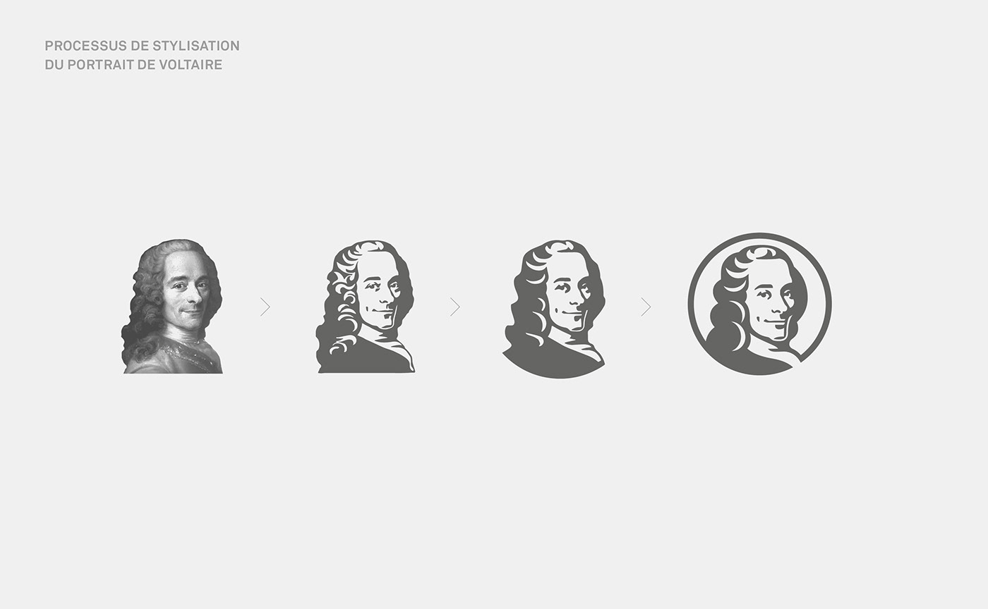
A portrait framing was chosen. A famous portrait of the young Voltaire painted in 1736 by Maurice Quentin de La Tour served as a model for the creation of the new emblem. A meticulous drawing work followed, which gradually simplified the portrait without compromising its recognizability.
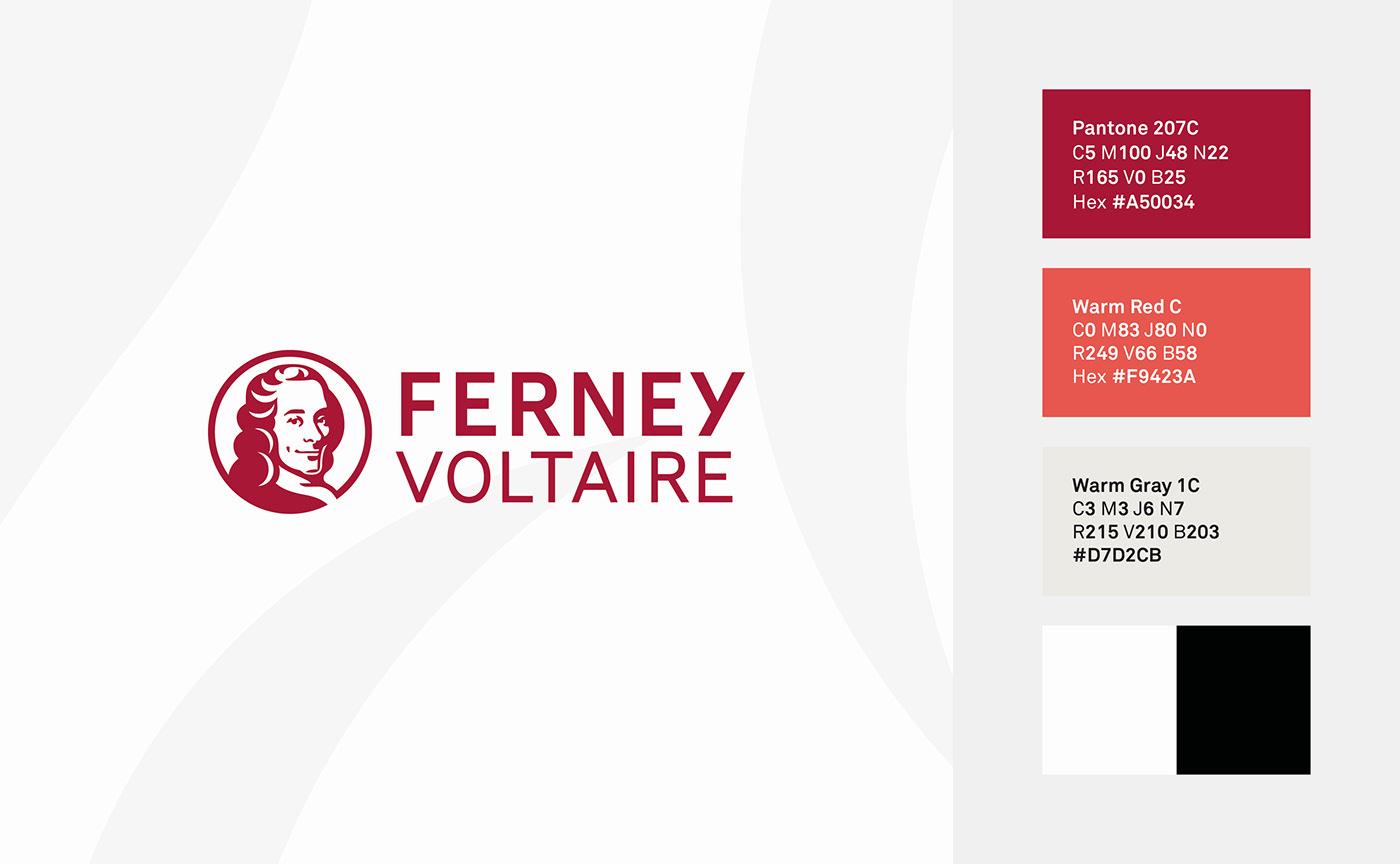
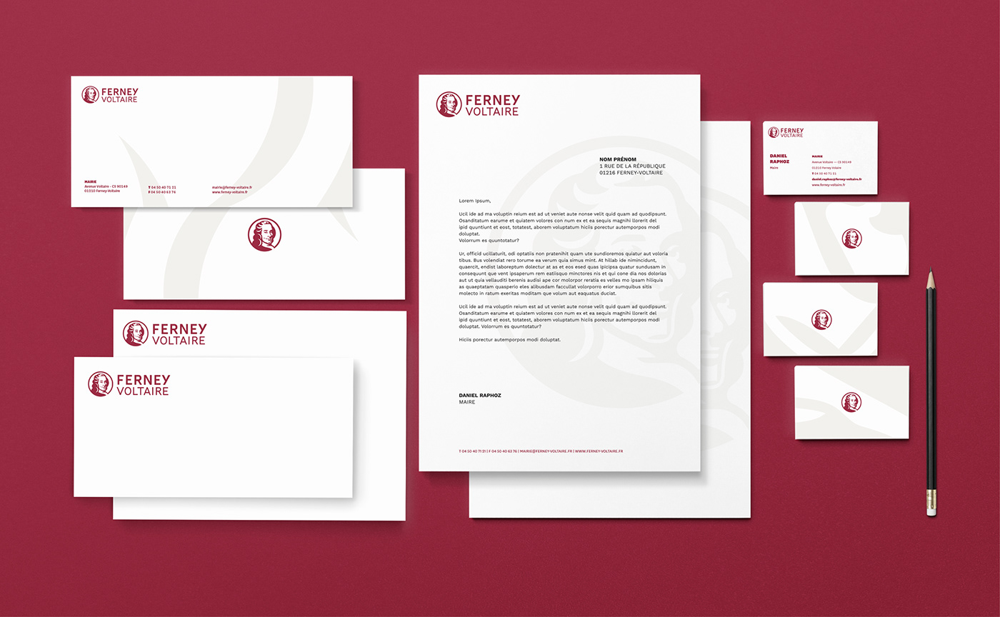
This emblem, inscribed in an open circle, gives the feeling of a seal marking the city. The opening of the circle, deliberately placed to line up with Voltaire's clothing, draws a path, symbolizing access to the character, to the city. A tribute reflecting the open-mindedness of the Age of Enlightenment.
This emblem, inscribed in an open circle, gives the feeling of a seal marking the city. The opening of the circle, deliberately placed to line up with Voltaire's clothing, draws a path, symbolizing access to the character, to the city. A tribute reflecting the open-mindedness of the Age of Enlightenment.
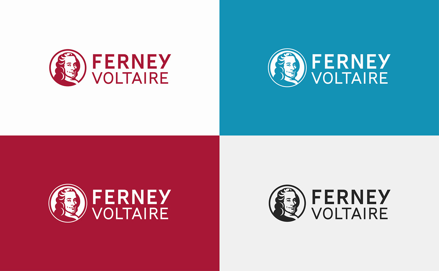
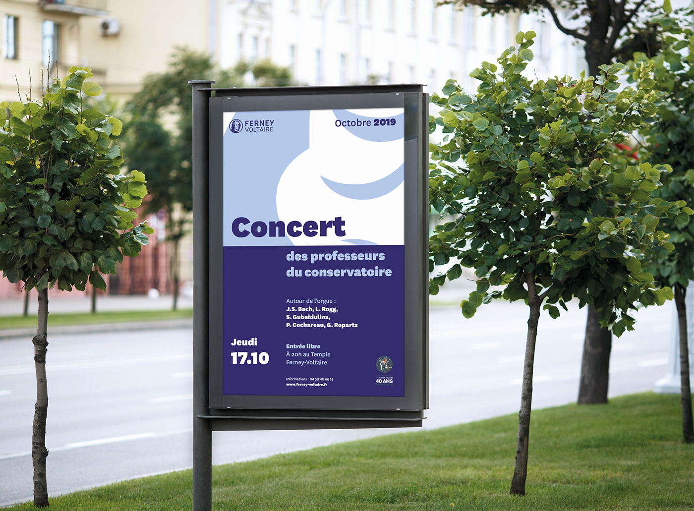
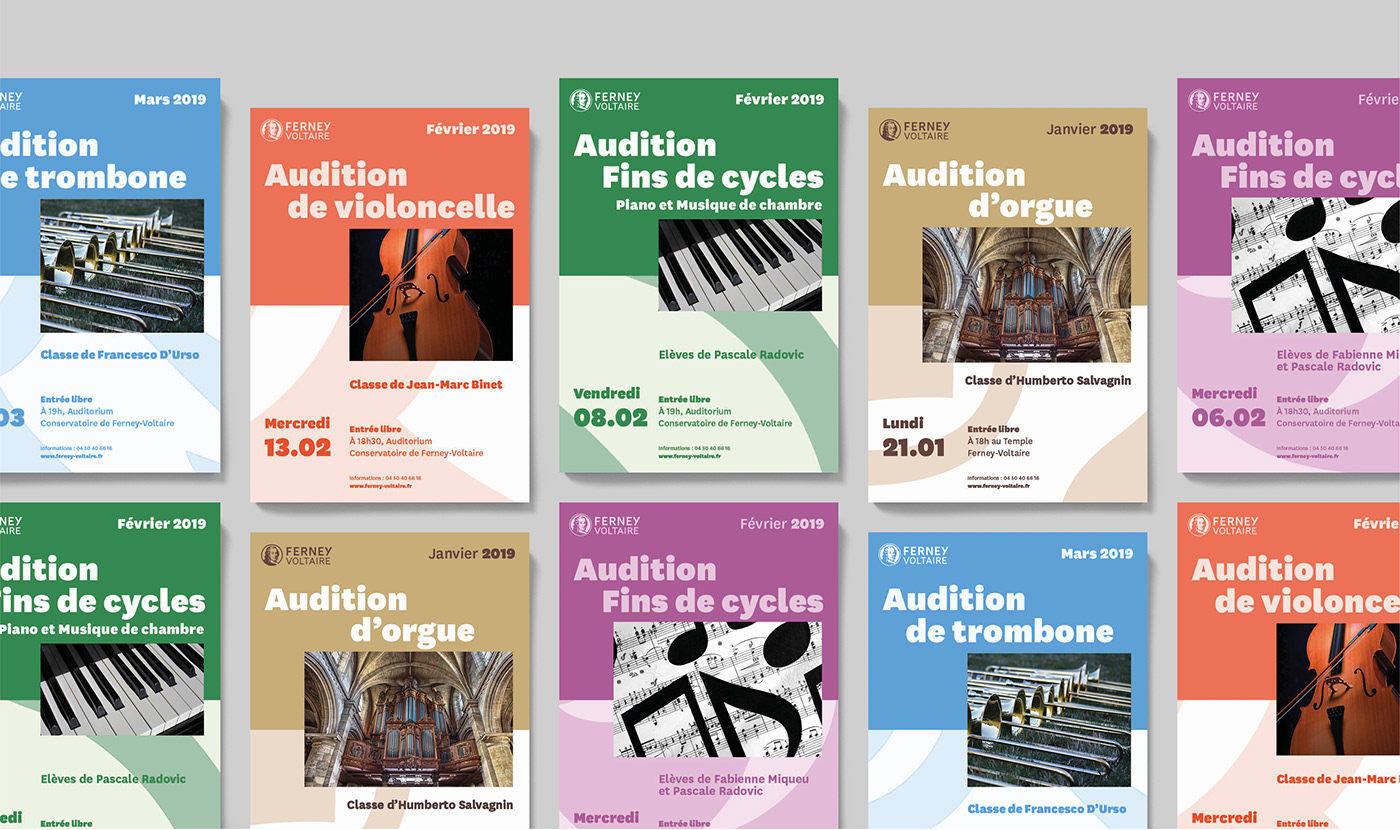
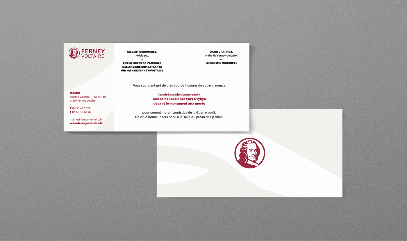
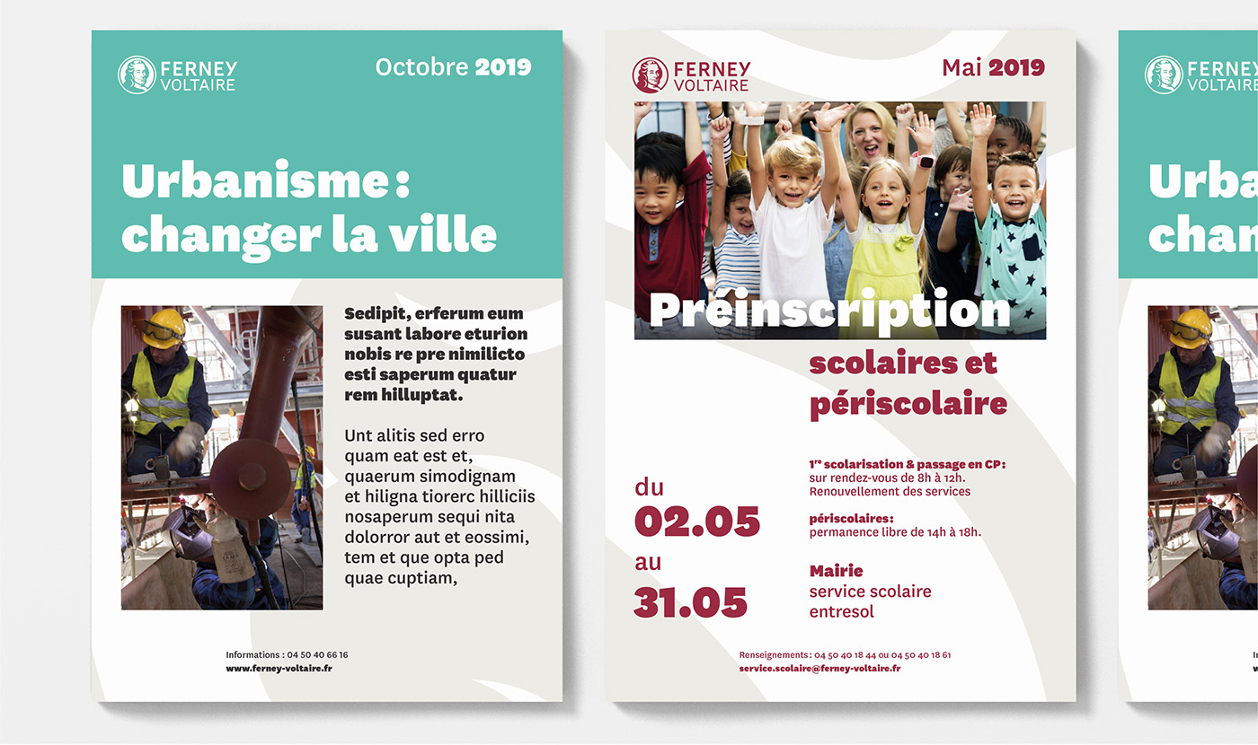
The logo keeps its red tint, a reminder of the natural colour of the clay extracted from the Ferneysian soil. The whole graphic charter is intended to be cheerful and colourful. As a city bordering Switzerland, the image attributed to Ferney-Voltaire is sometimes that of a dormitory city far from the richness of its heritage, its culture and activity.
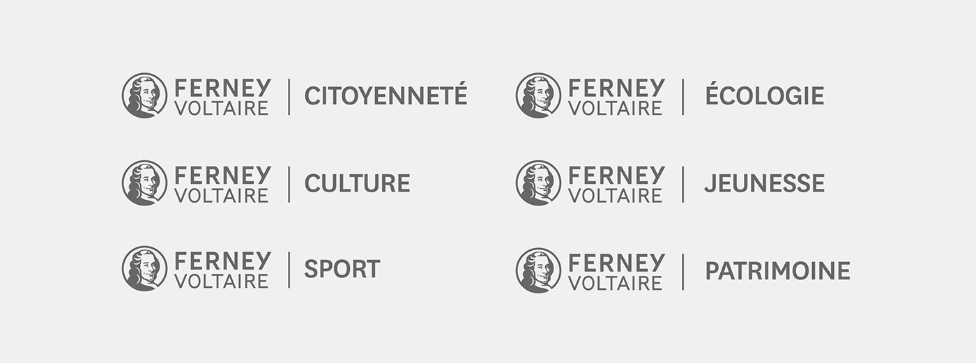
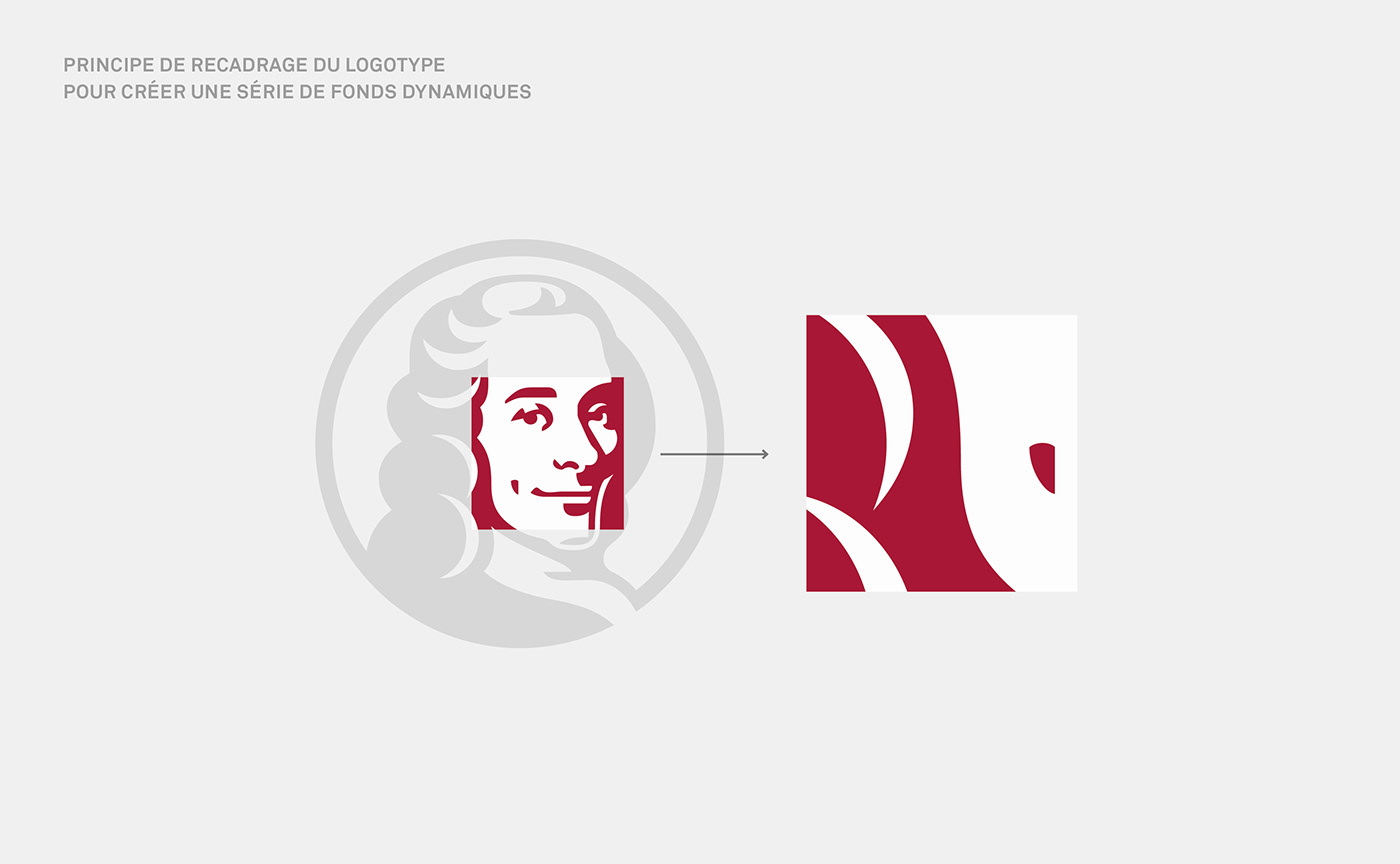
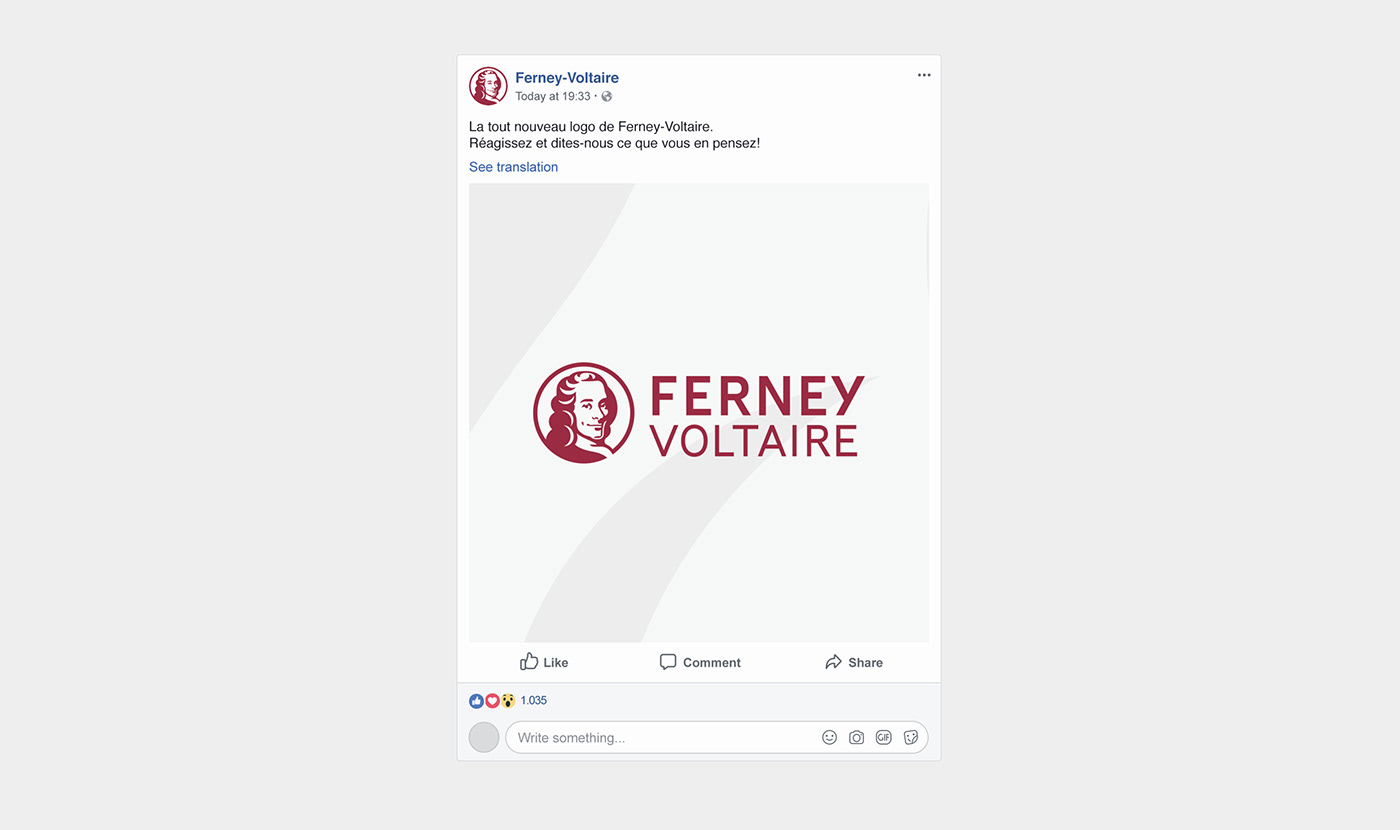
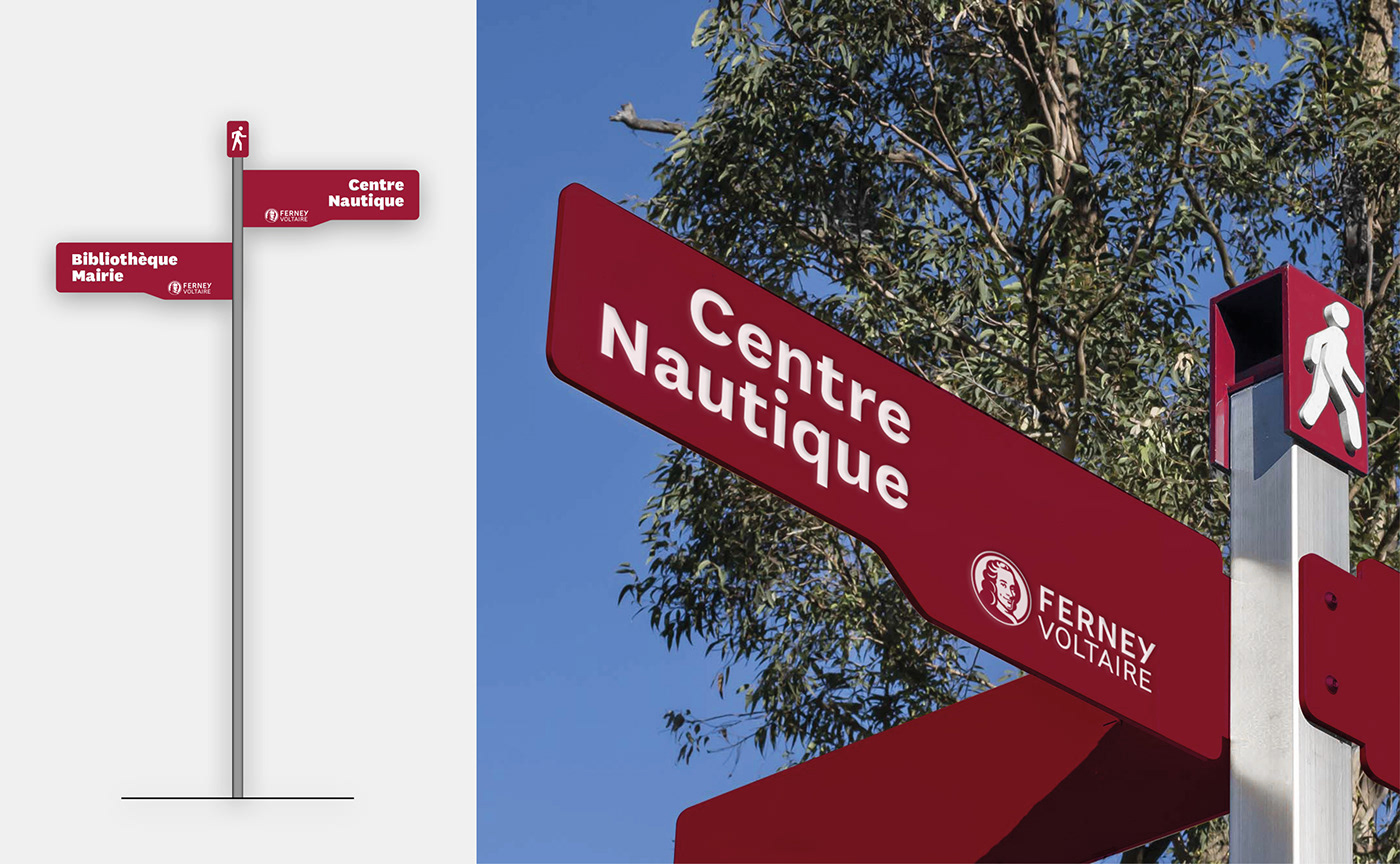
This new visual identity also solves the problems of adapting to digital media. The old version, placed in a rigid lockup, prevented a good readability across different communication channels. The creation of a horizontal version of the logo also makes it possible to extract the emblem and resolves the display challenges of all media.
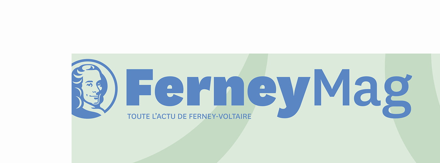
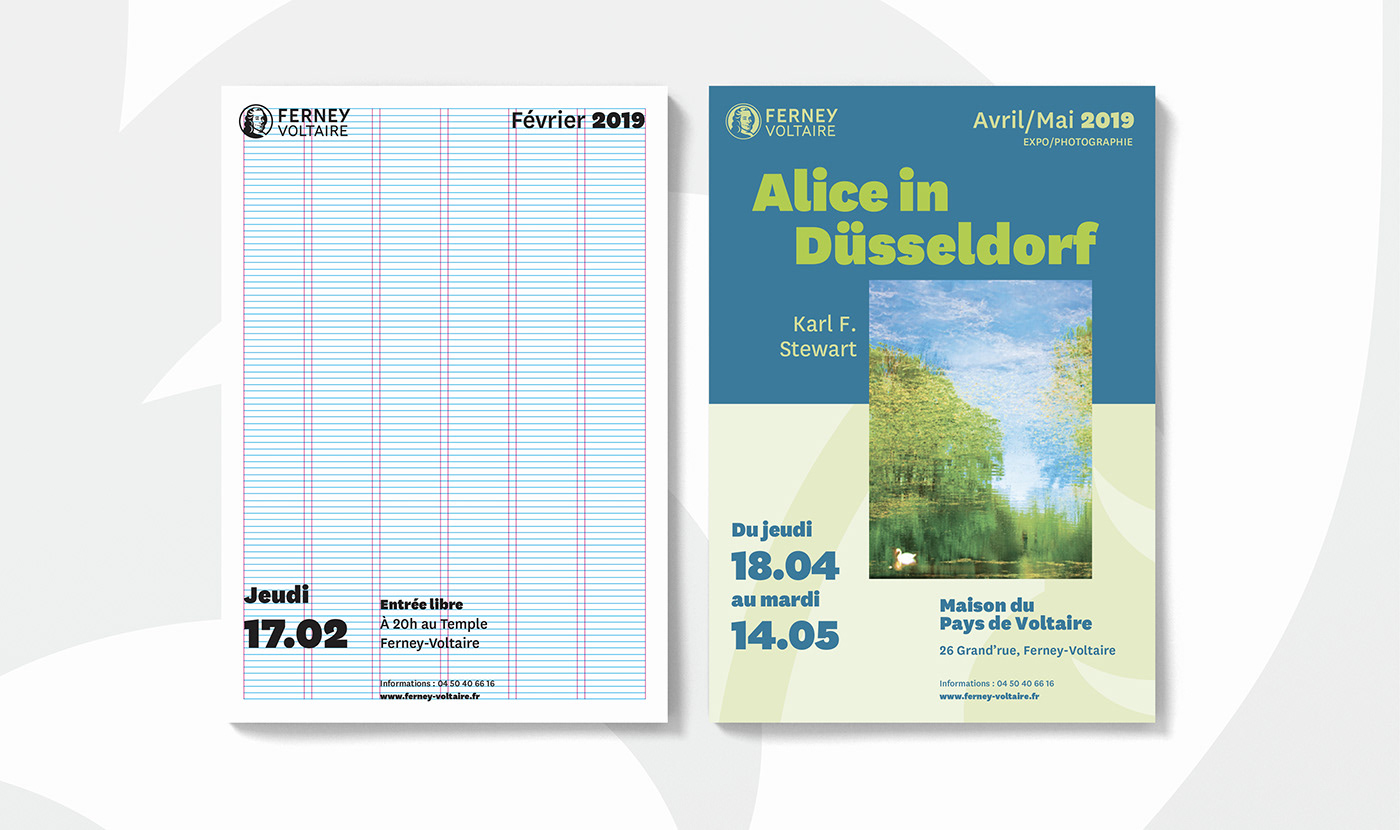
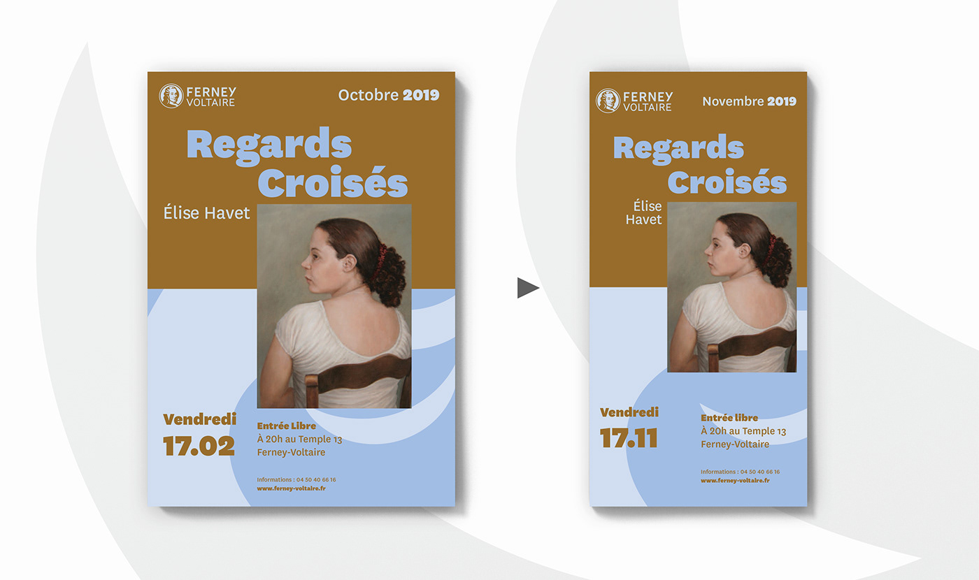
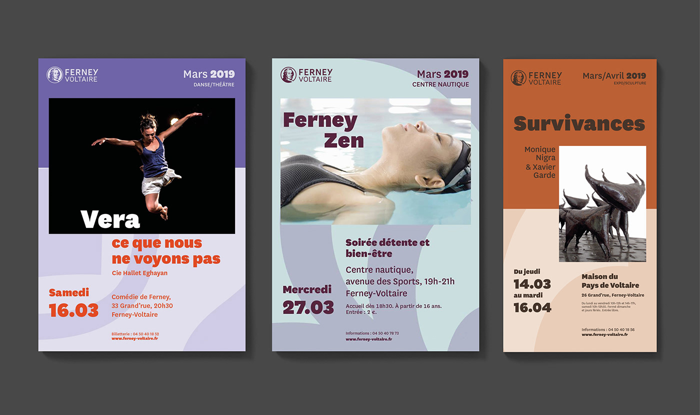
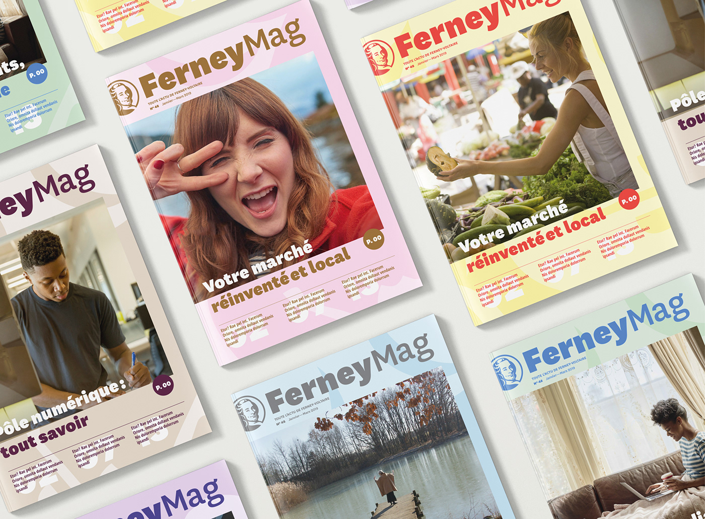
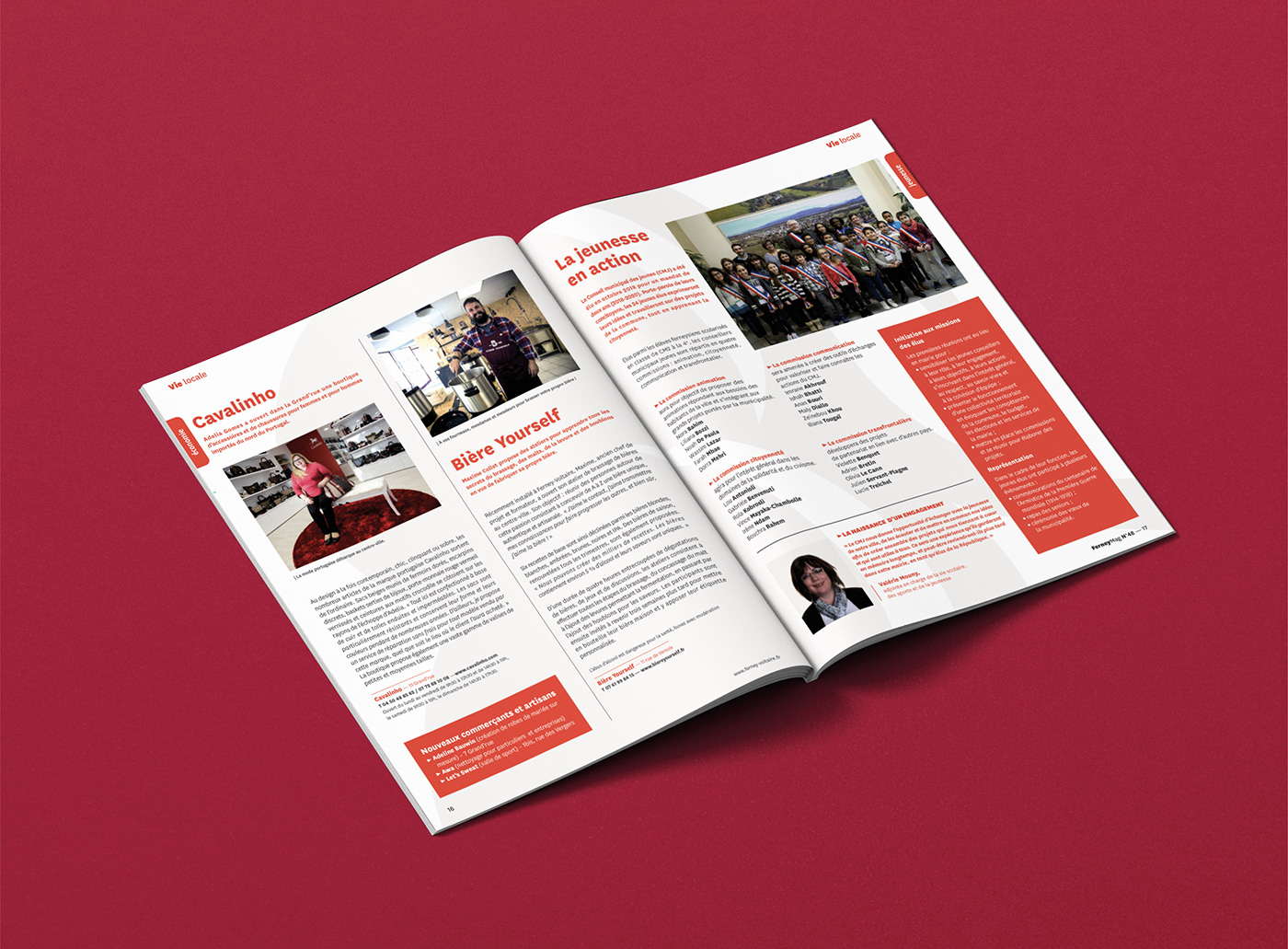
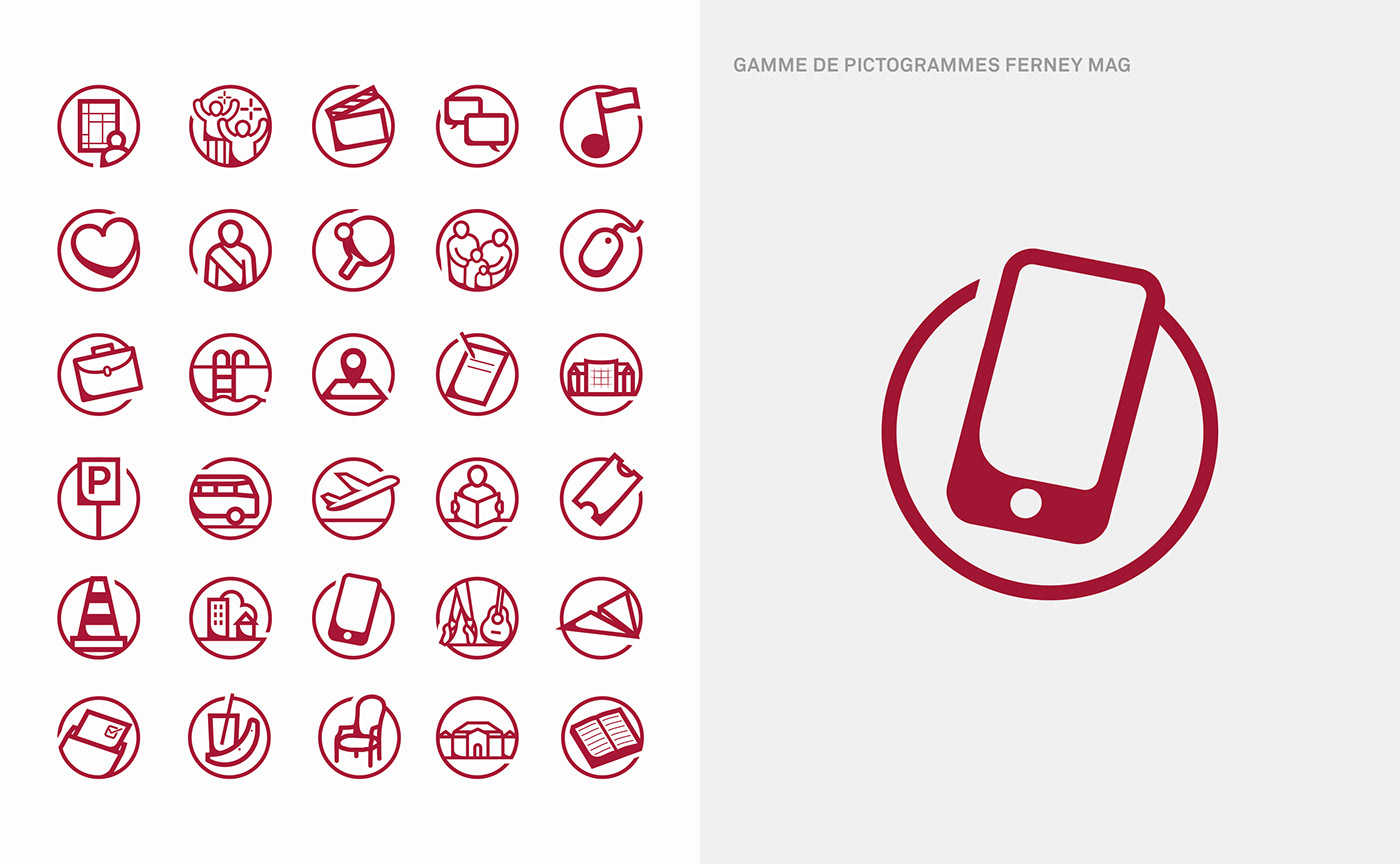
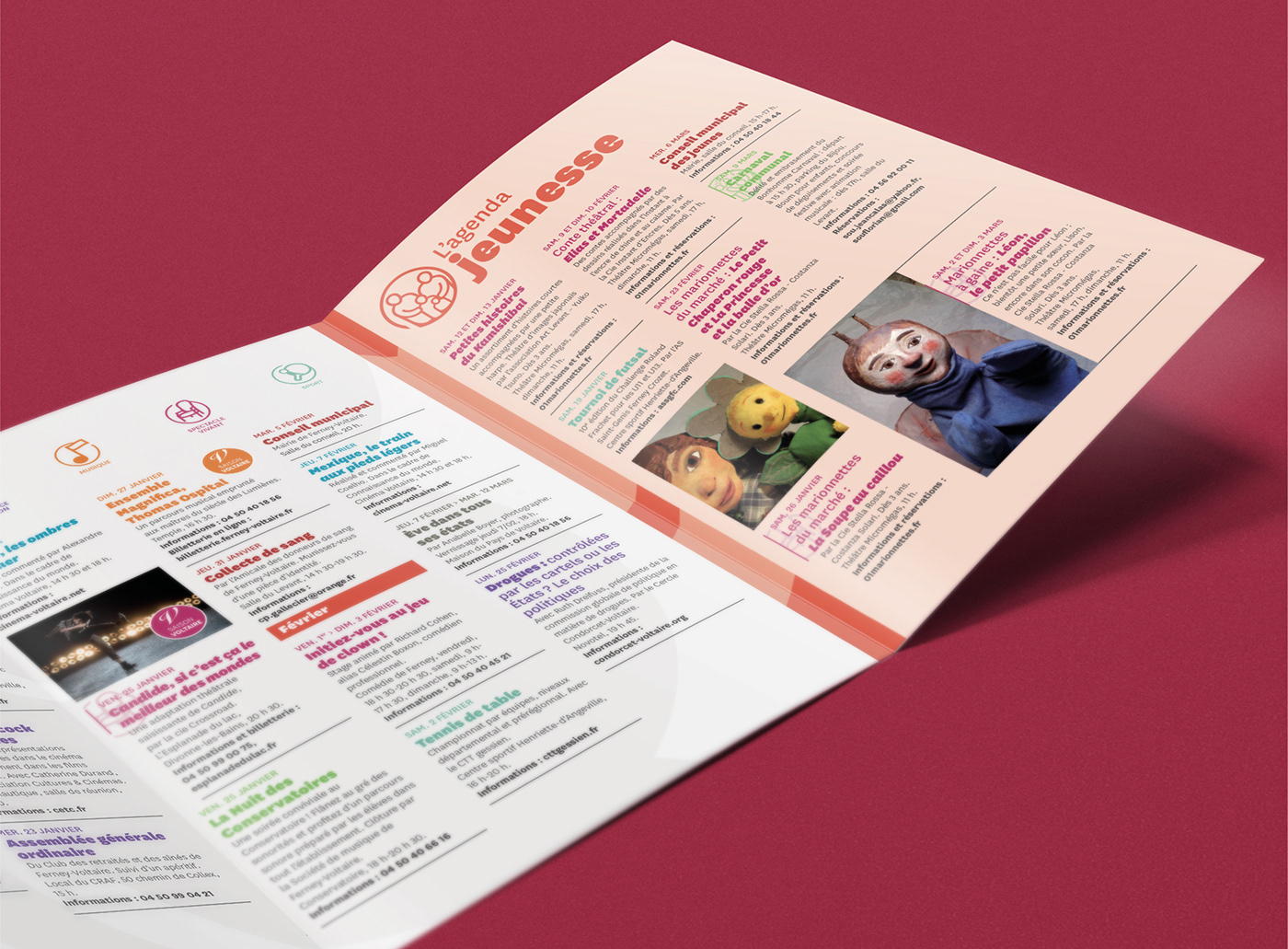
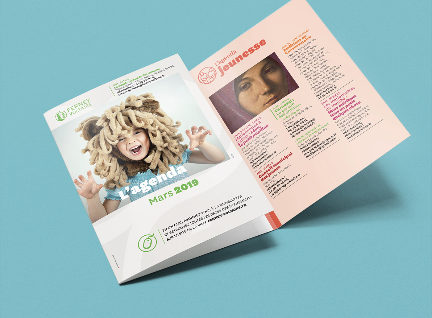
The design of the FerneyMag, the city's magazine, was also entrusted to us. This was the opportunity to propose a layout principle that plays on the reframing of the emblem and provides a rich and sparkling chromatic palette. This flexible palette adapts to the chromatic ambience of the front page photographs.


Learn more about this project:
Credits:
Creative & Art direction: Jérémie Fesson
Graphic design: Manon Moreau, Jean-Albert Heckel
Motion design: Ajitesh Lokhande
Project management: Leslie Darné
Creative & Art direction: Jérémie Fesson
Graphic design: Manon Moreau, Jean-Albert Heckel
Motion design: Ajitesh Lokhande
Project management: Leslie Darné