You are here

Scanner

  • Time to explore RISD’s abstract and playful typographic map

    To promote the RISD Grad show 2017, which took place this summer, the site is filled with Univers in a stunning and playful mode.
    By repeating information into digital infinity the typography of the site “presents an expansive range of fine art and design work by the 235 students completing master’s degrees at Rhode Island School of Design (RISD) this spring”. Bold and amazing the type experiment will keep you busy for ages.

    Enter the font-expanding universe of ultra talented people here.

    28Jul
  • #Fontgate: Microsoft’s Calibri Pakistani scandal is over

    The Twitter dubbed it as the major #Fontgate du jour. And it all started with a font that exposed Pakistani PM’s daughter in a major scandal as the court found that Mariam Nawaz Sharif fake font.
    “The daughter of Pakistan’s prime minister has become subject of ridicule in her home country after forensic experts cast doubts on documents central to her defence against corruption allegations” reports The Guardian.

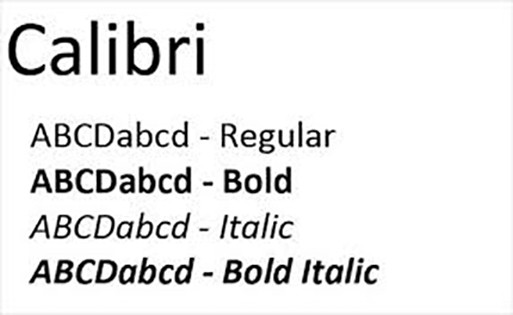
    “Mariam Nawaz Sharif is under supreme court investigation after the 2016 Panama Papers leak tied her to a purchase of high-end London property acquired through offshore companies in the British Virgin Islands. The unlikely source of this latest controversy, in a scandal that has gripped Pakistan for more than a year, is a font designed by Microsoft. Documents claiming that Mariam Nawaz Sharif was only a trustee of the companies that bought the London flats, are dated February 2006, and appear to be typed in Microsoft Calibri. But the font was only made commercially available in 2007, leading to suspicions that the documents are forged”.

    Inevitably the Twitteratis have derided Sharif for this apparent misstep, coining the hashtag #fontgate. As mentioned in Wikipedia, “the Calibri font was developed in 2004 but only reached the general public on 30 January 2007 with the launch of Microsoft Vista and Microsoft Office 2007."

    Opposition parties have urged prime minister Nawaz Sharif to step down after the investigation found a “significant disparity” between his family’s declared wealth and known sources of income with Imran Khan, the opposition leader, saying that Sharif had “lost all moral authority” and must resign immediately.

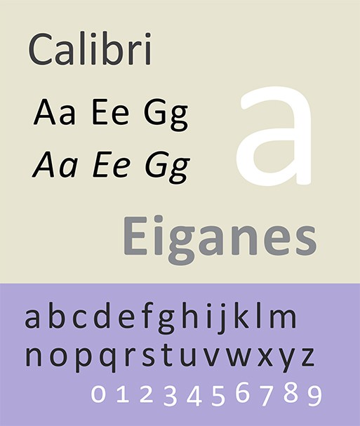
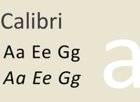
    Calibri, the renowned Microsoft font could be the key to unlocking whether or not Maryam Nawaz was involved in the scandal . As a result on July 12, Wikipediaadministrators voted to lock the article on Calibri after the joint investigation team report was released. “Calibri is a humanist sans-serif typeface family designed by Lucas de Groot in 2004 and reached the general public on January 30, 2007” writes the first line of the post.

    The font's creator, Dutch designer Lucas De Groot, told the AFP news agency in a statement that it was "unlikely" Calibri had been used in any official documents in 2006. "[In] my opinion the document in question was produced much later," he said.

    De Groot said he began designing Calibri in 2002 and sent the finalised version to Microsoft in 2004. After that, he said, it was used in beta versions that would have required "serious effort" to obtain.

    “#Calibri, a @Microsoft font that just made the biggest contribution to #Pakistan democracy” wrote a Twitter user.

    Calibri replaced Times New Roman as Word’s default typeface in 2007 and replaced Arial in Excel, Outlook, and Powerpoint. Calibri became the default font in Office for Mac 2016.

    The font was designed to work with Microsoft’s ClearType system, which is an application used to make text easier to read on LCD monitors. Cambria, Candara, Consolas, Constantia, and Corbel, are part of the same font family.

    "Pakistan’s Supreme Court ordered the removal of Prime Minister Nawaz Sharif from office over accusations of corruption" reports The New York Times. "Announced by the five-member Supreme Court, the verdict caps more than a year of high political drama, breathless court proceedings and a piercing investigation into the finances of the Sharif family." Obviously the verdict is not written in Calibri.

    26Jul
  • Dr Titus Nemeth dives into the Arabic typography evolution

    As the blurb says without any false modesty, this is the first in-depth account of the evolution of Arabic type in the twentieth century” writes Dr. Titus Nemeth on his book Arabic Type-Making in the Machine Age: The influence of Technology on the Form of Arabic Type 1908–1993, which is going to be published by the Dutch publisherBrill next month.

    “Crucially, it is the first comprehensive study of the subject that is based on original archival research, documenting a wealth of previously unpublished and largely unknown evidence about the evolution of this field. Taking the characteristics of various type-making and typesetting technologies as its starting point, Arabic Type-Making in the Machine Age seeks to understand how typographic forms emerged under the impetus of limitations and constraints of machinery. It narrates how the predominantly, Western manufacturers sought to provide typographic tools for the Arabic script, and investigates their various motivations, approaches, and solutions” he adds.

    Dr Titus Nemeth is an independent type designer and typographer with expertise in Arabic script culture. His internationally recognised practice spans commercial and cultural work, and his interests and activities extend to academic research and teaching in higher education.

    His original type designs have won multiple renowned awards and are widely used for complex cross-cultural visual communications. Titus holds a PhD in Typography & Graphic Communication from the University of Reading, UK, an MA in Typeface Design from the same institution, and a diploma in Graphic Design from Die Graphische in Vienna, Austria. He has taught type design and typography at schools in Austria, France, Morocco, Qatar and the UK. Titus is a member of the ATypI, the TDC New York, the typographische gesellschaft austria and Design Austria.

    Arabic is the third most widely used script in the world, and gave rise to one of the richest manuscript cultures of mankind. Its representation in type has engaged printers, engineers, businesses and designers since the 16th century, and today most digital devices render Arabic type. Yet the evolution of the printed form of Arabic, and its development from metal to pixels, has not been charted before.

    Arabic Type-Making in the Machine Age provides the first comprehensive account of this history using previously undocumented archival sources. In this richly illustrated volume, Titus Nemeth narrates the evolution of Arabic type under the influence of changing technologies from the perspective of a practitioner, combining historical research with applied design considerations.

    26Jul
  • Nate Harris’s graphic Spectrum skateboards are nostalgic and brilliant

    While others are investing in the digial technologyNate Harris brings his talent in full bloom with nostalgia and old-school inspiration. The Philadelphia based visual artist who has previously worked with Target, Saxbys, and Lotus incorporates, used skateboards into the printing technique for Spectrum.

    "There wasn't one specific influence for this graphic," he explains to the Creators. "It was more about the actual process. It's conceptual and ties back to skateboarding. I hope to have struck a good balance between having it be conceptual but not overly so."

    Inspired by “the type-heavy, iconic graphics of Zero Skateboards, who often opted for simple black-and-red colorways, as well as the design-heavy boards from Habitat, which often employed repeating patterns and iconography, rather than logo or character-based themes” Harris’s designs are a skateboarder’s object of desire.

    Check more here

    24Jul
  • “50 Books | 50 Covers” for 2016 just in by AIGA and Design Observer

    Book designers and publishers entered nearly 700 book and cover designs from more than 23 countries.

    The jury—consisting of Gail Anderson, Michael Carabetta, and Jessica Helfand — recognized submissions that successfully demonstrate design excellence in book and cover design.

    "AIGA and Design Observer are committed to finding the most effective means of bringing book design to the attention of designers and the public. Michael Carabetta, who has previously juried the competition, noted after a full day of reviewing entries that the final books selected were excellent 'not only in design—[but] in production; in paper, mixing coated and uncoated… People are getting into the real, physical qualities of the book.' Online, the selections become a part of a permanent, accessible, and historic collection of notable graphic design—the AIGA Design Archives—additionally, each piece is published on Design Observer.

    The books, which are exemplars of the craft and effect of good design, will become part of the AIGA collection at the Rare Book and Manuscript Library at Columbia University’s Butler Library and at at Yale University's Robert Haas Arts Library.

    Check the brilliant work here.

    20Jul