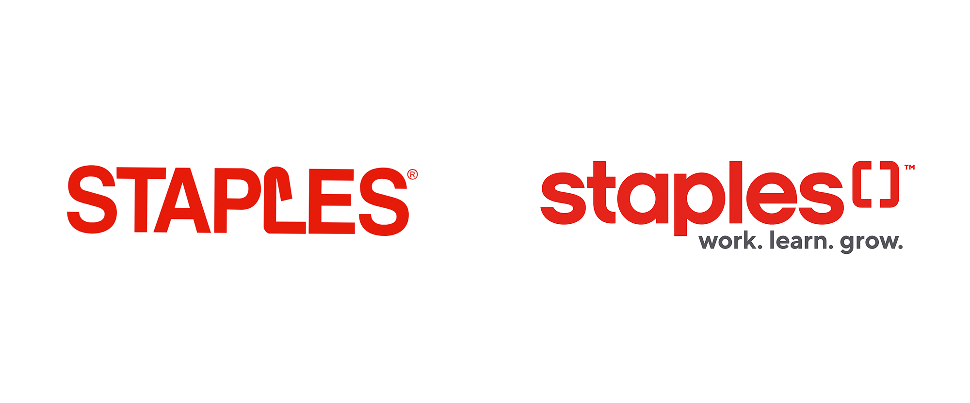
before
after
About
(Est. 1991) “Staples Canada Inc. (also known in Quebec as Bureau en Gros; formerly known as The Business Depot and later Staples Business Depot) is a Canadian office supply retail chain, part of the United States-based office supply company Staples Inc. The Canadian operation is headquartered in Richmond Hill, Ontario. Staples remains one of the most profitable office supply chains in Canada, with larger share than its main rival Grand & Toy. It is the largest supplier of office supplies to small businesses and home office workers, either in store, online or by catalogue, with over 300 stores and five delivery centers.” (Wikipedia)
Design by
N/A
Related links
Relevant quote
To officially mark this new day for Staples Canada, we’re sharing with you, a new identity, a new dynamic, future-focused brand. Our new brand identity starts with the logo you see below. We unfolded the ’staple’ from the current branding and introduced another staple to create a new icon that reflects the collaboration between you, our customers, and the 10,000 associates at our 300+ locations across the country. This symbol represents our desire to be your committed resource and sounding board, supporting your success and seeing you thrive.
Staples blog post
Images (opinion after)


Opinion
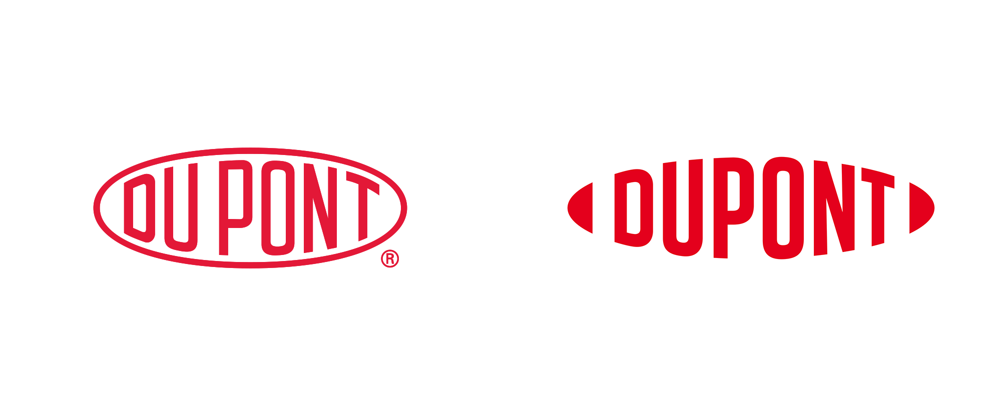
IMPORTANT: this change is for Staples in Canada ONLY. Is it possible it would apply to the U.S.? Sure. But that’s not the case at the moment. I have always liked the idea behind the Staples logo, of turning the “L” into a bent staple; the execution is harsh but it works. The new logo introduces a new staple to accompany the old one and opens them up, facing each other in the spirit of press-released collaboration. The icon has potential as a flexible device that can open up and expand to accommodate content — like Du Pont’s recent redesign — but on the logo there is something odd about it. It’s a hard graphic to use and I think I believe I may like it but I’m not entirely sure. The all lowercase wordmark is fine, I guess. I wouldn’t have minded an initial uppercase “S” in the name, not to mention proper capitals on the tagline. Overall, I think this has plenty of potential and if you think of how hard it is to come up with minimal icons in modern times, evocative of the company name, this is quite commendable.
Thanks to Oliver Oike for the tip.

Comments