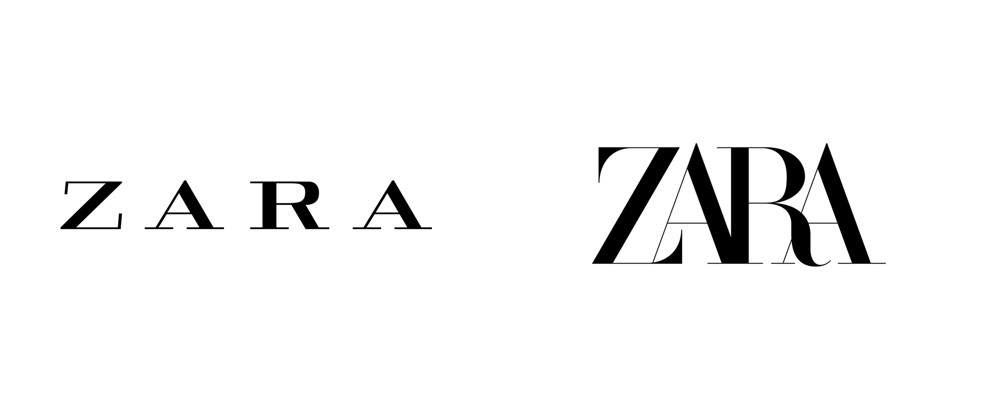
before
after
About
(Est. 1975) “Zara is a Spanish fast fashion (clothing and accessories) retailer based in Arteixo (A Coruña) in Galicia. The company was founded in 1975 by Amancio Ortega and Rosalía Mera. It is the main brand of the Inditex group, the world’s largest apparel retailer. Zara as of 2017 manages up to 20 clothing collections a year.” It has 7,475 stores in 97 global markets.
Design by
Baron & Baron (New York, NY)
Related links
Images (opinion after)

Opinion
The old logo was okay and it had a bit of an odd/off character that matched well how Zara sometimes brings in high-fashion flourishes to some of its products. Its loose spacing was perhaps too loose… which is the most distinctive difference with the new logo that has gone tight, tight, tight with a high-contrast Didone. The effect is a little disconcerting at first but the letters join and intersect in and at the right places… I especially like the “RA” combination. When this gets embroidered on a label it might be a hot mess as those thin lines will be hard to maintain and the counterspaces will fill in but, at least for now, digitally, it looks crisp. The one small detail that bothers me is how much the “A”s extend on the top… most “A”s will usually shoot up a little above the X-height but here they stand out a little too much. Overall, given the trend of fashion logos, let’s mostly appreciate that Zara didn’t change to an uppercase deadpan sans serif and instead doubled down on something more unique and (even though I hate this word) disruptive for today’s aesthetic trends.
Thanks to Alex Tass for the tip.


Comments