
Campari looks to Milanese architecture for its new brand identity
Robilant reduced the label size to allow the drink’s “unique red colour to emerge”, and emphasised the founder’s signature and Milanese roots.
Milan-based branding studio Robilant has designed the new brand identity and packaging for Campari, paying homage to Milanese architecture with a grooved canneté bottle and “a late Deco decorative theme”.
The project is result of a long collaboration between Robilant and Campari. In recent years the studio has rebranded some of the company’s other products, such as Campari Soda in 2020.

Robilant creative director Fabio Molinaro says that Campari has always had a “strong memorable identity, full of allure and charm”, which can sometimes lead to a resistance to change. Despite this, he says the Italian aperitivo brand was keen to push forward with “passion and courage”, enabling it to “keep the premiumness of the brand against competitors who are trying to get the same level”.
To find the balance between respecting its history and preparing it for the future, Robilant looked to Milan which is the birthplace of the brand founder Davide Campari. The bottle design is structured to create “a perfect and meaningful match with the city”, according to Molinaro.
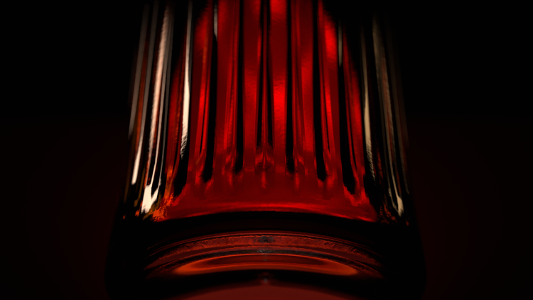
The bottle has been embossed with a ribbed canneté design, defined by a series of narrow parallel grooves. As well as enhancing its “slender and authoritative” look to improve shelf presence, Molinaro says it subtly references Milanese architecture, including “a stylistic feature present in the Galleria Vittorio Emanuele II and among the architectural furnishings of the Camparino bar”.

Campari’s new identity is first visible on the label, which has been reduced in size “to allow Campari’s bright and unique red colour to emerge”, Molinaro explains. It seeks to spotlight the Campari Milano brand by elevating the founder’s signature, indicating “craftsmanship and authoritativeness”, he adds.
Just as Milanese courtyards are often hidden behind “elegant austere facades”, Molinaro says the “compositional depth of the label can only be perceived with a close and sensitive look”.

For the new typeface and overall brand structure, Robilant sought to invoke a fashion brand aesthetic. “The idea was to create a new griffe (Italian for label) for the brand Davide Campari Milano”, says Molinaro.
The brand colour palette has also undergone changes to make it more premium and modern. Molinaro describes the new blue as “more elegant” and the touches of gold as “colder and more modern”, adding that the latter hue is actually a mix of gold and silver.

The new identity lives makes it possible to “give shape and substance to its refined cosmopolitan attitude” on brand touchpoints outside of the product, such as ads, posters and merchandise.

-
Post a comment


